形状
一个用于绘制几何形状的 Jetpack Compose Shape 组件。
For the complete documentation index, see llms.txt. Use this file to discover all available pages.
Expo UI Shape 与官方 Jetpack Compose Shapes API 保持一致,并提供了一组用于绘制几何形状的子组件,例如星形、圆形、矩形、胶囊形和多边形。
安装
- npx expo install @expo/uiIf you are installing this in an existing React Native app, make sure to install expo in your project.
用法
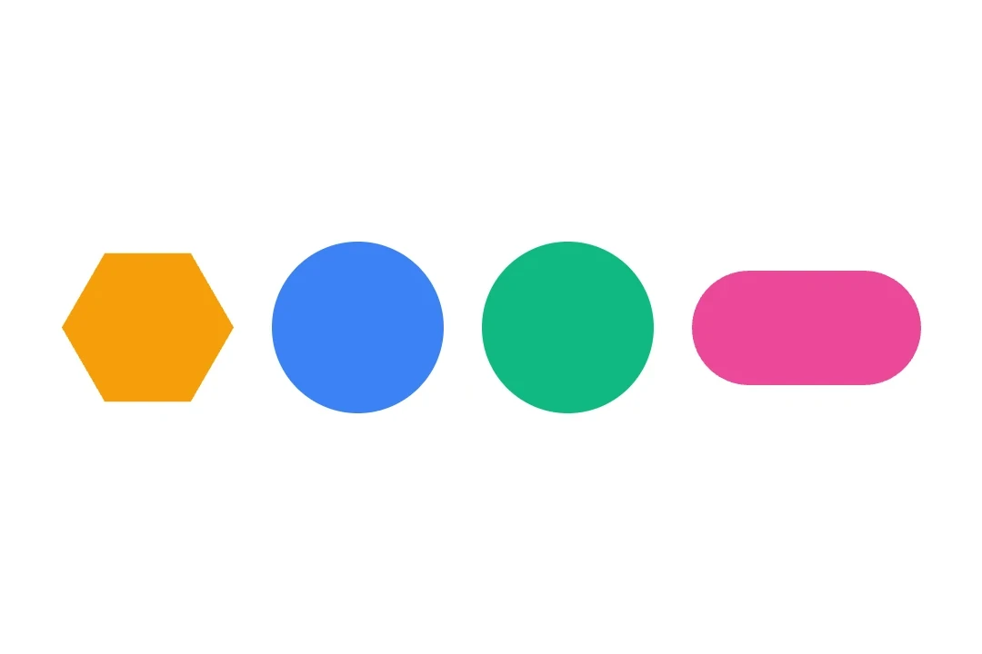
基本形状
使用 Shape 子组件渲染常见形状。
import { Host, Shape, Row } from '@expo/ui/jetpack-compose';
import { size } from '@expo/ui/jetpack-compose/modifiers';

export default function BasicShapesExample() {
  return (
    <Host matchContents>
      <Row horizontalArrangement={{ spacedBy: 16 }} verticalAlignment="center">
        <Shape.Star color="#FFD700" modifiers={[size(80, 80)]} />
        <Shape.Circle radius={40} color="#4285F4" modifiers={[size(80, 80)]} />
        <Shape.Rectangle color="#34A853" modifiers={[size(80, 80)]} />
        <Shape.Pill color="#EA4335" modifiers={[size(100, 50)]} />
      </Row>
    </Host>
  );
}
带圆角的形状
使用 cornerRounding 和 smoothing 来自定义形状的外观。
import { Host, Shape, Row } from '@expo/ui/jetpack-compose';
import { size } from '@expo/ui/jetpack-compose/modifiers';

export default function RoundedShapesExample() {
  return (
    <Host matchContents>
      <Row horizontalArrangement={{ spacedBy: 16 }} verticalAlignment="center">
        <Shape.Rectangle
          cornerRounding={16}
          smoothing={0.5}
          color="#9C27B0"
          modifiers={[size(100, 80)]}
        />
        <Shape.RoundedCorner
          cornerRadii={{ topStart: 20, topEnd: 20, bottomStart: 0, bottomEnd: 0 }}
          color="#FF5722"
          modifiers={[size(100, 80)]}
        />
      </Row>
    </Host>
  );
}
多边形和星形变体
使用 verticesCount 和 innerRadius 来控制形状几何。
import { Host, Shape, Row } from '@expo/ui/jetpack-compose';
import { size } from '@expo/ui/jetpack-compose/modifiers';

export default function PolygonShapesExample() {
  return (
    <Host matchContents>
      <Row horizontalArrangement={{ spacedBy: 16 }} verticalAlignment="center">
        <Shape.Polygon
          verticesCount={6}
          cornerRounding={4}
          color="#00BCD4"
          modifiers={[size(80, 80)]}
        />
        <Shape.Star
          verticesCount={8}
          innerRadius={0.4}
          cornerRounding={2}
          color="#FF9800"
          modifiers={[size(80, 80)]}
        />
        <Shape.PillStar
          verticesCount={6}
          innerRadius={0.5}
          color="#E91E63"
          modifiers={[size(80, 80)]}
        />
      </Row>
    </Host>
  );
}
API
import { Shape } from '@expo/ui/jetpack-compose';
Constants
Type: {
Circle: (props: Pick<ShapeProps, 'radius' | 'verticesCount' | 'color' | 'modifiers'>) => ShapeJSXElement,
Pill: (props: Pick<ShapeProps, 'smoothing' | 'color' | 'modifiers'>) => ShapeJSXElement,
PillStar: (props: ShapeProps) => ShapeJSXElement,
Polygon: (props: Pick<ShapeProps, 'smoothing' | 'cornerRounding' | 'verticesCount' | 'color' | 'modifiers'>) => ShapeJSXElement,
Rectangle: (props: Pick<ShapeProps, 'smoothing' | 'cornerRounding' | 'color' | 'modifiers'>) => ShapeJSXElement,
RoundedCorner: (props: Pick<ShapeProps, 'cornerRadii' | 'color' | 'modifiers'>) => ShapeJSXElement,
Star: (props: ShapeProps) => ShapeJSXElement
}
Props
CornerRadiiCorner radii for RoundedCorner shape. Values are in dp.
number • Default: 0.0Corner rounding percentage. Multiplied by the shorter dimension of the view to produce pixel values.
number • Default: 1.0Inner radius of star-related shapes ('STAR' and 'PILL_STAR'). Multiplied by the shorter dimension of the view to produce pixel values.
number • Default: 1.0Radius of the circular shape. Multiplied by the shorter dimension of the view to produce pixel values.
number • Default: 0.0Number between 0.0 and 1.0 that determines how much each line between vertices is "smoothed".
Methods
Types
Corner radii for RoundedCorner shape.
| Property | Type | Description |
|---|---|---|
| bottomEnd(optional) | number | Bottom-end corner radius in dp. |
| bottomStart(optional) | number | Bottom-start corner radius in dp. |
| topEnd(optional) | number | Top-end corner radius in dp. |
| topStart(optional) | number | Top-start corner radius in dp. |