DockedSearchBar
一个用于显示内联搜索输入的 Jetpack Compose DockedSearchBar 组件。
Android
Included in Expo Go
For the complete documentation index, see llms.txt. Use this file to discover all available pages.
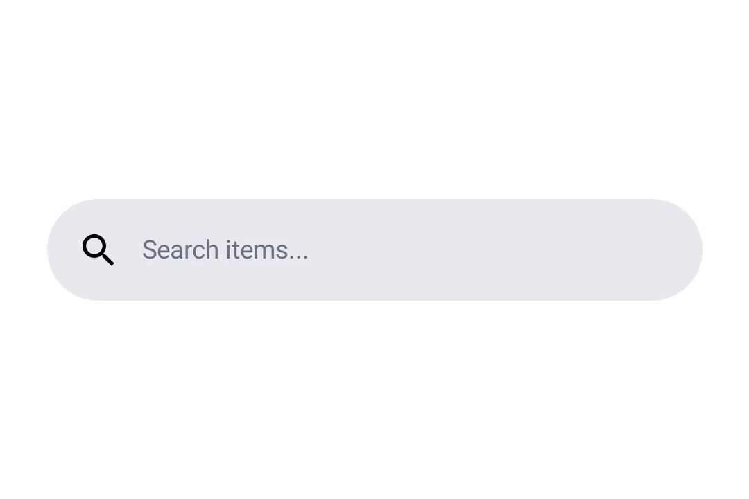
Expo UI DockedSearchBar 与官方 Jetpack Compose SearchBar API 保持一致,并显示一个搜索输入框,该输入框会保持锚定在其父布局中,而不是扩展到全屏。
安装
Terminal
- npx expo install @expo/uiIf you are installing this in an existing React Native app, make sure to install expo in your project.
使用
基本停靠式搜索栏
BasicDockedSearchBarExample.tsx
import { useState } from 'react';
import { Host, DockedSearchBar } from '@expo/ui/jetpack-compose';

export default function BasicDockedSearchBarExample() {
  const [query, setQuery] = useState('');

  return (
    <Host matchContents>
      <DockedSearchBar onQueryChange={setQuery} />
    </Host>
  );
}
使用占位符和前导图标
使用 DockedSearchBar.Placeholder 和 DockedSearchBar.LeadingIcon 插槽组件来自定义搜索栏外观。
DockedSearchBarWithSlotsExample.tsx
import { useState } from 'react';
import { Host, DockedSearchBar, Text } from '@expo/ui/jetpack-compose';

export default function DockedSearchBarWithSlotsExample() {
  const [query, setQuery] = useState('');

  return (
    <Host matchContents>
      <DockedSearchBar onQueryChange={setQuery}>
        <DockedSearchBar.Placeholder>
          <Text>搜索项目...</Text>
        </DockedSearchBar.Placeholder>
        <DockedSearchBar.LeadingIcon>
          <Text>🔍</Text>
        </DockedSearchBar.LeadingIcon>
      </DockedSearchBar>
    </Host>
  );
}
API
import { DockedSearchBar } from '@expo/ui/jetpack-compose';
Components
Type: React.Element<DockedSearchBarProps>
Type: React.Element<LeadingIconProps>
Type: React.Element<PlaceholderProps>