ExposedDropdownMenuBox
一个 Jetpack Compose ExposedDropdownMenuBox 组件,用于显示一个带有可自定义锚点的下拉菜单。
For the complete documentation index, see llms.txt. Use this file to discover all available pages.
如需跨平台选择器,请参阅Picker—— 在 Android 上基于ExposedDropdownMenuBox构建。
Expo UI 的 ExposedDropdownMenuBox 与官方 Jetpack Compose 的 ExposedDropdownMenuBox 保持一致。请在锚点内容(通常是只读的 TextField)上使用 menuAnchor() 修饰符,并使用 ExposedDropdownMenu 来包裹 DropdownMenuItem 子项。
安装
- npx expo install @expo/uiIf you are installing this in an existing React Native app, make sure to install expo in your project.
用法
基础
当将一个非受控的
TextField作为锚点时,请传入key={selected},以便在所选值变化时强制重新挂载——defaultValue只会在挂载时读取。
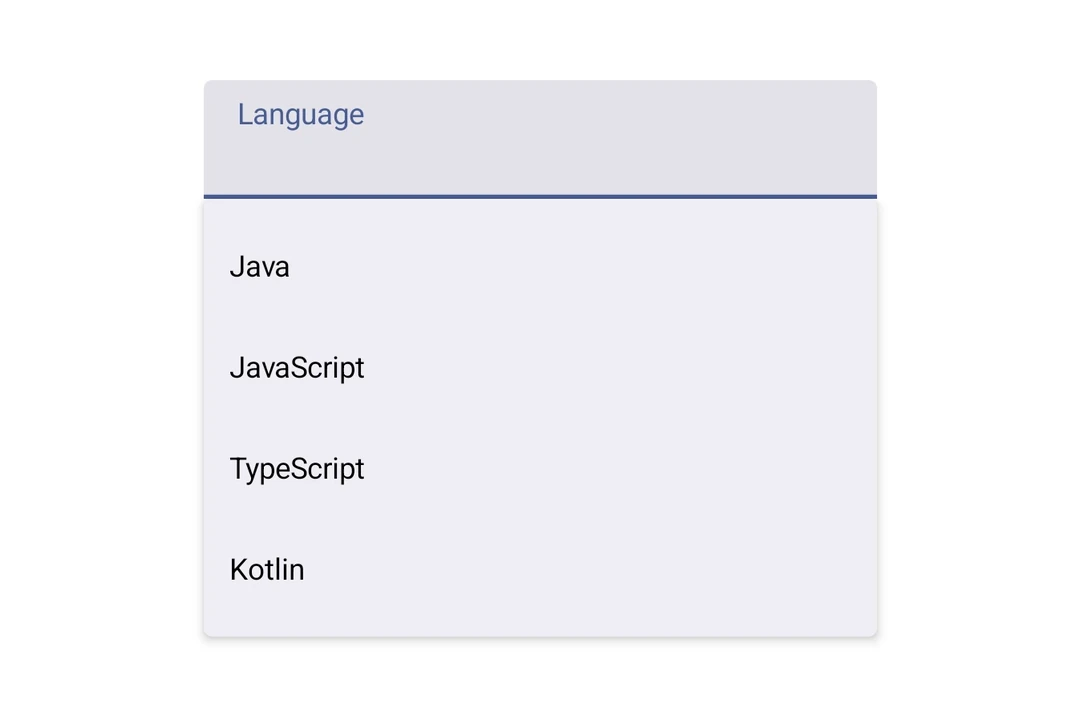
import {
  DropdownMenuItem,
  ExposedDropdownMenuBox,
  ExposedDropdownMenu,
  Host,
  Text,
  TextField,
} from '@expo/ui/jetpack-compose';
import { menuAnchor } from '@expo/ui/jetpack-compose/modifiers';
import { useState } from 'react';

const LANGUAGES = [
  { label: 'Java', value: 'java' },
  { label: 'JavaScript', value: 'js' },
  { label: 'TypeScript', value: 'ts' },
];

export default function BasicExposedDropdownMenuBoxExample() {
  const [selected, setSelected] = useState('java');
  const [expanded, setExpanded] = useState(false);

  const selectedLabel = LANGUAGES.find(l => l.value === selected)?.label ?? '';

  return (
    <Host matchContents>
      <ExposedDropdownMenuBox expanded={expanded} onExpandedChange={setExpanded}>
        <TextField
          defaultValue={selectedLabel}
          key={selected}
          readOnly
          modifiers={[menuAnchor()]}
        />
        <ExposedDropdownMenu expanded={expanded} onDismissRequest={() => setExpanded(false)}>
          {LANGUAGES.map(lang => (
            <DropdownMenuItem
              key={lang.value}
              onClick={() => {
                setSelected(lang.value);
                setExpanded(false);
              }}>
              <DropdownMenuItem.Text>
                <Text>{lang.label}</Text>
              </DropdownMenuItem.Text>
            </DropdownMenuItem>
          ))}
        </ExposedDropdownMenu>
      </ExposedDropdownMenuBox>
    </Host>
  );
}
接口
import { ExposedDropdownMenuBox } from '@expo/ui/jetpack-compose';
Components
Type: React.Element<ExposedDropdownMenuProps>
A Material 3 ExposedDropdownMenu that displays menu items in a dropdown.
Must be used inside an ExposedDropdownMenuBox.
Props for the ExposedDropdownMenu component.
Type: React.Element<ExposedDropdownMenuBoxProps>
A Material 3 ExposedDropdownMenuBox.
Use the menuAnchor() modifier on the anchor content (e.g. a TextField or Text).
Use ExposedDropdownMenu to wrap DropdownMenuItem children.
Example
<ExposedDropdownMenuBox expanded={expanded} onExpandedChange={setExpanded}>
  <TextField modifiers={[menuAnchor()]} defaultValue={value} readOnly />
  <ExposedDropdownMenu expanded={expanded} onDismissRequest={() => setExpanded(false)}>
    <DropdownMenuItem onClick={() => { setSelected('a'); setExpanded(false); }}>
      <DropdownMenuItem.Text><Text>Option A</Text></DropdownMenuItem.Text>
    </DropdownMenuItem>
  </ExposedDropdownMenu>
</ExposedDropdownMenuBox>
ReactNodeChildren — should contain an anchor element with the menuAnchor() modifier
and an ExposedDropdownMenu with DropdownMenuItem children.