Reference version

This documentation is available as Markdown for AI agents and LLMs. See the full Markdown index or append .md to any documentation URL.

HorizontalPager

一个用于可滑动页面的 Jetpack Compose HorizontalPager 组件。

Android
Included in Expo Go
Recommended version:
~57.0.0

Expo UI HorizontalPager 与 Jetpack Compose 的 HorizontalPager 匹配——这是一个水平滚动的分页器,会吸附到各个单独页面。

HorizontalPager 不会强制设定自身的高度——请使用 height 修饰符为其指定高度,或将其放置在具有有限高度的父容器中。
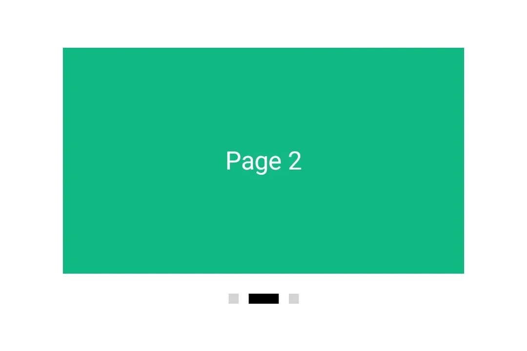
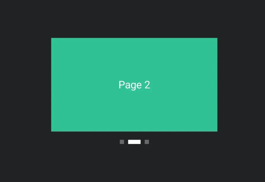
HorizontalPager 显示三页中的第二页,下方有页面指示器

安装

Terminal
npx expo install @expo/ui

If you are installing this in an existing React Native app, make sure to install expo in your project.

用法

非受控

分页器原生管理其滚动位置。使用 initialPage 选择起始页,并通过 onCurrentPageChange 监听变化(在滑动过程中、snap 目标切换时触发),或通过 onSettledPageChange 监听变化(仅在滑动结束并稳定后触发)。

UncontrolledPagerExample.tsx
import { Box, Column, Host, HorizontalPager, Text } from '@expo/ui/jetpack-compose'; import { background, fillMaxSize, fillMaxWidth, height } from '@expo/ui/jetpack-compose/modifiers'; import { useState } from 'react'; export default function UncontrolledPagerExample() { const [currentPage, setCurrentPage] = useState(1); const [settledPage, setSettledPage] = useState(1); return ( <Host matchContents={{ vertical: true }} style={{ width: '100%' }}> <Column verticalArrangement={{ spacedBy: 12 }} modifiers={[fillMaxWidth()]}> <Text style={{ typography: 'titleLarge' }}> currentPage: {currentPage} · settledPage: {settledPage} </Text> <HorizontalPager initialPage={1} onCurrentPageChange={setCurrentPage} onSettledPageChange={setSettledPage} modifiers={[fillMaxWidth(), height(240)]}> <Page label="第 1 页" color="#6200EE" /> <Page label="第 2 页" color="#03DAC5" /> <Page label="第 3 页" color="#FF5722" /> </HorizontalPager> </Column> </Host> ); } function Page({ label, color }: { label: string; color: string }) { return ( <Box modifiers={[fillMaxSize(), background(color)]} contentAlignment="center"> <Text color="#FFFFFF" style={{ typography: 'headlineLarge' }}> {label} </Text> </Box> ); }

程序化导航

附加一个 ref,然后在其上调用 animateScrollToPagescrollToPage。这两个方法分别对应 Compose 的 PagerState.animateScrollToPagePagerState.scrollToPage

ProgrammaticPagerExample.tsx
import { Box, Button, Column, Host, HorizontalPager, type HorizontalPagerHandle, Row, Text, } from '@expo/ui/jetpack-compose'; import { background, fillMaxSize, fillMaxWidth, height } from '@expo/ui/jetpack-compose/modifiers'; import { useRef, useState } from 'react'; const PAGE_COUNT = 5; export default function ProgrammaticPagerExample() { const pagerRef = useRef<HorizontalPagerHandle>(null); const [page, setPage] = useState(0); return ( <Host matchContents={{ vertical: true }} style={{ width: '100%' }}> <Column verticalArrangement={{ spacedBy: 12 }} modifiers={[fillMaxWidth()]}> <Text style={{ typography: 'titleLarge' }}>{page + 1} 页 / {PAGE_COUNT} </Text> <HorizontalPager ref={pagerRef} onSettledPageChange={setPage} modifiers={[fillMaxWidth(), height(200)]}> {Array.from({ length: PAGE_COUNT }).map((_, i) => ( <Page key={i} label={`${i + 1}`} color={COLORS[i]} /> ))} </HorizontalPager> <Row horizontalArrangement={{ spacedBy: 8 }}> <Button onClick={() => pagerRef.current?.animateScrollToPage(Math.max(0, page - 1))}> <Text>上一页</Text> </Button> <Button onClick={() => pagerRef.current?.animateScrollToPage(Math.min(PAGE_COUNT - 1, page + 1)) }> <Text>下一页</Text> </Button> <Button onClick={() => pagerRef.current?.scrollToPage(0)}> <Text>跳转到第一页</Text> </Button> </Row> </Column> </Host> ); } const COLORS = ['#6200EE', '#03DAC5', '#FF5722', '#4CAF50', '#2196F3']; function Page({ label, color }: { label: string; color: string }) { return ( <Box modifiers={[fillMaxSize(), background(color)]} contentAlignment="center"> <Text color="#FFFFFF" style={{ typography: 'headlineLarge' }}> {label} </Text> </Box> ); }

页面间距和内容内边距

使用 pageSpacing 在页面之间添加间隙(在滑动时可见),并使用 contentPadding 为分页器添加内边距,使相邻页面在静止时露出一部分。

PagerLayoutExample.tsx
import { Box, Host, HorizontalPager, Text } from '@expo/ui/jetpack-compose'; import { background, fillMaxSize, fillMaxWidth, height } from '@expo/ui/jetpack-compose/modifiers'; export default function PagerLayoutExample() { return ( <Host matchContents={{ vertical: true }} style={{ width: '100%' }}> <HorizontalPager pageSpacing={12} contentPadding={{ start: 32, end: 32 }} modifiers={[fillMaxWidth(), height(180)]}> <Page label="第 1 页" color="#6200EE" /> <Page label="第 2 页" color="#03DAC5" /> <Page label="第 3 页" color="#FF5722" /> </HorizontalPager> </Host> ); } function Page({ label, color }: { label: string; color: string }) { return ( <Box modifiers={[fillMaxSize(), background(color)]} contentAlignment="center"> <Text color="#FFFFFF" style={{ typography: 'headlineLarge' }}> {label} </Text> </Box> ); }

API

import { HorizontalPager } from '@expo/ui/jetpack-compose';

Component

HorizontalPager

Android

Type: React.Element<HorizontalPagerProps>

A horizontally scrolling pager that snaps to individual pages, matching Compose's HorizontalPager.

HorizontalPagerProps

beyondViewportPageCount

Android
Optional • Type: number • Default: 0

Number of pages to compose and keep beyond the visible viewport.

children

Android
Type: ReactNode

Children to render as pages.

contentPadding

Android
Optional • Literal type: union • Default: 0

Padding for pager content (dp or per-side object).

Acceptable values are: number | PaddingValuesRecord

initialPage

Android
Optional • Type: number • Default: 0

Page to mount on. Mirrors rememberPagerState(initialPage = …). Subsequent changes have no effect — use the ref methods to navigate after mount.

modifiers

Android
Optional • Type: ModifierConfig[]

Modifiers for the component.

onCurrentPageChange

Android
Optional • Type: (page: number) => void

Fires when Compose's PagerState.currentPage changes — i.e. when the page closest to the snap position flips, including mid-swipe as the user crosses between pages.

onDragInteraction

Android
Optional • Type: (kind: HorizontalPagerDragInteraction) => void

Fires for each drag interaction emitted by PagerState.interactionSource. Combine with onScrollInProgressChange to distinguish user dragging from fling/snap-settling.

onPageScroll

Android
Optional • Type: (currentPage: number, currentPageOffsetFraction: number) => void

Fires continuously while a swipe is in progress. Mirrors Compose's PagerState.currentPage and currentPageOffsetFraction — the latter is the signed fractional offset from currentPage, in the [-0.5, 0.5] range.

If the callback is marked with the 'worklet' directive, it runs synchronously on the UI thread; otherwise it is delivered asynchronously as a regular JS event.

onScrollInProgressChange

Android
Optional • Type: (isScrollInProgress: boolean) => void

Fires when Compose's PagerState.isScrollInProgress toggles — true while the pager is being dragged or animating to a snap target, false once it has settled.

onSettledPageChange

Android
Optional • Type: (page: number) => void

Fires when Compose's PagerState.settledPage changes — i.e. after a swipe or programmatic scroll has fully settled.

pageSpacing

Android
Optional • Type: number • Default: 0

Spacing between pages in dp.

ref

Android
Optional • Type: Ref<HorizontalPagerHandle>

Imperative handle for programmatic navigation. Mirrors the methods on Compose's PagerState.

reverseLayout

Android
Optional • Type: boolean • Default: false

Whether to reverse the layout direction.

userScrollEnabled

Android
Optional • Type: boolean • Default: true

Whether the user can scroll the pager by swiping.

Types

HorizontalPagerDragInteraction

Android

Literal type: string

Kind of drag interaction reported by onDragInteraction. Mirrors Compose's DragInteraction.Start / DragInteraction.Stop / DragInteraction.Cancel.

Acceptable values are: 'start' | 'stop' | 'cancel'

HorizontalPagerHandle

Android
PropertyTypeDescription
animateScrollToPage(page: number) => Promise<void>

Mirrors Compose's PagerState.animateScrollToPage. Resolves when the animation completes.

scrollToPage(page: number) => Promise<void>

Mirrors Compose's PagerState.scrollToPage. Jumps without animation.

PaddingValuesRecord

Android

Per-side padding values in dp for the content.

PropertyTypeDescription
bottom(optional)number
-
end(optional)number
-
start(optional)number
-
top(optional)number
-