This documentation is available as Markdown for AI agents and LLMs. See the full Markdown index or append .md to any documentation URL.
分段按钮
用于单选或多选的 Jetpack Compose 分段按钮组件。
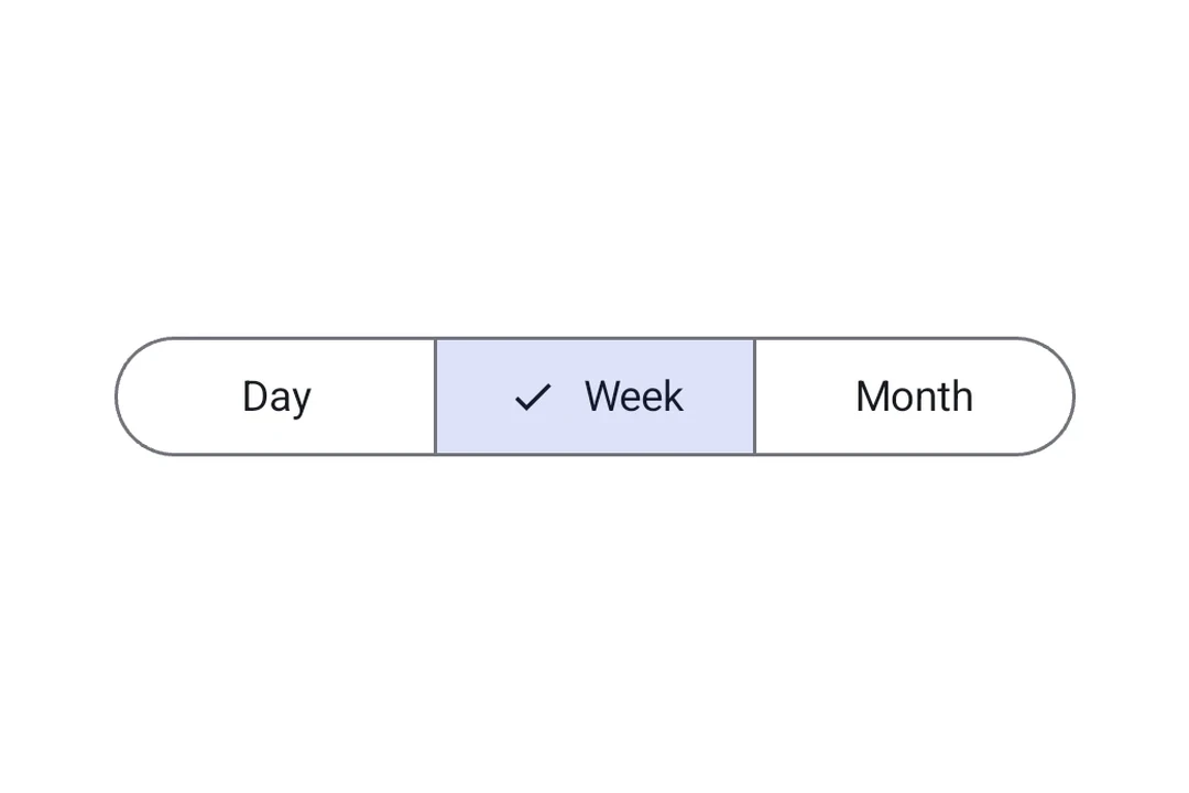
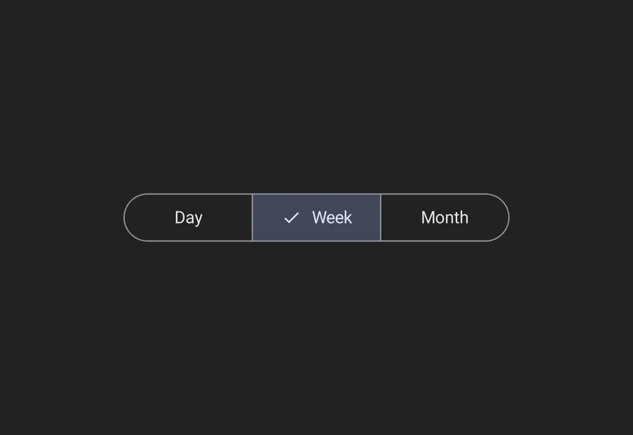
分段按钮让应用用户从一组少量选项中进行选择,这些选项会在一行中并排显示。它们对应官方 Jetpack Compose 分段按钮 API。
有两种容器类型:
SingleChoiceSegmentedButtonRow:任意时刻只能选中一个按钮(类似单选按钮)。MultiChoiceSegmentedButtonRow:多个按钮可以独立切换(类似复选框)。
安装
- npx expo install @expo/uiIf you are installing this in an existing React Native app, make sure to install expo in your project.
用法
单选分段按钮
当同一时间只能有一个选项处于激活状态时,使用 SingleChoiceSegmentedButtonRow。每个 SegmentedButton 接受 selected 和 onClick 属性。
import { useState } from 'react'; import { Host, SingleChoiceSegmentedButtonRow, SegmentedButton, Text, } from '@expo/ui/jetpack-compose'; export default function SingleChoiceExample() { const [selectedIndex, setSelectedIndex] = useState(0); const options = ['Day', 'Week', 'Month', 'Year']; return ( <Host matchContents> <SingleChoiceSegmentedButtonRow> {options.map((label, index) => ( <SegmentedButton key={label} selected={index === selectedIndex} onClick={() => setSelectedIndex(index)}> <SegmentedButton.Label> <Text>{label}</Text> </SegmentedButton.Label> </SegmentedButton> ))} </SingleChoiceSegmentedButtonRow> </Host> ); }
多选分段按钮
当多个选项可以独立切换时,使用 MultiChoiceSegmentedButtonRow。每个 SegmentedButton 接受 checked 和 onCheckedChange 属性。
import { useState } from 'react'; import { Host, MultiChoiceSegmentedButtonRow, SegmentedButton, Text, } from '@expo/ui/jetpack-compose'; export default function MultiChoiceExample() { const [checkedItems, setCheckedItems] = useState([false, false, false, false]); const options = ['Wi-Fi', 'Bluetooth', 'NFC', 'GPS']; return ( <Host matchContents> <MultiChoiceSegmentedButtonRow> {options.map((label, index) => ( <SegmentedButton key={label} checked={checkedItems[index]} onCheckedChange={checked => { setCheckedItems(prev => { const next = [...prev]; next[index] = checked; return next; }); }}> <SegmentedButton.Label> <Text>{label}</Text> </SegmentedButton.Label> </SegmentedButton> ))} </MultiChoiceSegmentedButtonRow> </Host> ); }
自定义颜色
使用 SegmentedButton 上的 colors 属性来自定义其在激活、未激活和禁用状态下的外观。
import { useState } from 'react'; import { Host, SingleChoiceSegmentedButtonRow, SegmentedButton, Text, } from '@expo/ui/jetpack-compose'; export default function CustomColorsExample() { const [selectedIndex, setSelectedIndex] = useState(0); const options = ['$', '$$', '$$$', '$$$$']; return ( <Host matchContents> <SingleChoiceSegmentedButtonRow> {options.map((label, index) => ( <SegmentedButton key={label} selected={index === selectedIndex} onClick={() => setSelectedIndex(index)} colors={{ activeContainerColor: '#6200EE', activeContentColor: '#FFFFFF', }}> <SegmentedButton.Label> <Text>{label}</Text> </SegmentedButton.Label> </SegmentedButton> ))} </SingleChoiceSegmentedButtonRow> </Host> ); }
API
import { SingleChoiceSegmentedButtonRow, MultiChoiceSegmentedButtonRow, SegmentedButton, } from '@expo/ui/jetpack-compose';
Components
Type: React.Element<MultiChoiceSegmentedButtonRowProps>
A row container for multi-choice SegmentedButton children.
Maps to Material 3 MultiChoiceSegmentedButtonRow.
Type: React.Element<SegmentedButtonProps>
A Material 3 segmented button. Must be used inside a SingleChoiceSegmentedButtonRow
or MultiChoiceSegmentedButtonRow.
booleanWhether the button is currently checked (used inside MultiChoiceSegmentedButtonRow).
(checked: boolean) => voidCallback that is called when the checked state changes (used inside MultiChoiceSegmentedButtonRow).
() => voidCallback that is called when the button is clicked (used inside SingleChoiceSegmentedButtonRow).
Type: React.Element<SingleChoiceSegmentedButtonRowProps>
A row container for single-choice SegmentedButton children.
Maps to Material 3 SingleChoiceSegmentedButtonRow.
Types
Colors for the segmented button in different states.
| Property | Type | Description |
|---|---|---|
| activeBorderColor(optional) | ColorValue | - |
| activeContainerColor(optional) | ColorValue | - |
| activeContentColor(optional) | ColorValue | - |
| disabledActiveBorderColor(optional) | ColorValue | - |
| disabledActiveContainerColor(optional) | ColorValue | - |
| disabledActiveContentColor(optional) | ColorValue | - |
| disabledInactiveBorderColor(optional) | ColorValue | - |
| disabledInactiveContainerColor(optional) | ColorValue | - |
| disabledInactiveContentColor(optional) | ColorValue | - |
| inactiveBorderColor(optional) | ColorValue | - |
| inactiveContainerColor(optional) | ColorValue | - |
| inactiveContentColor(optional) | ColorValue | - |