按钮
用于显示原生 Material3 按钮的 Jetpack Compose 按钮组件。
For the complete documentation index, see llms.txt. Use this file to discover all available pages.
信息 关于跨平台用法,请参见通用的
Button— 它会针对每个平台渲染相应的原生组件。
Expo UI 提供五个与官方 Jetpack Compose Button API 一致的按钮组件:Button(填充)、FilledTonalButton、OutlinedButton、ElevatedButton 和 TextButton。所有变体共享相同的 props,并接受可组合子元素作为内容。
| 类型 | 外观 | 用途 |
|---|---|---|
| Filled | 实心背景,文字形成对比。 | 用于主要操作的高强调按钮,例如“提交”和“保存”。 |
| Filled tonal | 背景颜色变化以匹配表面。 | 也用于主要或重要操作。Filled tonal 按钮更有视觉分量,适合“加入购物车”和“登录”之类的功能。 |
| Elevated | 通过阴影突出显示。 | 作用与 tonal 按钮类似。提高海拔可使按钮看起来更加醒目。 |
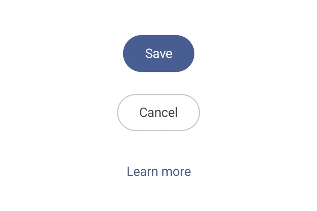
| Outlined | 具有边框但没有填充。 | 中强调按钮,包含重要但非主要的操作。它们与其他按钮搭配良好,可用于表示“取消”或“返回”等替代、次要操作。 |
| Text | 显示文本,没有背景或边框。 | 低强调按钮,非常适合不那么关键的操作,例如导航链接,或“了解更多”“查看详情”等次要功能。 |
安装
- npx expo install @expo/uiIf you are installing this in an existing React Native app, make sure to install expo in your project.
使用
基础按钮
填充按钮是用于主要操作的默认高强调按钮。
import { Host, Button, Text } from '@expo/ui/jetpack-compose';

export default function BasicButtonExample() {
  return (
    <Host matchContents>
      <Button onClick={() => alert('Pressed!')}>
        <Text>按我</Text>
      </Button>
    </Host>
  );
}
按钮变体
使用不同的按钮组件来传达不同程度的强调。
import {
  Host,
  Button,
  FilledTonalButton,
  OutlinedButton,
  ElevatedButton,
  TextButton,
  Column,
  Text,
} from '@expo/ui/jetpack-compose';

export default function ButtonVariantsExample() {
  return (
    <Host matchContents>
      <Column verticalArrangement={{ spacedBy: 8 }}>
        <Button onClick={() => {}}>
          <Text>Filled</Text>
        </Button>
        <FilledTonalButton onClick={() => {}}>
          <Text>Filled Tonal</Text>
        </FilledTonalButton>
        <OutlinedButton onClick={() => {}}>
          <Text>Outlined</Text>
        </OutlinedButton>
        <ElevatedButton onClick={() => {}}>
          <Text>Elevated</Text>
        </ElevatedButton>
        <TextButton onClick={() => {}}>
          <Text>Text</Text>
        </TextButton>
      </Column>
    </Host>
  );
}
带图标的按钮
由于按钮接受可组合子元素,你可以使用 Icon 组件添加前置和后置图标。这遵循 带图标的 Material 3 按钮 模式(官方示例),请使用 18dp 的图标尺寸,图标与标签之间间距为 8dp。
import {
  Host,
  Button,
  OutlinedButton,
  FilledTonalButton,
  Icon,
  Spacer,
  Text,
} from '@expo/ui/jetpack-compose';
import { width } from '@expo/ui/jetpack-compose/modifiers';

const addIcon = require('./assets/add.png');
const sendIcon = require('./assets/send.png');

export default function ButtonWithIconsExample() {
  return (
    <Host matchContents>
      {/* 前置图标 */}
      <Button onClick={() => {}}>
        <Icon source={addIcon} size={18} tintColor="#FFFFFF" />
        <Spacer modifiers={[width(8)]} />
        <Text>添加项目</Text>
      </Button>

      {/* 后置图标 */}
      <OutlinedButton onClick={() => {}}>
        <Text>发送</Text>
        <Spacer modifiers={[width(8)]} />
        <Icon source={sendIcon} size={18} />
      </OutlinedButton>

      {/* 同时包含前置和后置图标 */}
      <FilledTonalButton onClick={() => {}}>
        <Icon source={addIcon} size={18} />
        <Spacer modifiers={[width(8)]} />
        <Text>创建并发送</Text>
        <Spacer modifiers={[width(8)]} />
        <Icon source={sendIcon} size={18} />
      </FilledTonalButton>
    </Host>
  );
}
自定义颜色
使用 colors prop 覆盖容器和内容颜色。
import { Host, Button, Text } from '@expo/ui/jetpack-compose';

export default function CustomColorsExample() {
  return (
    <Host matchContents>
      <Button onClick={() => {}} colors={{ containerColor: '#6200EE', contentColor: '#FFFFFF' }}>
        <Text>紫色按钮</Text>
      </Button>
    </Host>
  );
}
自定义形状
import { Host, Button, Shape, Text } from '@expo/ui/jetpack-compose';

export default function CustomShapeExample() {
  return (
    <Host matchContents>
      <Button
        onClick={() => {}}
        shape={Shape.RoundedCorner({ cornerRadii: { topStart: 16, bottomEnd: 16 } })}>
        <Text>自定义形状</Text>
      </Button>
    </Host>
  );
}
API
import {
  Button,
  FilledTonalButton,
  OutlinedButton,
  ElevatedButton,
  TextButton,
} from '@expo/ui/jetpack-compose';
Components
Type: React.Element<ButtonProps>
A filled button component.
ButtonContentPaddingThe padding between the button container and its content. Use this to adjust internal spacing, for example when adding a leading icon
boolean • Default: trueWhether the button is enabled for user interaction.
Types
Colors for button elements.
| Property | Type | Description |
|---|---|---|
| containerColor(optional) | ColorValue | - |
| contentColor(optional) | ColorValue | - |
| disabledContainerColor(optional) | ColorValue | - |
| disabledContentColor(optional) | ColorValue | - |