分割线
用于创建视觉分隔符的 Jetpack Compose 分割线组件。
For the complete documentation index, see llms.txt. Use this file to discover all available pages.
Expo UI 提供 HorizontalDivider 和 VerticalDivider,与官方 Jetpack Compose Divider API 保持一致。
安装
- npx expo install @expo/uiIf you are installing this in an existing React Native app, make sure to install expo in your project.
用法
水平分隔线
用于在列表和布局中以视觉方式分隔内容的细水平线。
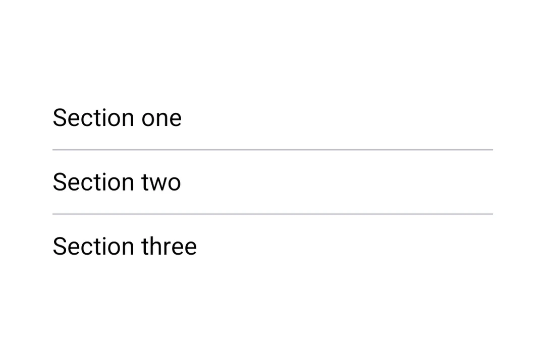
import { Host, HorizontalDivider, Column, Text } from '@expo/ui/jetpack-compose';

export default function HorizontalDividerExample() {
  return (
    <Host matchContents>
      <Column>
        <Text>第一部分</Text>
        <HorizontalDivider />
        <Text>第二部分</Text>
      </Column>
    </Host>
  );
}
自定义粗细和颜色
HorizontalDivider 和 VerticalDivider 都接受 thickness 和 color 属性。使用 StyleSheet.hairlineWidth 可创建 1 像素的线,或者设置自定义的粗细和颜色。
import { Host, HorizontalDivider, Column, Text } from '@expo/ui/jetpack-compose';
import { StyleSheet } from 'react-native';

export default function CustomDividerExample() {
  return (
    <Host matchContents>
      <Column>
        <Text>发丝线分隔线(1 像素)</Text>
        <HorizontalDivider thickness={StyleSheet.hairlineWidth} />
        <Text>粗的彩色分隔线</Text>
        <HorizontalDivider thickness={4} color="#E91E63" />
        <Text>下方</Text>
      </Column>
    </Host>
  );
}
垂直分隔线
用于在行布局中左右并排分隔项目的竖线。
import { Host, VerticalDivider, Row, Text } from '@expo/ui/jetpack-compose';
import { height } from '@expo/ui/jetpack-compose/modifiers';

export default function VerticalDividerExample() {
  return (
    <Host matchContents>
      <Row verticalAlignment="center" modifiers={[height(48)]}>
        <Text>左侧</Text>
        <VerticalDivider />
        <Text>右侧</Text>
      </Row>
    </Host>
  );
}
API
import { HorizontalDivider, VerticalDivider } from '@expo/ui/jetpack-compose';
Components
Type: React.Element<ComponentType<DividerCommonConfig>>
A horizontal divider line that groups content in lists and layouts,
matching Compose's HorizontalDivider.
Type: React.Element<ComponentType<DividerCommonConfig>>
A vertical divider line that groups content in layouts,
matching Compose's VerticalDivider.
Types
| Property | Type | Description |
|---|---|---|
| color(optional) | ColorValue | Color of the divider line. |
| modifiers(optional) | ModifierConfig[] | Modifiers for the component. |
| thickness(optional) | number | Thickness of the divider line. Accepts dp values; use |