This documentation is available as Markdown for AI agents and LLMs. See the full Markdown index or append .md to any documentation URL.
复选框
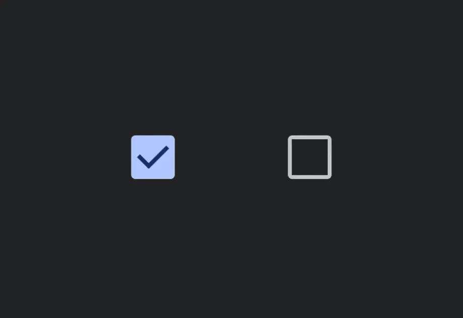
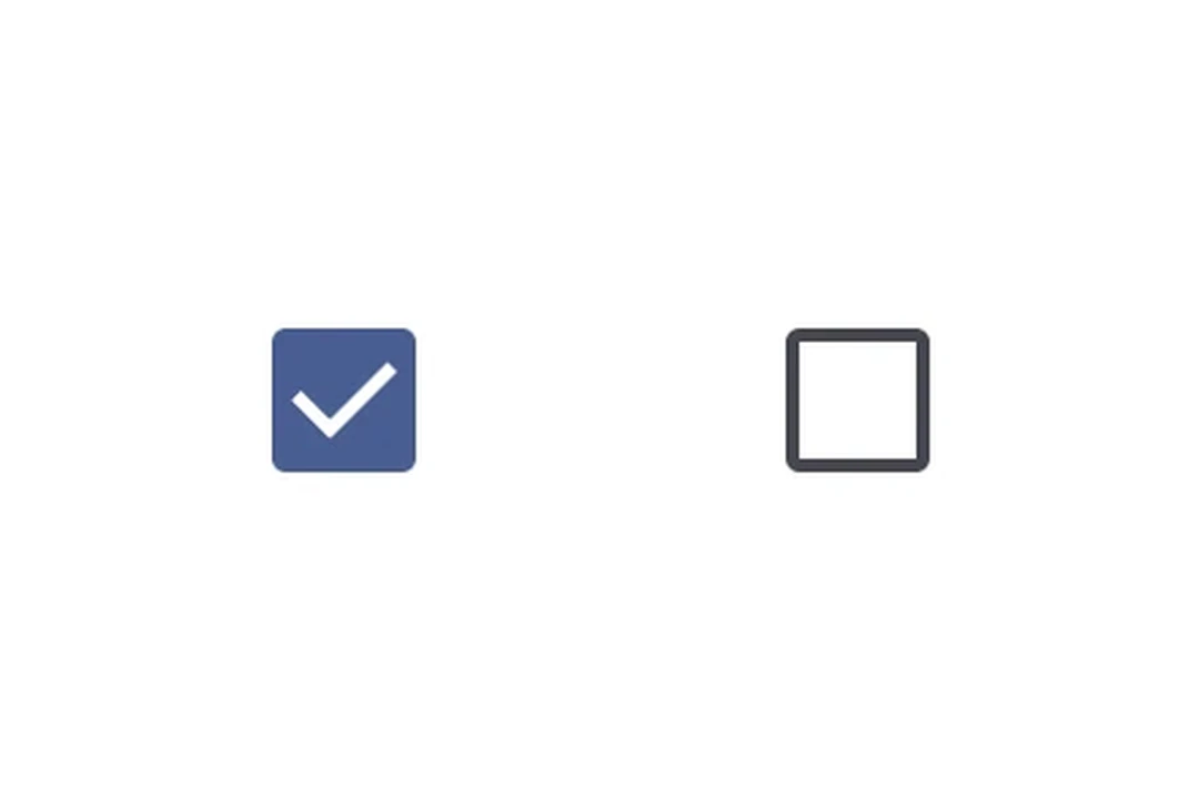
一个用于选择控件的 Jetpack Compose 复选框组件。
有关跨平台使用,请参阅通用的Checkbox— 它会根据平台渲染相应的原生组件。
Expo UI Checkbox 与官方 Jetpack Compose Checkbox API 保持一致。
安装
- npx expo install @expo/uiIf you are installing this in an existing React Native app, make sure to install expo in your project.
用法
基本复选框
import { useState } from 'react'; import { Host, Checkbox } from '@expo/ui/jetpack-compose'; export default function CheckboxExample() { const [checked, setChecked] = useState(false); return ( <Host matchContents> <Checkbox value={checked} onCheckedChange={setChecked} /> </Host> ); }
自定义颜色
import { useState } from 'react'; import { Host, Checkbox } from '@expo/ui/jetpack-compose'; export default function CustomColorsExample() { const [checked, setChecked] = useState(false); return ( <Host matchContents> <Checkbox value={checked} onCheckedChange={setChecked} colors={{ checkedColor: '#6200EE', checkmarkColor: '#FFFFFF', }} /> </Host> ); }
全选(TriStateCheckbox)
当父复选框需要反映其子项状态时,请使用 TriStateCheckbox。它支持三种状态:'on'、'off' 和 'indeterminate'。
将 toggleable 修饰符应用到每个 Row 上,使整行(复选框 + 标签)都可点击,并保持正确的无障碍语义。对行使用 toggleable 时,请省略复选框本身的 onCheckedChange/onClick,以避免重复处理。
import { useState } from 'react'; import { Host, Checkbox, TriStateCheckbox, Row, Column, Text } from '@expo/ui/jetpack-compose'; import { toggleable } from '@expo/ui/jetpack-compose/modifiers'; export default function SelectAllExample() { const [child1, setChild1] = useState(false); const [child2, setChild2] = useState(false); const [child3, setChild3] = useState(false); const parentState = child1 && child2 && child3 ? 'on' : !child1 && !child2 && !child3 ? 'off' : 'indeterminate'; return ( <Host matchContents> <Column> <Row verticalAlignment="center" modifiers={[ toggleable( parentState === 'on', () => { const newState = parentState !== 'on'; setChild1(newState); setChild2(newState); setChild3(newState); }, { role: 'checkbox' } ), ]}> <TriStateCheckbox state={parentState} /> <Text>全选</Text> </Row> <Row verticalAlignment="center" modifiers={[toggleable(child1, () => setChild1(!child1), { role: 'checkbox' })]}> <Checkbox value={child1} /> <Text>选项 1</Text> </Row> <Row verticalAlignment="center" modifiers={[toggleable(child2, () => setChild2(!child2), { role: 'checkbox' })]}> <Checkbox value={child2} /> <Text>选项 2</Text> </Row> <Row verticalAlignment="center" modifiers={[toggleable(child3, () => setChild3(!child3), { role: 'checkbox' })]}> <Checkbox value={child3} /> <Text>选项 3</Text> </Row> </Column> </Host> ); }
API
import { Checkbox, TriStateCheckbox } from '@expo/ui/jetpack-compose';
Components
Type: React.Element<CheckboxProps>
A checkbox component.
(value: boolean) => voidCallback function that is called when the checked state changes.
Type: React.Element<TriStateCheckboxProps>
A tri-state checkbox component that supports 'on', 'off', and 'indeterminate' states.
Useful for "select all" patterns where the parent checkbox reflects the state of its children.
() => voidCallback function that is called when the checkbox is clicked.
ToggleableStateThe toggleable state of the checkbox: 'on', 'off', or 'indeterminate'.
Types
Colors for checkbox core elements.
| Property | Type | Description |
|---|---|---|
| checkedColor(optional) | ColorValue | - |
| checkmarkColor(optional) | ColorValue | - |
| disabledCheckedColor(optional) | ColorValue | - |
| disabledIndeterminateColor(optional) | ColorValue | - |
| disabledUncheckedColor(optional) | ColorValue | - |
| uncheckedColor(optional) | ColorValue | - |