This documentation is available as Markdown for AI agents and LLMs. See the full Markdown index or append .md to any documentation URL.
图标按钮
用于显示原生 Material3 图标按钮的 Jetpack Compose 图标按钮组件。
Expo UI 提供四个与官方 Jetpack Compose IconButton API 一致的图标按钮组件:IconButton、FilledIconButton、FilledTonalIconButton 和 OutlinedIconButton。所有变体都共享相同的 props,并接受可组合子元素作为内容。
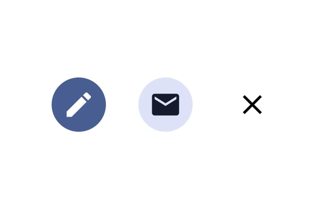
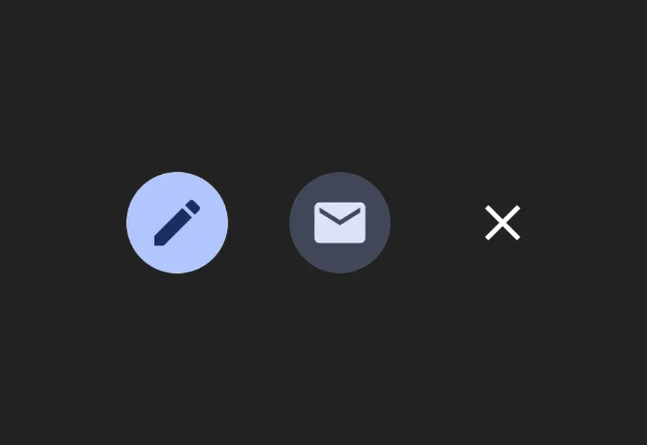
安装
- npx expo install @expo/uiIf you are installing this in an existing React Native app, make sure to install expo in your project.
用法
基本图标按钮
一种标准的、没有背景的图标按钮,通常用于工具栏操作。
import { Host, IconButton, Icon } from '@expo/ui/jetpack-compose'; export default function BasicIconButtonExample() { return ( <Host matchContents> <IconButton onClick={() => alert('已按下!')}> <Icon source={require('./assets/settings.xml')} size={24} /> </IconButton> </Host> ); }
图标按钮变体
使用不同的图标按钮组件来传达不同层级的强调程度。
import { Host, IconButton, FilledIconButton, FilledTonalIconButton, OutlinedIconButton, Icon, Row, } from '@expo/ui/jetpack-compose'; export default function IconButtonVariantsExample() { return ( <Host matchContents> <Row horizontalArrangement={{ spacedBy: 8 }}> <IconButton onClick={() => {}}> <Icon source={require('./assets/star.xml')} size={24} /> </IconButton> <FilledIconButton onClick={() => {}}> <Icon source={require('./assets/star.xml')} size={24} /> </FilledIconButton> <FilledTonalIconButton onClick={() => {}}> <Icon source={require('./assets/star.xml')} size={24} /> </FilledTonalIconButton> <OutlinedIconButton onClick={() => {}}> <Icon source={require('./assets/star.xml')} size={24} /> </OutlinedIconButton> </Row> </Host> ); }
API
import { IconButton, FilledIconButton, FilledTonalIconButton, OutlinedIconButton, } from '@expo/ui/jetpack-compose';
Components
Type: React.Element<IconButtonProps>
A filled icon button with a solid background.
Type: React.Element<IconButtonProps>
A filled tonal icon button with a muted background.
Type: React.Element<IconButtonProps>
A standard icon button with no background.
boolean • Default: trueWhether the icon button is enabled for user interaction.
Type: React.Element<IconButtonProps>
An outlined icon button with a border and no fill.
Types
Colors for icon button elements.
| Property | Type | Description |
|---|---|---|
| containerColor(optional) | ColorValue | - |
| contentColor(optional) | ColorValue | - |
| disabledContainerColor(optional) | ColorValue | - |
| disabledContentColor(optional) | ColorValue | - |