Reference version

This documentation is available as Markdown for AI agents and LLMs. See the full Markdown index or append .md to any documentation URL.

形状

一个用于绘制几何形状的 Jetpack Compose Shape 组件。

Android
Included in Expo Go
Recommended version:
~57.0.0

Expo UI Shape 与官方 Jetpack Compose Shapes API 保持一致,并提供了一组用于绘制几何形状的子组件,例如星形、圆形、矩形、胶囊形和多边形。
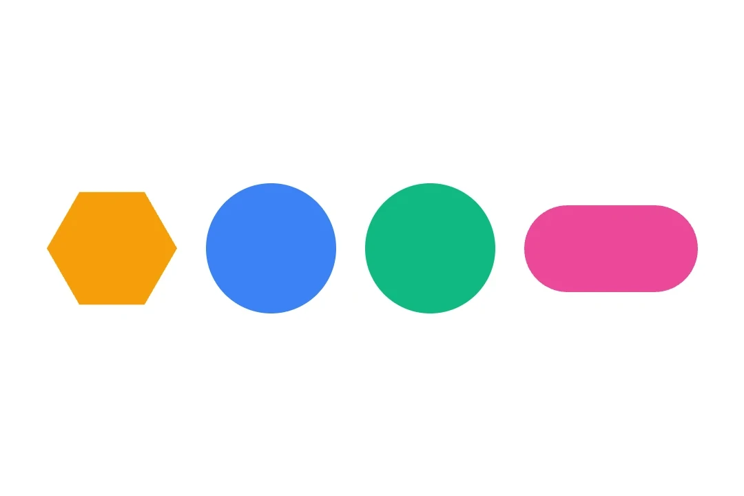
四种几何形状:六边形、圆形、圆角矩形和胶囊形

安装

Terminal
npx expo install @expo/ui

If you are installing this in an existing React Native app, make sure to install expo in your project.

用法

基本形状

使用 Shape 子组件渲染常见形状。

BasicShapesExample.tsx
import { Host, Shape, Row } from '@expo/ui/jetpack-compose'; import { size } from '@expo/ui/jetpack-compose/modifiers'; export default function BasicShapesExample() { return ( <Host matchContents> <Row horizontalArrangement={{ spacedBy: 16 }} verticalAlignment="center"> <Shape.Star color="#FFD700" modifiers={[size(80, 80)]} /> <Shape.Circle radius={40} color="#4285F4" modifiers={[size(80, 80)]} /> <Shape.Rectangle color="#34A853" modifiers={[size(80, 80)]} /> <Shape.Pill color="#EA4335" modifiers={[size(100, 50)]} /> </Row> </Host> ); }

带圆角的形状

使用 cornerRoundingsmoothing 自定义形状外观。

RoundedShapesExample.tsx
import { Host, Shape, Row } from '@expo/ui/jetpack-compose'; import { size } from '@expo/ui/jetpack-compose/modifiers'; export default function RoundedShapesExample() { return ( <Host matchContents> <Row horizontalArrangement={{ spacedBy: 16 }} verticalAlignment="center"> <Shape.Rectangle cornerRounding={16} smoothing={0.5} color="#9C27B0" modifiers={[size(100, 80)]} /> <Shape.RoundedCorner cornerRadii={{ topStart: 20, topEnd: 20, bottomStart: 0, bottomEnd: 0 }} color="#FF5722" modifiers={[size(100, 80)]} /> </Row> </Host> ); }

多边形和星形变体

使用 verticesCountinnerRadius 来控制形状几何结构。

PolygonShapesExample.tsx
import { Host, Shape, Row } from '@expo/ui/jetpack-compose'; import { size } from '@expo/ui/jetpack-compose/modifiers'; export default function PolygonShapesExample() { return ( <Host matchContents> <Row horizontalArrangement={{ spacedBy: 16 }} verticalAlignment="center"> <Shape.Polygon verticesCount={6} cornerRounding={4} color="#00BCD4" modifiers={[size(80, 80)]} /> <Shape.Star verticesCount={8} innerRadius={0.4} cornerRounding={2} color="#FF9800" modifiers={[size(80, 80)]} /> <Shape.PillStar verticesCount={6} innerRadius={0.5} color="#E91E63" modifiers={[size(80, 80)]} /> </Row> </Host> ); }

API

import { Shape } from '@expo/ui/jetpack-compose';

Constants

Shape.Shape

Type: { Circle: (props: Pick<ShapeProps, 'radius' | 'verticesCount' | 'color' | 'modifiers'>) => ShapeJSXElement, Pill: (props: Pick<ShapeProps, 'smoothing' | 'color' | 'modifiers'>) => ShapeJSXElement, PillStar: (props: ShapeProps) => ShapeJSXElement, Polygon: (props: Pick<ShapeProps, 'smoothing' | 'cornerRounding' | 'verticesCount' | 'color' | 'modifiers'>) => ShapeJSXElement, Rectangle: (props: Pick<ShapeProps, 'smoothing' | 'cornerRounding' | 'color' | 'modifiers'>) => ShapeJSXElement, RoundedCorner: (props: Pick<ShapeProps, 'cornerRadii' | 'color' | 'modifiers'>) => ShapeJSXElement, Star: (props: ShapeProps) => ShapeJSXElement }

Props

color

Optional • Type: ColorValue

Color of the shape

cornerRadii

Optional • Type: CornerRadii

Corner radii for RoundedCorner shape. Values are in dp.

cornerRounding

Optional • Type: number • Default: 0.0

Corner rounding percentage. Multiplied by the shorter dimension of the view to produce pixel values.

innerRadius

Optional • Type: number • Default: 1.0

Inner radius of star-related shapes ('STAR' and 'PILL_STAR'). Multiplied by the shorter dimension of the view to produce pixel values.

modifiers

Optional • Type: ModifierConfig[]

Modifiers for the component.

radius

Optional • Type: number • Default: 1.0

Radius of the circular shape. Multiplied by the shorter dimension of the view to produce pixel values.

smoothing

Optional • Type: number • Default: 0.0

Number between 0.0 and 1.0 that determines how much each line between vertices is "smoothed".

verticesCount

Optional • Type: number • Default: 6.0

Number of vertices. For 'POLYGON' it must be at least 3.0. For 'STAR' and 'PILL_STAR' it is a number of vertices for each of two radii (A 5-pointed star has 10 vertices.)

Methods

Shape.parseJSXShape(shape)

Overload #1
ParameterType
shapeShapeJSXElement

Returns:
ShapeRecordProps

Shape.parseJSXShape(shape)

Overload #2
ParameterType
shape(optional)ShapeJSXElement

Returns:
ShapeRecordProps | undefined

Types

CornerRadii

Corner radii for RoundedCorner shape.

PropertyTypeDescription
bottomEnd(optional)number

Bottom-end corner radius in dp.

bottomStart(optional)number

Bottom-start corner radius in dp.

topEnd(optional)number

Top-end corner radius in dp.

topStart(optional)number

Top-start corner radius in dp.

ShapeJSXElement

Type: React.ReactElement<NativeShapeProps> extended by:

PropertyTypeDescription
__expo_shape_jsx_element_markertrue
-