This documentation is available as Markdown for AI agents and LLMs. See the full Markdown index or append .md to any documentation URL.
基本警报对话框
一个用于显示自定义内容对话框的 Jetpack Compose BasicAlertDialog 组件。
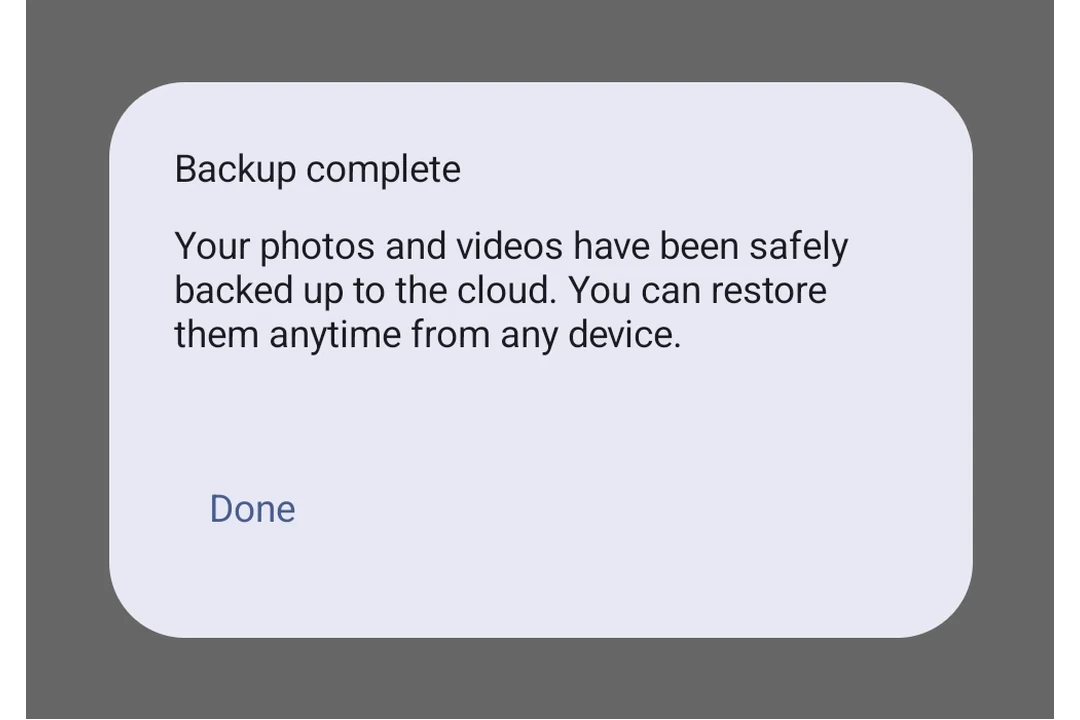
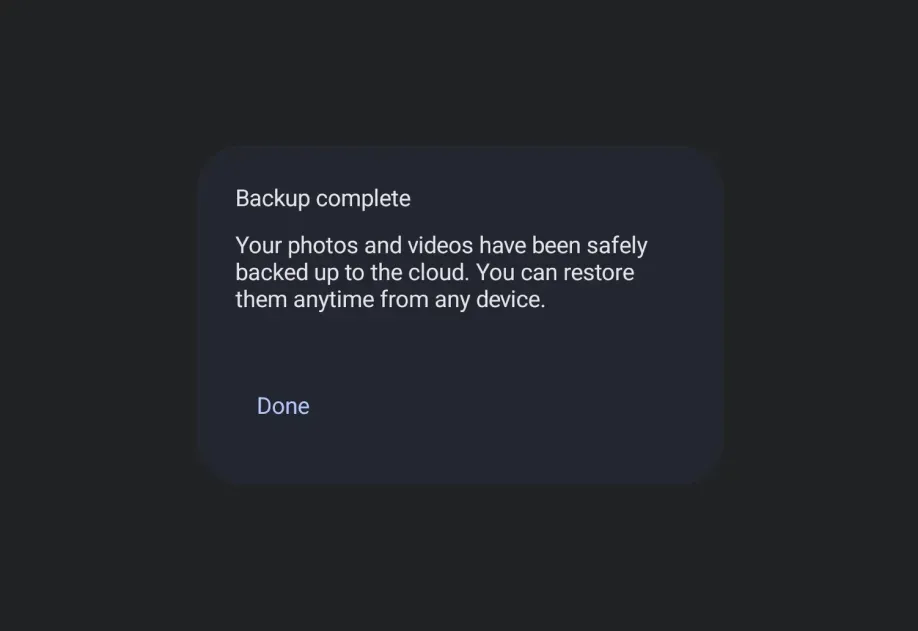
Expo UI BasicAlertDialog 与官方 Jetpack Compose BasicAlertDialog API 保持一致,并显示一个最简对话框,允许将自定义子组件作为其内容,从而让你完全控制对话框布局。
安装
- npx expo install @expo/uiIf you are installing this in an existing React Native app, make sure to install expo in your project.
用法
带自定义内容的基本对话框
import { useState } from 'react'; import { Host, BasicAlertDialog, Button, TextButton, Text, Surface, Column, Spacer, } from '@expo/ui/jetpack-compose'; import { padding, wrapContentWidth, wrapContentHeight, clip, height, align, Shapes, } from '@expo/ui/jetpack-compose/modifiers'; export default function BasicAlertDialogExample() { const [visible, setVisible] = useState(false); return ( <Host matchContents> <Button onClick={() => setVisible(true)}> <Text>打开对话框</Text> </Button> {visible && ( <BasicAlertDialog onDismissRequest={() => setVisible(false)}> <Surface tonalElevation={6} modifiers={[wrapContentWidth(), wrapContentHeight(), clip(Shapes.RoundedCorner(28))]}> <Column modifiers={[padding(16, 16, 16, 16)]}> <Text> 此区域通常包含支持性文本,用于展示有关对话框用途的详细信息。 </Text> <Spacer modifiers={[height(24)]} /> <TextButton onClick={() => setVisible(false)} modifiers={[align('centerEnd')]}> <Text>确认</Text> </TextButton> </Column> </Surface> </BasicAlertDialog> )} </Host> ); }
API
import { BasicAlertDialog } from '@expo/ui/jetpack-compose';
Component
Type: React.Element<BasicAlertDialogProps>
A basic alert dialog that provides a blank container for custom content.
Unlike AlertDialog, this component does not have structured title/text/buttons slots.
() => voidCallback that is called when the user tries to dismiss the dialog (e.g. by tapping outside of it or pressing the back button).
Types
Properties for the dialog window, matching DialogProperties in Compose.
| Property | Type | Description |
|---|---|---|
| decorFitsSystemWindows(optional) | boolean | Whether the dialog's decor fits system windows (status bar, navigation bar, and more).
When Default: true |
| dismissOnBackPress(optional) | boolean | Whether the dialog can be dismissed by pressing the back button. Default: true |
| dismissOnClickOutside(optional) | boolean | Whether the dialog can be dismissed by clicking outside of it. Default: true |
| usePlatformDefaultWidth(optional) | boolean | Whether the dialog should use the platform default width. Default: true |