Reference version

This documentation is available as Markdown for AI agents and LLMs. See the full Markdown index or append .md to any documentation URL.

按钮

用于显示原生 Material3 按钮的 Jetpack Compose 按钮组件。

Android
Included in Expo Go
Recommended version:
~57.0.0

Expo UI 提供五种与官方 Jetpack Compose Button API 对应的按钮组件:Button(填充)、FilledTonalButtonOutlinedButtonElevatedButtonTextButton。所有变体都共享相同的 props,并接受可组合子元素作为内容。
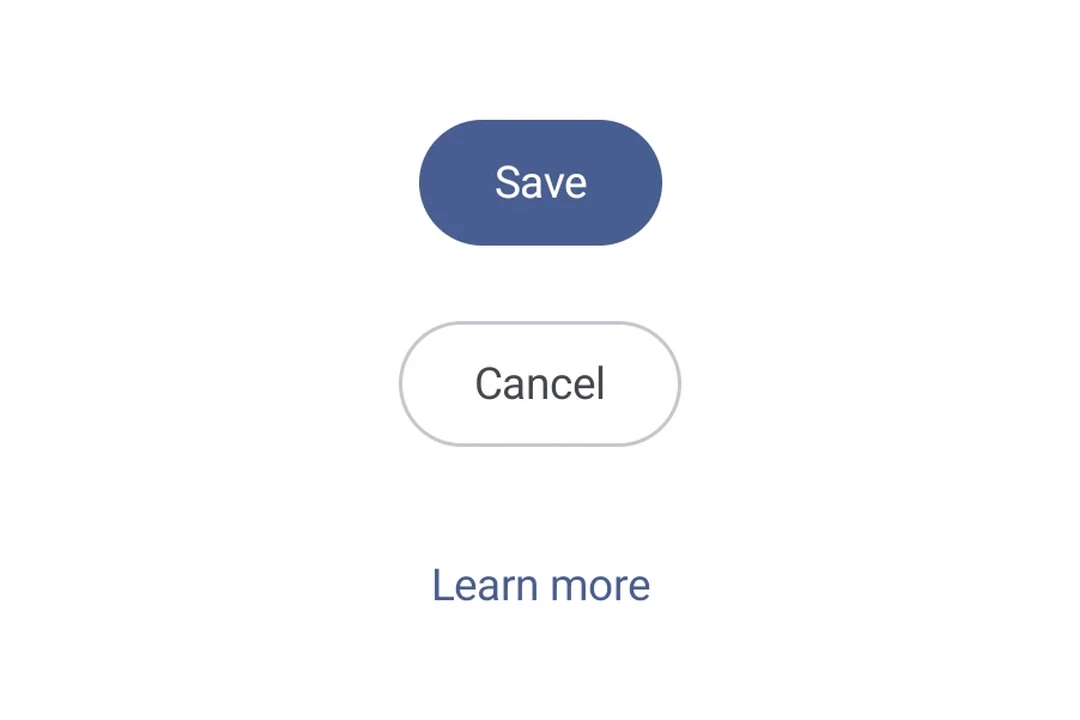
展示 Material 3 强调层级的填充、描边和文本按钮
类型外观用途
Filled纯色背景搭配对比色文本。用于“提交”和“保存”等主要操作的高强调按钮。
Filled tonal背景颜色会变化,以匹配表面颜色。同样用于主要或重要操作。填充色调按钮具有更强的视觉重量,适用于“添加到购物车”和“登录”等功能。
Elevated通过阴影突出显示。用途与色调按钮类似。提高高度可以让按钮显得更加突出。
Outlined带有边框但没有填充。中等强调按钮,用于包含重要但非主要的操作。它们与其他按钮搭配良好,用于表示“取消”或“返回”等替代性次要操作。
Text显示没有背景或边框的文本。低强调按钮,非常适合导航链接等不太重要的操作,或“了解更多”“查看详情”等次要功能。

安装

Terminal
npx expo install @expo/ui

If you are installing this in an existing React Native app, make sure to install expo in your project.

用法

基本按钮

填充按钮是默认的高强调度按钮,用于主要操作。

BasicButtonExample.tsx
import { Host, Button, Text } from '@expo/ui/jetpack-compose'; export default function BasicButtonExample() { return ( <Host matchContents> <Button onClick={() => alert('Pressed!')}> <Text>按我</Text> </Button> </Host> ); }

按钮变体

使用不同的按钮组件来传达不同程度的强调。

ButtonVariantsExample.tsx
import { Host, Button, FilledTonalButton, OutlinedButton, ElevatedButton, TextButton, Column, Text, } from '@expo/ui/jetpack-compose'; export default function ButtonVariantsExample() { return ( <Host matchContents> <Column verticalArrangement={{ spacedBy: 8 }}> <Button onClick={() => {}}> <Text>填充</Text> </Button> <FilledTonalButton onClick={() => {}}> <Text>填充色调</Text> </FilledTonalButton> <OutlinedButton onClick={() => {}}> <Text>描边</Text> </OutlinedButton> <ElevatedButton onClick={() => {}}> <Text>高架</Text> </ElevatedButton> <TextButton onClick={() => {}}> <Text>文本</Text> </TextButton> </Column> </Host> ); }

带图标的按钮

由于按钮接受可组合的子元素,你可以使用 Icon 组件添加前置和后置图标。这遵循了带图标的 Material 3 按钮模式(官方示例),使用 18dp 的图标大小,图标与标签之间间距为 8dp。

ButtonWithIconsExample.tsx
import { Host, Button, OutlinedButton, FilledTonalButton, Icon, Spacer, Text, } from '@expo/ui/jetpack-compose'; import { width } from '@expo/ui/jetpack-compose/modifiers'; const addIcon = require('./assets/add.png'); const sendIcon = require('./assets/send.png'); export default function ButtonWithIconsExample() { return ( <Host matchContents> {/* 前置图标 */} <Button onClick={() => {}}> <Icon source={addIcon} size={18} tint="#FFFFFF" /> <Spacer modifiers={[width(8)]} /> <Text>添加项目</Text> </Button> {/* 后置图标 */} <OutlinedButton onClick={() => {}}> <Text>发送</Text> <Spacer modifiers={[width(8)]} /> <Icon source={sendIcon} size={18} /> </OutlinedButton> {/* 同时包含前置和后置图标 */} <FilledTonalButton onClick={() => {}}> <Icon source={addIcon} size={18} /> <Spacer modifiers={[width(8)]} /> <Text>创建并发送</Text> <Spacer modifiers={[width(8)]} /> <Icon source={sendIcon} size={18} /> </FilledTonalButton> </Host> ); }

自定义颜色

使用 colors 属性覆盖容器和内容颜色。

CustomColorsExample.tsx
import { Host, Button, Text } from '@expo/ui/jetpack-compose'; export default function CustomColorsExample() { return ( <Host matchContents> <Button onClick={() => {}} colors={{ containerColor: '#6200EE', contentColor: '#FFFFFF' }}> <Text>紫色按钮</Text> </Button> </Host> ); }

自定义形状

CustomShapeExample.tsx
import { Host, Button, Shape, Text } from '@expo/ui/jetpack-compose'; export default function CustomShapeExample() { return ( <Host matchContents> <Button onClick={() => {}} shape={Shape.RoundedCorner({ cornerRadii: { topStart: 16, bottomEnd: 16 } })}> <Text>自定义形状</Text> </Button> </Host> ); }

API

import { Button, FilledTonalButton, OutlinedButton, ElevatedButton, TextButton, } from '@expo/ui/jetpack-compose';

Components

Button

Type: React.Element<ButtonProps>

A filled button component.

ButtonProps

children

Type: ReactNode

Content to display inside the button.

colors

Optional • Type: ButtonColors

Colors for button elements.

contentPadding

Optional • Type: ButtonContentPadding

The padding between the button container and its content. Use this to adjust internal spacing, for example when adding a leading icon

enabled

Optional • Type: boolean • Default: true

Whether the button is enabled for user interaction.

modifiers

Optional • Type: ModifierConfig[]

Modifiers for the component.

onClick

Optional • Type: () => void

Callback that is called when the button is clicked.

shape

Optional • Type: ShapeJSXElement

The shape of the button.

ElevatedButton

Type: React.Element<ButtonProps>

An elevated button component.

FilledTonalButton

Type: React.Element<ButtonProps>

A filled tonal button component.

OutlinedButton

Type: React.Element<ButtonProps>

An outlined button component.

TextButton

Type: React.Element<ButtonProps>

A text button component.

Types

ButtonColors

Colors for button elements.

PropertyTypeDescription
containerColor(optional)ColorValue
-
contentColor(optional)ColorValue
-
disabledContainerColor(optional)ColorValue
-
disabledContentColor(optional)ColorValue
-

ButtonContentPadding

Content padding for the button's inner content. All values are in density-independent pixels (dp).

PropertyTypeDescription
bottom(optional)number
-
end(optional)number
-
start(optional)number
-
top(optional)number
-