Reference version

This documentation is available as Markdown for AI agents and LLMs. See the full Markdown index or append .md to any documentation URL.

TextField

用于原生 Material3 文本输入的 Jetpack Compose TextField 组件。

Android
Included in Expo Go
Recommended version:
~57.0.0

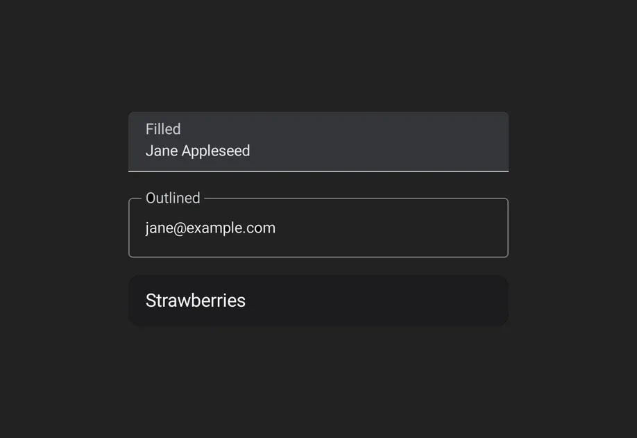
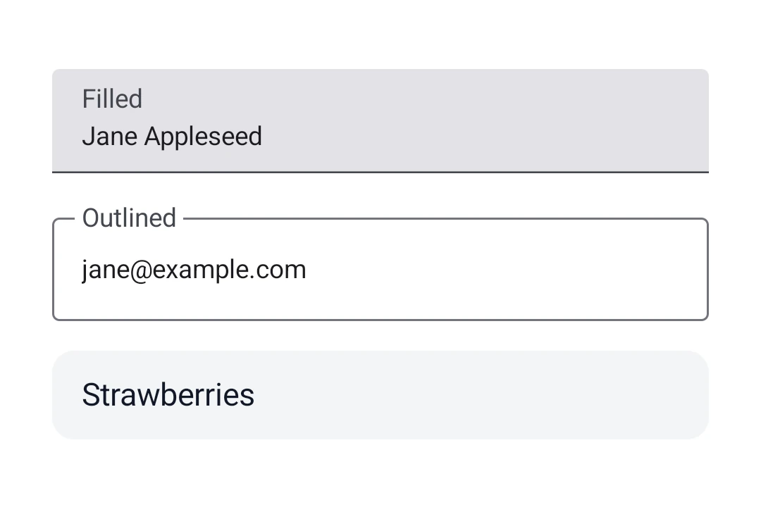
Expo UI 提供了三个文本字段组件,与官方 Jetpack Compose TextField API 保持一致:TextField(填充式)、OutlinedTextField(带轮廓边框)和 BasicTextField(无样式)。Material 变体 TextFieldOutlinedTextField 共享相同的 props,并支持用于标签、占位符、图标、前缀、后缀以及辅助文本的可组合插槽子元素。BasicTextField 没有 Material 外观,因此需要你自行提供装饰。

类型外观用途
填充式带底部指示线的实心背景。遵循 Material3 设计的默认文本输入样式。适用于大多数表单和输入字段。
轮廓式带边框轮廓的透明背景。提供清晰视觉边界的替代样式。当填充式字段与背景融为一体时使用。
基础无容器、指示线或内边距。仅显示可编辑文本。完全自定义样式的输入框。自行设置样式,并通过 DecorationBox 添加装饰。
填充式、轮廓式和基础(无样式)文本字段

安装

Terminal
npx expo install @expo/ui

If you are installing this in an existing React Native app, make sure to install expo in your project.

用法

非受控文本字段

将一个 useNativeState 可观察对象绑定到 value。该字段会自行跟踪用户输入,你可以从 text.value 读取当前值。此处显示的填充样式是默认的 Material3 文本输入样式。

UncontrolledTextFieldExample.tsx
import { Host, TextField, Text, useNativeState } from '@expo/ui/jetpack-compose'; export default function UncontrolledTextFieldExample() { const text = useNativeState(''); return ( <Host matchContents> <TextField value={text}> <TextField.Label> <Text>用户名</Text> </TextField.Label> </TextField> </Host> ); }

受控文本字段

将一个 useNativeState 可观察对象作为 value 传入,并使用 onValueChange worklet 在写回之前转换或验证输入。下面的示例会在输入时将文本转换为大写。

ControlledTextFieldExample.tsx
import { Host, TextField, Text, useNativeState } from '@expo/ui/jetpack-compose'; import { useCallback } from 'react'; export default function ControlledTextFieldExample() { const text = useNativeState(''); const handleValueChange = useCallback( (value: string) => { 'worklet'; text.value = value.toUpperCase(); }, [text] ); return ( <Host matchContents> <TextField value={text} onValueChange={handleValueChange}> <TextField.Label> <Text>姓名</Text> </TextField.Label> </TextField> </Host> ); }

描边文本字段

当你想要一个带边框描边而不是填充背景的文本字段时,请使用 OutlinedTextField

OutlinedTextFieldExample.tsx
import { Host, OutlinedTextField, Text, useNativeState } from '@expo/ui/jetpack-compose'; export default function OutlinedTextFieldExample() { const text = useNativeState(''); return ( <Host matchContents> <OutlinedTextField value={text}> <OutlinedTextField.Label> <Text>电子邮件</Text> </OutlinedTextField.Label> <OutlinedTextField.Placeholder> <Text>you@example.com</Text> </OutlinedTextField.Placeholder> </OutlinedTextField> </Host> ); }

基础文本字段

BasicTextField 是未加样式的 Compose 原语,没有容器、指示器或内边距。你可以使用 modifiers 自行设置样式,并通过 DecorationBox 提供装饰内容,将 InnerTextField 放在可编辑文本应当渲染的位置。将占位符内容包裹在 Placeholder 中,这样它只会在字段为空时显示,并由字段文本在原生层面切换显示状态。

BasicTextFieldExample.tsx
import { Host, BasicTextField, Box, Text, useNativeState } from '@expo/ui/jetpack-compose'; import { background, clip, fillMaxWidth, padding, Shapes, } from '@expo/ui/jetpack-compose/modifiers'; export default function BasicTextFieldExample() { const value = useNativeState(''); return ( <Host matchContents> <BasicTextField cursorColor="#7c3aed" value={value} modifiers={[ fillMaxWidth(), clip(Shapes.RoundedCorner(12)), background('#f3f4f6'), padding(12, 10, 12, 10), ]}> <BasicTextField.DecorationBox> <Box> <BasicTextField.Placeholder> <Text color="#9ca3af">搜索…</Text> </BasicTextField.Placeholder> <BasicTextField.InnerTextField /> </Box> </BasicTextField.DecorationBox> </BasicTextField> </Host> ); }

插槽

TextFieldOutlinedTextField 都支持 7 个可组合插槽,对应 Compose API:LabelPlaceholderLeadingIconTrailingIconPrefixSuffixSupportingText

TextFieldSlotsExample.tsx
import { Host, TextField, Text, useNativeState } from '@expo/ui/jetpack-compose'; export default function TextFieldSlotsExample() { const text = useNativeState(''); return ( <Host matchContents> <TextField value={text}> <TextField.Label> <Text>价格</Text> </TextField.Label> <TextField.Placeholder> <Text>0.00</Text> </TextField.Placeholder> <TextField.LeadingIcon> <Text>💰</Text> </TextField.LeadingIcon> <TextField.Prefix> <Text>$</Text> </TextField.Prefix> <TextField.Suffix> <Text>美元</Text> </TextField.Suffix> <TextField.SupportingText> <Text>请输入金额</Text> </TextField.SupportingText> </TextField> </Host> ); }

键盘选项

使用 keyboardOptions 属性来配置键盘类型、首字母大写、自动纠错和 IME 操作。

KeyboardOptionsExample.tsx
import { Host, TextField, Text, useNativeState } from '@expo/ui/jetpack-compose'; export default function KeyboardOptionsExample() { const text = useNativeState(''); return ( <Host matchContents> <TextField value={text} singleLine keyboardOptions={{ keyboardType: 'email', capitalization: 'none', autoCorrectEnabled: false, imeAction: 'done', }}> <TextField.Label> <Text>电子邮件</Text> </TextField.Label> </TextField> </Host> ); }

键盘操作

使用 keyboardActions 属性来处理 IME 操作按钮的按下事件。触发的回调取决于 keyboardOptions 中设置的 imeAction。每个回调都会接收当前文本值。

KeyboardActionsExample.tsx
import { Host, TextField, Text, useNativeState } from '@expo/ui/jetpack-compose'; export default function KeyboardActionsExample() { const text = useNativeState(''); return ( <Host matchContents> <TextField value={text} singleLine keyboardOptions={{ imeAction: 'search' }} keyboardActions={{ onSearch: value => console.log('已搜索:', value), }}> <TextField.Label> <Text>搜索</Text> </TextField.Label> </TextField> </Host> ); }

命令式 ref

使用 ref 可以以命令式方式设置文本、清空字段、更改选择范围或移动焦点。

ImperativeRefExample.tsx
import { useRef } from 'react'; import { Host, TextField, TextFieldRef, Button, Row, Text, Column, useNativeState, } from '@expo/ui/jetpack-compose'; import { padding } from '@expo/ui/jetpack-compose/modifiers'; export default function ImperativeRefExample() { const ref = useRef<TextFieldRef>(null); const text = useNativeState(''); return ( <Host matchContents> <Column> <TextField ref={ref} value={text} singleLine> <TextField.Label> <Text>姓名</Text> </TextField.Label> </TextField> <Row horizontalArrangement={{ spacedBy: 8 }} modifiers={[padding(8, 0, 0, 0)]}> <Button onClick={() => ref.current?.setText('Hello world')}> <Text>设置文本</Text> </Button> <Button onClick={() => ref.current?.clear()}> <Text>清空</Text> </Button> <Button onClick={() => ref.current?.setSelection(0, 5)}> <Text>选择第一个单词</Text> </Button> </Row> <Row horizontalArrangement={{ spacedBy: 8 }} modifiers={[padding(8, 0, 0, 0)]}> <Button onClick={() => ref.current?.focus()}> <Text>聚焦</Text> </Button> <Button onClick={() => ref.current?.blur()}> <Text>失焦</Text> </Button> </Row> </Column> </Host> ); }

Worklet 文本遮罩

onValueChange 使用 'worklet' 指令标记时,它会在 UI 线程上同步运行,因此在回调中对 useNativeState 可观察对象的写入会在下一帧之前生效。输入文本与遮罩文本之间不会出现闪烁。下面的示例会在用户输入时遮罩电话号码,并在 worklet 中同时写入 valueselection,以保持光标位于格式化后值的末尾。

WorkletPhoneMaskExample.tsx
import { Host, TextField, Text, useNativeState } from '@expo/ui/jetpack-compose'; import { fillMaxWidth } from '@expo/ui/jetpack-compose/modifiers'; import { useEffectEvent } from 'react'; export default function WorkletPhoneMaskExample() { const phone = useNativeState(''); const selection = useNativeState({ start: 0, end: 0 }); const handleValueChange = useEffectEvent((v: string) => { 'worklet'; const digits = v.replace(/\D/g, '').slice(0, 10); let formatted = digits; if (digits.length > 6) { formatted = `(${digits.slice(0, 3)}) ${digits.slice(3, 6)}-${digits.slice(6)}`; } else if (digits.length > 3) { formatted = `(${digits.slice(0, 3)}) ${digits.slice(3)}`; } if (formatted !== v) { phone.value = formatted; // 为演示而吸附到末尾。实际的遮罩需要更智能的光标处理。 selection.value = { start: formatted.length, end: formatted.length }; } }); return ( <Host matchContents> <TextField value={phone} selection={selection} keyboardOptions={{ keyboardType: 'phone' }} modifiers={[fillMaxWidth()]} onValueChange={handleValueChange}> <TextField.Placeholder> <Text>(555) 123-4567</Text> </TextField.Placeholder> </TextField> </Host> ); }

API

import { TextField, OutlinedTextField, BasicTextField } from '@expo/ui/jetpack-compose';

Components

BasicTextField

Type: React.Element<BasicTextFieldProps>

A bare, unstyled Compose BasicTextField with no Material decoration.

Props for BasicTextField. Mirrors Compose's BasicTextField: a bare, unstyled text field with no Material chrome (no container, indicator, or built-in padding). Shares CommonTextFieldProperties with TextField and OutlinedTextField; use BasicTextField.DecorationBox to add your own decoration.

BasicTextFieldProps

cursorColor

Optional • Type: ColorValue

Color of the text cursor. Maps to Compose's cursorBrush via SolidColor(color). Defaults to the theme's primary color (MaterialTheme.colorScheme.primary) so it stays visible in light and dark.

OutlinedTextField

Type: React.Element<OutlinedTextFieldProps>

A Material3 OutlinedTextField with a transparent background and border outline.

Props shared by every Compose text field variant — TextField, OutlinedTextField, and BasicTextField. The Material variants add their own decoration props (isError, shape, colors, slot children); BasicTextField adds cursorColor.

OutlinedTextFieldProps

colors

Optional • Type: TextFieldColors

isError

Optional • Type: boolean • Default: false

shape

Optional • Type: ShapeJSXElement

Shape used for the field's container outline/fill. Use the helpers from Shape (for example, <Shape.Pill /> or <Shape.RoundedCorner cornerRadii={...} />). Defaults to the Material OutlinedTextFieldDefaults.shape/TextFieldDefaults.shape.

TextField

Type: React.Element<TextFieldProps>

A Material3 TextField.

Props shared by every Compose text field variant — TextField, OutlinedTextField, and BasicTextField. The Material variants add their own decoration props (isError, shape, colors, slot children); BasicTextField adds cursorColor.

TextFieldProps

colors

Optional • Type: TextFieldColors

isError

Optional • Type: boolean • Default: false

shape

Optional • Type: ShapeJSXElement

Shape used for the field's container outline/fill. Use the helpers from Shape (for example, <Shape.Pill /> or <Shape.RoundedCorner cornerRadii={...} />). Defaults to the Material OutlinedTextFieldDefaults.shape/TextFieldDefaults.shape.

Types

BasicTextFieldRef

Type: TextFieldRef

Imperative methods for BasicTextField. Identical to TextFieldRef.

CommonTextFieldProperties

Props shared by every Compose text field variant — TextField, OutlinedTextField, and BasicTextField. The Material variants add their own decoration props (isError, shape, colors, slot children); BasicTextField adds cursorColor.

PropertyTypeDescription
autoFocus(optional)boolean

If true, the text field will be focused automatically when mounted.

Default:false
children(optional)ReactNode

Slot children that configure the field's decoration.

enabled(optional)boolean
Default:true
keyboardActions(optional)TextFieldKeyboardActions
-
keyboardOptions(optional)TextFieldKeyboardOptions
-
maxLength(optional)number

Maximum number of characters allowed. Truncates natively as the user types.

maxLines(optional)number
-
minLines(optional)number
-
modifiers(optional)ModifierConfig[]
-
onFocusChanged(optional)(focused: boolean) => void

A callback triggered when the field gains or loses focus.

onSelectionChange(optional)(selection: { end: number, start: number }) => void

Called when the selection range changes.

onValueChange(optional)(value: string) => void

Fires whenever the text value changes. If marked with the 'worklet' directive, runs synchronously on the UI thread; otherwise delivered asynchronously as a regular JS event. Use onSelectionChange (or read the selection observable) to react to selection-only changes.

readOnly(optional)boolean
Default:false
ref(optional)Ref<TextFieldRef>
-
selection(optional)ObservableState<{ end: number, start: number }>

Observable state holding the current selection range. Create with useNativeState({ start: 0, end: 0 }). The field writes user-driven changes back to it, and writes from JS (or a worklet) update the cursor/selection in the field. Use ref.setSelection(start, end) for imperative one-shot updates.

singleLine(optional)boolean
Default:false
textSelectionColors(optional){ backgroundColor: ColorValue, handleColor: ColorValue }

Selection-related colors. Maps to Compose's TextSelectionColors via LocalTextSelectionColors. handleColor controls the drag handles (and the caret's drag handle); backgroundColor is the highlighted-text background (typically the same tint at lower alpha so the underlying text stays readable). Independent of cursorColor, which tints the caret line.

textStyle(optional)TextFieldTextStyle

Text styling for the field's content. Maps to Compose's TextStyle.

value(optional)ObservableState<string>

An observable state that holds the current text value. Create one with useNativeState('initial text'). If omitted, the field manages its own internal state.

visualTransformation(optional)'password' | 'none'

Display-time text transformation. 'password' masks every character; 'none' (default) leaves the buffer as-is.

ObservableState

Observable state shared between JavaScript and native views (Jetpack Compose on Android and SwiftUI on iOS).

Type: SharedObject extended by:

PropertyTypeDescription
onChange[listener] | null

A single listener invoked on the native UI runtime whenever the value changes (after iOS didSet and Android's setter). Assigning replaces the previous listener; assign null to clear. The initial value does not fire onChange.

The callback must be a worklet so it can run synchronously on the UI thread. Attach it inside useEffect and clear it in the cleanup so the listener lifecycle matches the component lifecycle.

Example

const state = useNativeState(0); useEffect(() => { state.onChange = (value) => { 'worklet'; console.log('changed to', value); }; }, []);
valueT

The current value.

Writes from a UI worklet are synchronous and immediately readable. Writes from the JS thread are scheduled to the UI thread asynchronously, the new value is not readable until the update has been applied. Prefer writing from a worklet when you need synchronous updates

get() => T

Reads the current value. A React Compiler compliant alternative to reading .value

set(value: T) => void

Writes a new value. A React Compiler-compliant alternative to assigning .value
TextFieldCapitalization

Literal type: string

Acceptable values are: 'none' | 'characters' | 'words' | 'sentences'

TextFieldColors

Colors for TextField and OutlinedTextField. Maps to TextFieldColors in Compose, shared by both variants.

PropertyTypeDescription
cursorColor(optional)ColorValue
-
disabledContainerColor(optional)ColorValue
-
disabledIndicatorColor(optional)ColorValue
-
disabledLabelColor(optional)ColorValue
-
disabledLeadingIconColor(optional)ColorValue
-
disabledPlaceholderColor(optional)ColorValue
-
disabledPrefixColor(optional)ColorValue
-
disabledSuffixColor(optional)ColorValue
-
disabledSupportingTextColor(optional)ColorValue
-
disabledTextColor(optional)ColorValue
-
disabledTrailingIconColor(optional)ColorValue
-
errorContainerColor(optional)ColorValue
-
errorCursorColor(optional)ColorValue
-
errorIndicatorColor(optional)ColorValue
-
errorLabelColor(optional)ColorValue
-
errorLeadingIconColor(optional)ColorValue
-
errorPlaceholderColor(optional)ColorValue
-
errorPrefixColor(optional)ColorValue
-
errorSuffixColor(optional)ColorValue
-
errorSupportingTextColor(optional)ColorValue
-
errorTextColor(optional)ColorValue
-
errorTrailingIconColor(optional)ColorValue
-
focusedContainerColor(optional)ColorValue
-
focusedIndicatorColor(optional)ColorValue
-
focusedLabelColor(optional)ColorValue
-
focusedLeadingIconColor(optional)ColorValue
-
focusedPlaceholderColor(optional)ColorValue
-
focusedPrefixColor(optional)ColorValue
-
focusedSuffixColor(optional)ColorValue
-
focusedSupportingTextColor(optional)ColorValue
-
focusedTextColor(optional)ColorValue
-
focusedTrailingIconColor(optional)ColorValue
-
unfocusedContainerColor(optional)ColorValue
-
unfocusedIndicatorColor(optional)ColorValue
-
unfocusedLabelColor(optional)ColorValue
-
unfocusedLeadingIconColor(optional)ColorValue
-
unfocusedPlaceholderColor(optional)ColorValue
-
unfocusedPrefixColor(optional)ColorValue
-
unfocusedSuffixColor(optional)ColorValue
-
unfocusedSupportingTextColor(optional)ColorValue
-
unfocusedTextColor(optional)ColorValue
-
unfocusedTrailingIconColor(optional)ColorValue
-

TextFieldImeAction

Literal type: string

Acceptable values are: 'default' | 'none' | 'go' | 'search' | 'send' | 'previous' | 'next' | 'done'

TextFieldKeyboardActions

Keyboard actions matching Compose KeyboardActions. The triggered callback depends on the imeAction in keyboardOptions.

PropertyTypeDescription
onDone(optional)(value: string) => void
-
onGo(optional)(value: string) => void
-
onNext(optional)(value: string) => void
-
onPrevious(optional)(value: string) => void
-
onSearch(optional)(value: string) => void
-
onSend(optional)(value: string) => void
-

TextFieldKeyboardOptions

Keyboard options matching Compose KeyboardOptions.

PropertyTypeDescription
autoCorrectEnabled(optional)boolean
Default:true
capitalization(optional)TextFieldCapitalization
Default:'none'
imeAction(optional)TextFieldImeAction
Default:'default'
keyboardType(optional)TextFieldKeyboardType
Default:'text'

TextFieldKeyboardType

Literal type: string

Acceptable values are: 'text' | 'number' | 'email' | 'phone' | 'decimal' | 'password' | 'ascii' | 'uri' | 'numberPassword'

TextFieldRef

Can be used for imperatively focusing and setting text/selection on the TextField, OutlinedTextField, and BasicTextField components.

PropertyTypeDescription
blur() => Promise<void>
-
clear() => Promise<void>

Clear the current text.

focus() => Promise<void>
-
setSelection(start: number, end: number) => Promise<void>

Programmatically set the selection range.

setText(newText: string) => Promise<void>
-

TextFieldTextStyle

Text styling for a text field's content. Maps to Compose's TextStyle. Shared by TextField, OutlinedTextField, and BasicTextField.

PropertyTypeDescription
color(optional)ColorValue
-
fontFamily(optional)string
-
fontSize(optional)number
-
fontWeight(optional)'100' | '200' | '300' | '400' | '500' | '600' | '700' | '800' | '900' | 'normal' | 'bold'
-
letterSpacing(optional)number
-
lineHeight(optional)number
-
textAlign(optional)'left' | 'right' | 'center' | 'justify'
-