Reference version

This documentation is available as Markdown for AI agents and LLMs. See the full Markdown index or append .md to any documentation URL.

开关

一个用于切换控件的 Jetpack Compose 开关组件。

Android
Included in Expo Go
Recommended version:
~57.0.0

Expo UI Switch 与官方 Jetpack Compose Switch API 保持一致。
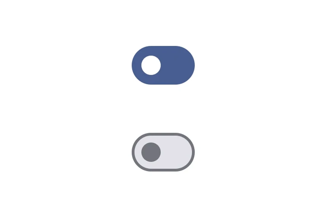
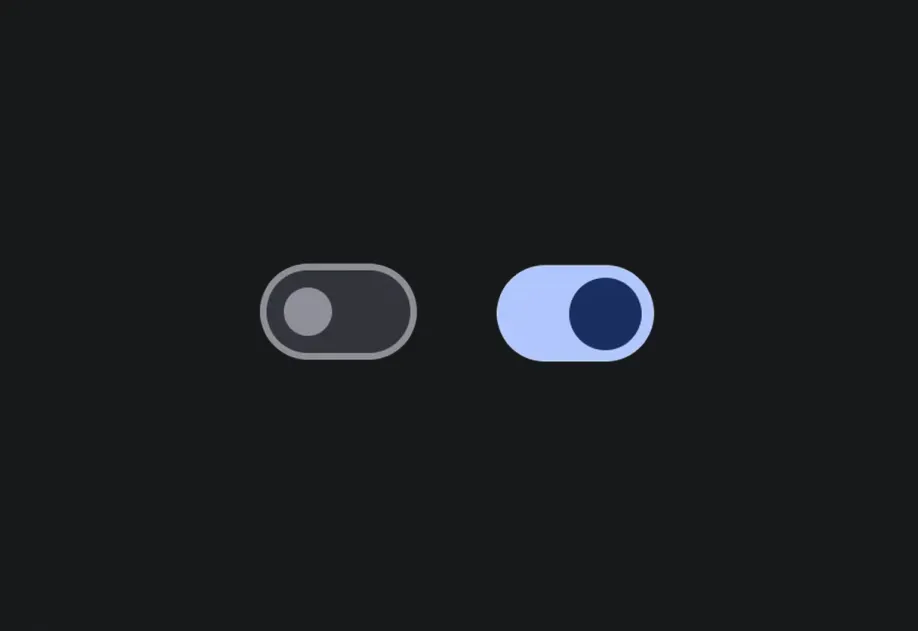
两个 Material 3 开关,展示开启和关闭状态

安装

Terminal
npx expo install @expo/ui

If you are installing this in an existing React Native app, make sure to install expo in your project.

用法

切换开关

ToggleSwitchExample.tsx
import { useState } from 'react'; import { Host, Switch } from '@expo/ui/jetpack-compose'; export default function ToggleSwitchExample() { const [checked, setChecked] = useState(false); return ( <Host matchContents> <Switch value={checked} onCheckedChange={setChecked} /> </Host> ); }

自定义颜色

CustomColorsExample.tsx
import { useState } from 'react'; import { Host, Switch } from '@expo/ui/jetpack-compose'; export default function CustomColorsExample() { const [checked, setChecked] = useState(false); return ( <Host matchContents> <Switch value={checked} onCheckedChange={setChecked} colors={{ checkedThumbColor: '#6200EE', checkedTrackColor: '#EDE9FE', uncheckedThumbColor: '#9CA3AF', uncheckedTrackColor: '#F3F4F6', uncheckedBorderColor: '#D1D5DB', }} /> </Host> ); }

自定义拇指内容

使用 Switch.ThumbContent 在拇指内部渲染自定义元素。Switch.DefaultIconSize 会提供 M3 的默认图标大小,因此你的内容能够完美适配。

ThumbContentExample.tsx
import { useState } from 'react'; import { Host, Switch, Box } from '@expo/ui/jetpack-compose'; import { size, clip, background, Shapes } from '@expo/ui/jetpack-compose/modifiers'; export default function ThumbContentExample() { const [checked, setChecked] = useState(false); return ( <Host matchContents> <Switch value={checked} onCheckedChange={setChecked} colors={{ checkedThumbColor: '#7C3AED', checkedTrackColor: '#EDE9FE', checkedIconColor: '#7C3AED', uncheckedThumbColor: '#9CA3AF', uncheckedTrackColor: '#F3F4F6', uncheckedBorderColor: '#D1D5DB', uncheckedIconColor: '#9CA3AF', }}> <Switch.ThumbContent> <Box modifiers={[ size(Switch.DefaultIconSize, Switch.DefaultIconSize), clip(Shapes.Circle), background(checked ? '#FFFFFF' : '#E5E7EB'), ]} /> </Switch.ThumbContent> </Switch> </Host> ); }

API

import { Switch } from '@expo/ui/jetpack-compose';

Components

Switch

Type: React.Element<SwitchProps>

A switch component.

SwitchProps

children

Only for:
Android

Optional • Type: ReactNode

Children containing ThumbContent slot.

colors

Optional • Type: SwitchColors

Colors for switch core elements.

enabled

Optional • Type: boolean • Default: true

Whether the switch is enabled.

modifiers

Optional • Type: ModifierConfig[]

Modifiers for the component.

onCheckedChange

Optional • Type: (value: boolean) => void

Callback function that is called when the checked state changes.

value

Type: boolean

Indicates whether the switch is checked.

SwitchThumbContent

Only for:
Android

Type: React.Element<ThumbContentProps>

Custom content to be displayed inside the switch thumb.

Types

SwitchColors

Colors for switch core elements.

PropertyTypeDescription
checkedBorderColor(optional)ColorValue
-
checkedIconColor(optional)ColorValue
-
checkedThumbColor(optional)ColorValue
-
checkedTrackColor(optional)ColorValue
-
disabledCheckedBorderColor(optional)ColorValue
-
disabledCheckedIconColor(optional)ColorValue
-
disabledCheckedThumbColor(optional)ColorValue
-
disabledCheckedTrackColor(optional)ColorValue
-
disabledUncheckedBorderColor(optional)ColorValue
-
disabledUncheckedIconColor(optional)ColorValue
-
disabledUncheckedThumbColor(optional)ColorValue
-
disabledUncheckedTrackColor(optional)ColorValue
-
uncheckedBorderColor(optional)ColorValue
-
uncheckedIconColor(optional)ColorValue
-
uncheckedThumbColor(optional)ColorValue
-
uncheckedTrackColor(optional)ColorValue
-