Reference version

This documentation is available as Markdown for AI agents and LLMs. See the full Markdown index or append .md to any documentation URL.

芯片

用于显示紧凑元素的 Jetpack Compose 芯片组件。

Android
Included in Expo Go
Recommended version:
~57.0.0

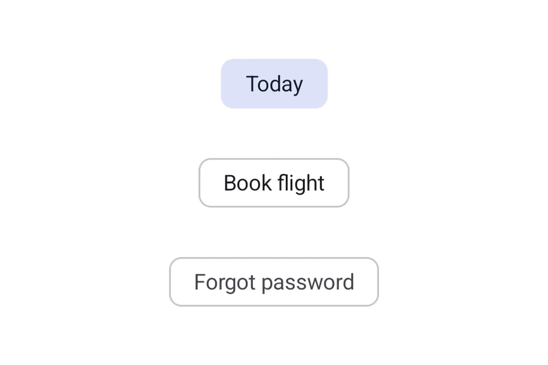
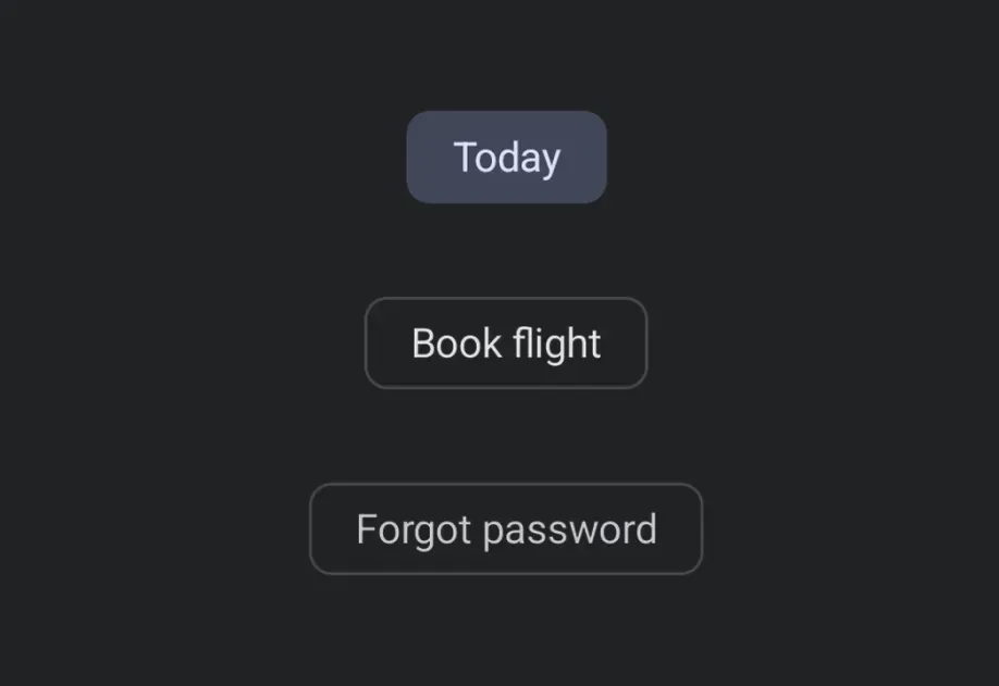
Expo UI Chip 与官方 Jetpack Compose Chip API 保持一致。每种 Chip 类型都是一个独立组件:AssistChipFilterChipInputChipSuggestionChip

筛选、辅助和建议 Material 3 Chips

安装

Terminal
npx expo install @expo/ui

If you are installing this in an existing React Native app, make sure to install expo in your project.

用法

辅助芯片

辅助芯片可帮助用户执行操作或开始任务,例如预订航班或打开地图。它们通常会在响应用户输入时作为临时 UI 元素出现。

AssistChipExample.tsx
import { Host, AssistChip, Icon, Text } from '@expo/ui/jetpack-compose'; export default function AssistChipExample() { return ( <Host matchContents> <AssistChip onClick={() => console.log('正在打开航班预订...')}> <AssistChip.Label> <Text>预订航班</Text> </AssistChip.Label> <AssistChip.LeadingIcon> <Icon source={require('./assets/flight.xml')} size={18} /> </AssistChip.LeadingIcon> </AssistChip> </Host> ); }

筛选芯片

筛选芯片允许用户从一组选项中细化内容。它们支持选中状态,通常用于搜索栏或内容筛选。

FilterChipExample.tsx
import { useState } from 'react'; import { Host, FilterChip, Text } from '@expo/ui/jetpack-compose'; export default function FilterChipExample() { const [selected, setSelected] = useState(false); return ( <Host matchContents> <FilterChip selected={selected} onClick={() => setSelected(!selected)}> <FilterChip.Label> <Text>图片</Text> </FilterChip.Label> </FilterChip> </Host> ); }

输入芯片

输入芯片表示用户输入的离散信息片段,例如文本字段中的标签。它们支持头像、尾随图标,并且可以被移除。

InputChipExample.tsx
import { useState } from 'react'; import { Host, InputChip, Icon, Text, FlowRow } from '@expo/ui/jetpack-compose'; export default function InputChipExample() { const [chips, setChips] = useState(['工作', '旅行', '新闻']); return ( <Host matchContents> <FlowRow horizontalArrangement={{ spacedBy: 8 }}> {chips.map(label => ( <InputChip key={label} selected onClick={() => setChips(prev => prev.filter(c => c !== label))}> <InputChip.Label> <Text>{label}</Text> </InputChip.Label> <InputChip.TrailingIcon> <Icon source={require('./assets/close.xml')} size={18} /> </InputChip.TrailingIcon> </InputChip> ))} </FlowRow> </Host> ); }

建议芯片

建议芯片通过展示动态生成的建议来帮助缩小用户意图范围,例如聊天中的快速回复选项或搜索细化项。

SuggestionChipExample.tsx
import { Host, SuggestionChip, Text } from '@expo/ui/jetpack-compose'; export default function SuggestionChipExample() { return ( <Host matchContents> <SuggestionChip onClick={() => console.log('正在搜索附近地点...')}> <SuggestionChip.Label> <Text>附近</Text> </SuggestionChip.Label> </SuggestionChip> </Host> ); }

API

import { AssistChip, FilterChip, InputChip, SuggestionChip } from '@expo/ui/jetpack-compose';

Components

AssistChip

Type: React.Element<AssistChipProps>

An assist chip that helps users complete actions and primary tasks.

AssistChipProps

border

Optional • Type: ChipBorder

Border configuration.

children

Type: ReactNode

Children containing Label, LeadingIcon, and TrailingIcon slots.

colors

Optional • Type: AssistChipColors

Colors for the chip's container, label, and icons.

elevation

Optional • Type: number

Elevation in dp.

enabled

Optional • Type: boolean • Default: true

Whether the chip is enabled and can be clicked.

modifiers

Optional • Type: ModifierConfig[]

Modifiers for the component.

onClick

Optional • Type: () => void

Callback fired when the chip is clicked.

FilterChip

Type: React.Element<FilterChipProps>

A filter chip component for refining content with selection/deselection.

FilterChipProps

border

Optional • Type: ChipBorder

Border configuration.

children

Type: ReactNode

Children containing Label, LeadingIcon, and TrailingIcon slots.

colors

Optional • Type: FilterChipColors

Colors for the chip's container, label, icon, and selected states.

elevation

Optional • Type: number

Elevation in dp.

enabled

Optional • Type: boolean

Whether the chip is enabled and can be interacted with.

modifiers

Optional • Type: ModifierConfig[]

Modifiers for the component.

onClick

Optional • Type: () => void

Callback fired when the chip is clicked.

selected

Type: boolean

Whether the chip is currently selected.

InputChip

Type: React.Element<InputChipProps>

An input chip that represents user input and can be dismissed.

InputChipProps

border

Optional • Type: ChipBorder

Border configuration.

children

Type: ReactNode

Children containing Label, Avatar, and TrailingIcon slots.

colors

Optional • Type: InputChipColors

Colors for the chip's container, label, icons, and selected states.

elevation

Optional • Type: number

Elevation in dp.

enabled

Optional • Type: boolean • Default: true

Whether the chip is enabled and can be interacted with.

modifiers

Optional • Type: ModifierConfig[]

Modifiers for the component.

onClick

Optional • Type: () => void

Callback fired when the chip is clicked.

selected

Optional • Type: boolean • Default: false

Whether the chip is selected.

SuggestionChip

Type: React.Element<SuggestionChipProps>

A suggestion chip that offers contextual suggestions and recommendations.

SuggestionChipProps

border

Optional • Type: ChipBorder

Border configuration.

children

Type: ReactNode

Children containing Label and Icon slots.

colors

Optional • Type: SuggestionChipColors

Colors for the chip's container, label, and icon.

elevation

Optional • Type: number

Elevation in dp.

enabled

Optional • Type: boolean • Default: true

Whether the chip is enabled and can be clicked.

modifiers

Optional • Type: ModifierConfig[]

Modifiers for the component.

onClick

Optional • Type: () => void

Callback fired when the chip is clicked.

Types

AssistChipColors

Colors for AssistChip.

PropertyTypeDescription
containerColor(optional)ColorValue
-
labelColor(optional)ColorValue
-
leadingIconContentColor(optional)ColorValue
-
trailingIconContentColor(optional)ColorValue
-

ChipBorder

Border configuration for chips.

PropertyTypeDescription
color(optional)ColorValue

Border color.

width(optional)number

Border width in dp.

Default:1

FilterChipColors

Colors for FilterChip.

PropertyTypeDescription
containerColor(optional)ColorValue
-
iconColor(optional)ColorValue
-
labelColor(optional)ColorValue
-
selectedContainerColor(optional)ColorValue
-
selectedLabelColor(optional)ColorValue
-
selectedLeadingIconColor(optional)ColorValue
-
selectedTrailingIconColor(optional)ColorValue
-

InputChipColors

Colors for InputChip.

PropertyTypeDescription
containerColor(optional)ColorValue
-
labelColor(optional)ColorValue
-
leadingIconColor(optional)ColorValue
-
selectedContainerColor(optional)ColorValue
-
selectedLabelColor(optional)ColorValue
-
selectedLeadingIconColor(optional)ColorValue
-
selectedTrailingIconColor(optional)ColorValue
-
trailingIconColor(optional)ColorValue
-

SuggestionChipColors

Colors for SuggestionChip.

PropertyTypeDescription
containerColor(optional)ColorValue
-
iconContentColor(optional)ColorValue
-
labelColor(optional)ColorValue
-