Reference version

This documentation is available as Markdown for AI agents and LLMs. See the full Markdown index or append .md to any documentation URL.

ExposedDropdownMenuBox

一个用于显示带有可自定义锚点的下拉菜单的 Jetpack Compose ExposedDropdownMenuBox 组件。

Android
Included in Expo Go
Recommended version:
~57.0.0

Expo UI ExposedDropdownMenuBox 与官方 Jetpack Compose ExposedDropdownMenuBox 保持一致。在锚点内容(通常是只读 TextField)上使用 menuAnchor() 修饰符,并使用 ExposedDropdownMenu 来包裹 DropdownMenuItem 子项。

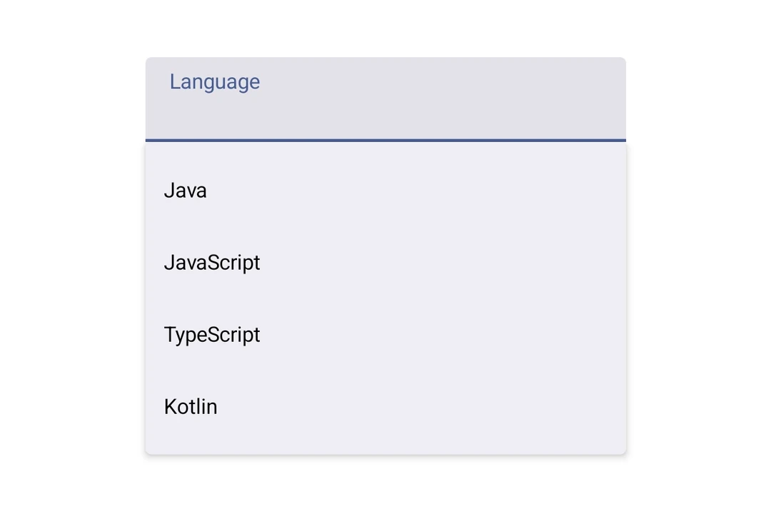
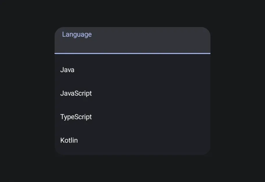
显示四个语言选项并锚定到文本字段的展开式下拉菜单

安装

Terminal
npx expo install @expo/ui

If you are installing this in an existing React Native app, make sure to install expo in your project.

用法

基本

BasicExposedDropdownMenuBoxExample.tsx
import { DropdownMenuItem, ExposedDropdownMenuBox, ExposedDropdownMenu, Host, Text, TextField, useNativeState, } from '@expo/ui/jetpack-compose'; import { menuAnchor } from '@expo/ui/jetpack-compose/modifiers'; import { useState } from 'react'; const LANGUAGES = [ { label: 'Java', value: 'java' }, { label: 'JavaScript', value: 'js' }, { label: 'TypeScript', value: 'ts' }, ]; export default function BasicExposedDropdownMenuBoxExample() { const selectedLabel = useNativeState('Java'); const [expanded, setExpanded] = useState(false); return ( <Host matchContents> <ExposedDropdownMenuBox expanded={expanded} onExpandedChange={setExpanded}> <TextField value={selectedLabel} readOnly modifiers={[menuAnchor()]} /> <ExposedDropdownMenu expanded={expanded} onDismissRequest={() => setExpanded(false)}> {LANGUAGES.map(lang => ( <DropdownMenuItem key={lang.value} onClick={() => { selectedLabel.value = lang.label; setExpanded(false); }}> <DropdownMenuItem.Text> <Text>{lang.label}</Text> </DropdownMenuItem.Text> </DropdownMenuItem> ))} </ExposedDropdownMenu> </ExposedDropdownMenuBox> </Host> ); }

API

import { ExposedDropdownMenuBox } from '@expo/ui/jetpack-compose';

Components

ExposedDropdownMenu

Type: React.Element<ExposedDropdownMenuProps>

A Material 3 ExposedDropdownMenu that displays menu items in a dropdown.

Must be used inside an ExposedDropdownMenuBox.

Props for the ExposedDropdownMenu component.

ExposedDropdownMenuProps

children

Optional • Type: ReactNode

Children should be DropdownMenuItem components.

containerColor

Optional • Type: ColorValue

Background color of the dropdown menu container.

expanded

Type: boolean

Whether the dropdown menu is expanded (visible).

modifiers

Optional • Type: ModifierConfig[]

Modifiers for the component.

onDismissRequest

Optional • Type: () => void

Callback fired when the menu requests to be dismissed (e.g. tapping outside, back button).

ExposedDropdownMenuBox

Type: React.Element<ExposedDropdownMenuBoxProps>

A Material 3 ExposedDropdownMenuBox.

Use the menuAnchor() modifier on the anchor content (e.g. a TextField or Text). Use ExposedDropdownMenu to wrap DropdownMenuItem children.

Example

<ExposedDropdownMenuBox expanded={expanded} onExpandedChange={setExpanded}> <TextField modifiers={[menuAnchor()]} defaultValue={value} readOnly /> <ExposedDropdownMenu expanded={expanded} onDismissRequest={() => setExpanded(false)}> <DropdownMenuItem onClick={() => { setSelected('a'); setExpanded(false); }}> <DropdownMenuItem.Text><Text>Option A</Text></DropdownMenuItem.Text> </DropdownMenuItem> </ExposedDropdownMenu> </ExposedDropdownMenuBox>

ExposedDropdownMenuBoxProps

children

Optional • Type: ReactNode

Children — should contain an anchor element with the menuAnchor() modifier and an ExposedDropdownMenu with DropdownMenuItem children.

expanded

Type: boolean

Whether the dropdown menu is expanded (visible).

modifiers

Optional • Type: ModifierConfig[]

Modifiers for the component.

onExpandedChange

Optional • Type: (expanded: boolean) => void

Callback when the expanded state changes (for example, tapping the field or dismissing the menu).