Reference version

This documentation is available as Markdown for AI agents and LLMs. See the full Markdown index or append .md to any documentation URL.

Box

用于堆叠子元素的 Jetpack Compose Box 组件。

Android
Included in Expo Go
Recommended version:
~57.0.0

Expo UI Box 与官方 Jetpack Compose Box API 保持一致,并会将子元素叠放在一起,且内容对齐方式可配置。

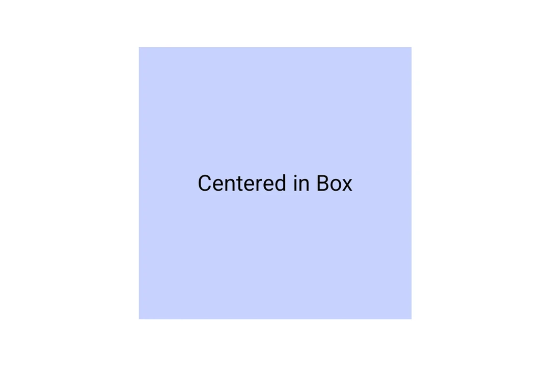
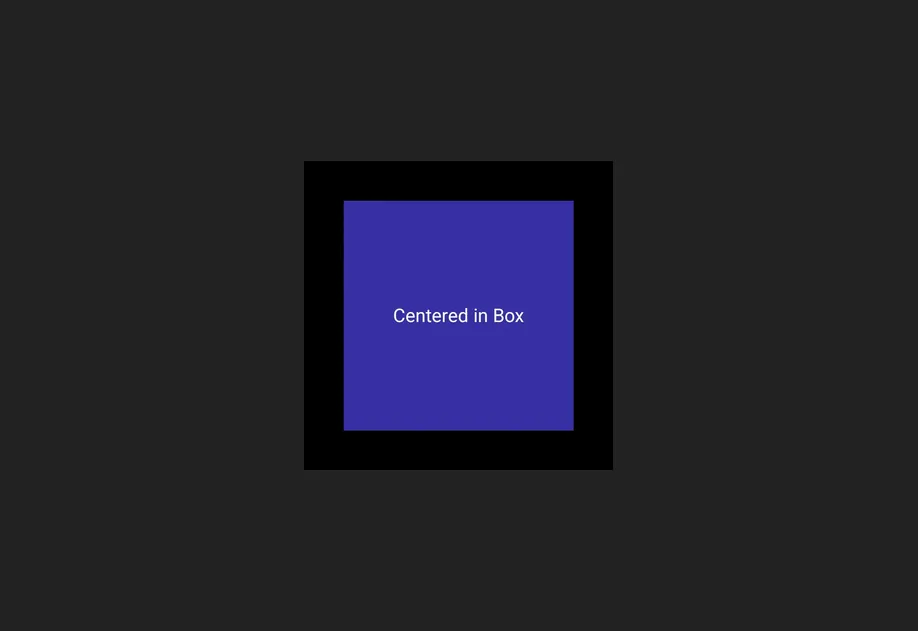
内容居中显示在内部的 Material 3 Box

安装

Terminal
npx expo install @expo/ui

If you are installing this in an existing React Native app, make sure to install expo in your project.

用法

Box 会将子元素叠放在彼此之上。使用 contentAlignment 可将它们定位在 box 内部。

BoxExample.tsx
import { Host, Box, Text } from '@expo/ui/jetpack-compose'; import { size, background } from '@expo/ui/jetpack-compose/modifiers'; export default function BoxExample() { return ( <Host matchContents> <Box contentAlignment="center" modifiers={[size(200, 200), background('#E0E0E0')]}> <Text>在 Box 中居中</Text> </Box> </Host> ); }

API

import { Box } from '@expo/ui/jetpack-compose';

Component

Box

Type: React.Element<BoxProps>

BoxProps

children

Optional • Type: ReactNode

contentAlignment

Optional • Type: ContentAlignment

Alignment of children within the box.

floatingToolbarExitAlwaysScrollBehavior

Optional • Type: FloatingToolbarExitAlwaysScrollBehavior

Scroll behavior for the floating toolbar exit.

Inherited props

  • PrimitiveBaseProps