Reference version

This documentation is available as Markdown for AI agents and LLMs. See the full Markdown index or append .md to any documentation URL.

进度指示器

用于显示操作状态的 Jetpack Compose 进度指示器组件。

Android
Included in Expo Go
Recommended version:
~57.0.0

Expo UI 进度指示器与官方 Jetpack Compose 进度指示器 API 保持一致。
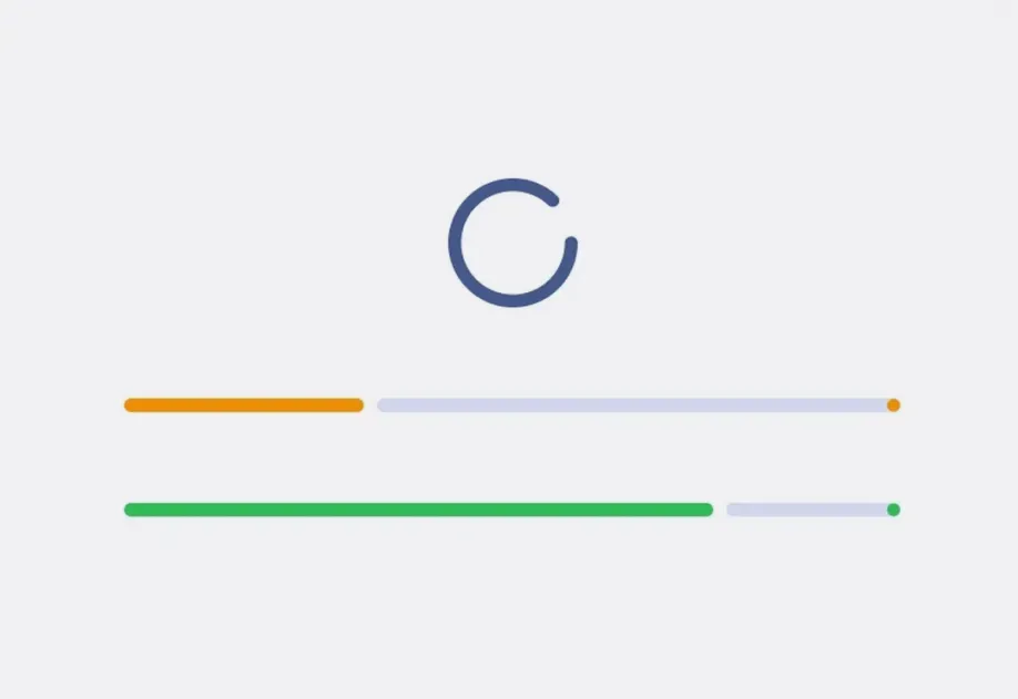
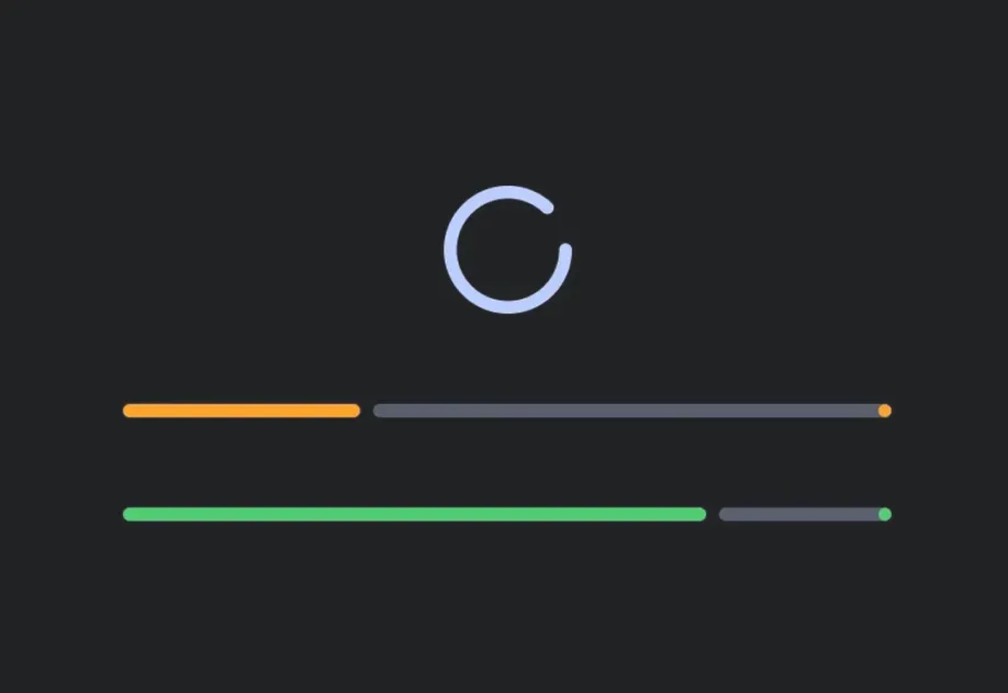
不确定的圆形进度指示器,以及两个分别处于 30% 和 75% 的确定性线性进度条

安装

Terminal
npx expo install @expo/ui

If you are installing this in an existing React Native app, make sure to install expo in your project.

用法

线性进度

一个水平条,通过填充来表示进度。对于确定模式,请提供一个介于 01 之间的 progress 值。

LinearExample.tsx
import { Host, LinearProgressIndicator } from '@expo/ui/jetpack-compose'; export default function LinearExample() { return ( <Host matchContents> <LinearProgressIndicator progress={0.5} /> </Host> ); }

环形进度

一个旋转的圆,其描边会增长以表示进度。

CircularExample.tsx
import { Host, CircularProgressIndicator } from '@expo/ui/jetpack-compose'; export default function CircularExample() { return ( <Host matchContents> <CircularProgressIndicator progress={0.75} /> </Host> ); }

不确定进度

省略 progress 属性,以持续动画方式运行,而不指示具体完成程度。

IndeterminateExample.tsx
import { CircularProgressIndicator, CircularWavyProgressIndicator, Column, Host, LinearProgressIndicator, LinearWavyProgressIndicator, } from '@expo/ui/jetpack-compose'; export default function IndeterminateExample() { return ( <Host matchContents> <Column verticalArrangement={{ spacedBy: 16 }}> <LinearProgressIndicator /> <CircularProgressIndicator /> <CircularWavyProgressIndicator /> <LinearWavyProgressIndicator /> </Column> </Host> ); }

自定义颜色

对指示器使用 color,对背景轨道使用 trackColor

ColorsExample.tsx
import { Host, CircularProgressIndicator } from '@expo/ui/jetpack-compose'; export default function ColorsExample() { return ( <Host matchContents> <CircularProgressIndicator progress={0.6} color="red" trackColor="#cccccc" /> </Host> ); }

波浪变体

LinearWavyProgressIndicatorCircularWavyProgressIndicator 添加了来自 Material 3 Expressive 的富有表现力的波浪动画。

WavyExample.tsx
import { Host, LinearWavyProgressIndicator, CircularWavyProgressIndicator, Column, } from '@expo/ui/jetpack-compose'; export default function WavyExample() { return ( <Host matchContents> <Column verticalArrangement={{ spacedBy: 16 }}> <LinearWavyProgressIndicator progress={0.6} /> <CircularWavyProgressIndicator progress={0.6} /> </Column> </Host> ); }

API

import { LinearProgressIndicator, CircularProgressIndicator, LinearWavyProgressIndicator, CircularWavyProgressIndicator, } from '@expo/ui/jetpack-compose';

Components

CircularProgressIndicator

Type: React.Element<ComponentType<CircularProgressIndicatorProps>>

A circular progress indicator that displays progress in a circular format.

Matches the Jetpack Compose CircularProgressIndicator.

Common props shared by all progress indicator variants.

CircularProgressIndicatorProps

gapSize

Optional • Type: number

Gap size between the indicator and track in dp.

strokeCap

Optional • Type: StrokeCap • Default: 'round'

Stroke cap style for the indicator ends.

strokeWidth

Optional • Type: number

Width of the circular stroke in dp.

Inherited props

CircularWavyProgressIndicator

Type: React.Element<ComponentType<CircularWavyProgressIndicatorProps>>

A circular progress indicator with wavy animation style.

Matches the Jetpack Compose CircularWavyProgressIndicator.

Common props shared by all progress indicator variants.

CircularWavyProgressIndicatorProps

Inherited props

LinearProgressIndicator

Type: React.Element<ComponentType<LinearProgressIndicatorProps>>

A linear progress indicator that displays progress in a horizontal bar.

Matches the Jetpack Compose LinearProgressIndicator.

Common props shared by all progress indicator variants.

LinearProgressIndicatorProps

drawStopIndicator

Optional • Type: DrawStopIndicatorConfig

Configuration for the stop indicator dot at the end of the determinate progress track.

gapSize

Optional • Type: number

Gap size between the indicator and track in dp.

strokeCap

Optional • Type: StrokeCap • Default: 'round'

Stroke cap style for the indicator ends.

Inherited props

LinearWavyProgressIndicator

Type: React.Element<ComponentType<LinearWavyProgressIndicatorProps>>

A linear progress indicator with wavy animation style.

Matches the Jetpack Compose LinearWavyProgressIndicator.

Common props shared by all progress indicator variants.

LinearWavyProgressIndicatorProps

stopSize

Optional • Type: number

Size of the stop indicator in dp at the end of the determinate progress track.

Inherited props

Types

DrawStopIndicatorConfig

Configuration for the stop indicator dot at the end of the determinate linear progress track. When provided, draws a stop indicator with the given options. Omit to use the Compose default.

PropertyTypeDescription
color(optional)ColorValue

Color of the stop indicator. Defaults to the indicator's color.

stopSize(optional)number

Size of the stop indicator in dp. Defaults to the Material 3 default.

strokeCap(optional)StrokeCap

Stroke cap style for the stop indicator. Defaults to the indicator's strokeCap.

ProgressCommonConfig

Common props shared by all progress indicator variants.

PropertyTypeDescription
color(optional)ColorValue

Progress indicator color.

modifiers(optional)ModifierConfig[]

Modifiers for the component.

progress(optional)number | null

The current progress value between 0 and 1. Omit for indeterminate.

trackColor(optional)ColorValue

Track (background) color.

StrokeCap

Literal type: string

Stroke cap style for progress indicators.

Acceptable values are: 'round' | 'butt' | 'square'