This documentation is available as Markdown for AI agents and LLMs. See the full Markdown index or append .md to any documentation URL.
Snackbar
一种简短的通知,会出现在屏幕底部,在不打断用户的情况下提供反馈。
Expo UI 提供了两个组件,对应 Jetpack Compose 的 Snackbar API:
SnackbarHost封装了 Compose 的 SnackbarHost 和 SnackbarHostState。在布局中只放置一次,然后在ref上调用showSnackbar。Snackbar 会根据duration自动消失,也可以通过操作按钮或可选的关闭图标手动关闭。Snackbar是SnackbarHost的仅用于样式的子组件。传入它可以覆盖颜色,或将操作放到新的一行。
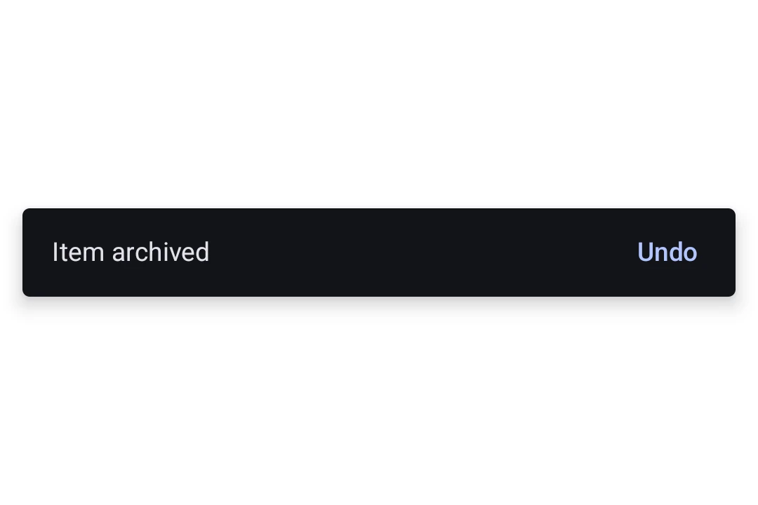
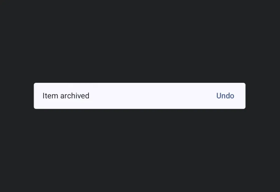
安装
- npx expo install @expo/uiIf you are installing this in an existing React Native app, make sure to install expo in your project.
用法
显示 Snackbar
在布局中放置一次 SnackbarHost,然后在其 ref 上调用 showSnackbar 来显示消息。返回的 promise 会在 snackbar 消失后以 'actionPerformed' 或 'dismissed' 解析。
import { useRef } from 'react'; import { Box, Button, Column, Host, SnackbarHost, Text, type SnackbarHostRef, } from '@expo/ui/jetpack-compose'; import { align, fillMaxSize, fillMaxWidth, padding } from '@expo/ui/jetpack-compose/modifiers'; export default function SnackbarExample() { const hostRef = useRef<SnackbarHostRef>(null); const onArchive = async () => { const result = await hostRef.current?.showSnackbar({ message: 'Item archived', actionLabel: 'Undo', duration: 'short', }); if (result === 'actionPerformed') { // 用户点击了撤销,恢复该项。 } }; return ( <Host style={{ flex: 1 }}> <Box modifiers={[fillMaxSize()]}> <Column modifiers={[padding(16, 16, 16, 16)]}> <Button onClick={onArchive}> <Text>Archive</Text> </Button> </Column> <Box modifiers={[align('bottomCenter'), fillMaxWidth()]}> <SnackbarHost ref={hostRef} /> </Box> </Box> </Host> ); }
自定义样式
向 SnackbarHost 传入一个 Snackbar 子元素,以覆盖颜色或将操作按钮放到新的一行。Snackbar 本身不接受内容,消息和操作都来自每次 showSnackbar 调用。
import { useRef } from 'react'; import { Box, Button, Column, Host, Snackbar, SnackbarHost, Text, type SnackbarHostRef, } from '@expo/ui/jetpack-compose'; import { align, fillMaxSize, fillMaxWidth, padding } from '@expo/ui/jetpack-compose/modifiers'; export default function StyledSnackbar() { const hostRef = useRef<SnackbarHostRef>(null); const onSave = () => { hostRef.current?.showSnackbar({ message: 'Saved', actionLabel: 'Undo', }); }; return ( <Host style={{ flex: 1 }}> <Box modifiers={[fillMaxSize()]}> <Column modifiers={[padding(16, 16, 16, 16)]}> <Button onClick={onSave}> <Text>Save</Text> </Button> </Column> <Box modifiers={[align('bottomCenter'), fillMaxWidth()]}> <SnackbarHost ref={hostRef}> <Snackbar containerColor="#1E1E2E" contentColor="#CDD6F4" actionContentColor="#F38BA8" dismissActionContentColor="#CDD6F4" /> </SnackbarHost> </Box> </Box> </Host> ); }
API
import { Snackbar, SnackbarHost } from '@expo/ui/jetpack-compose';
Components
Type: React.Element<SnackbarProps>
Styling configuration for the snackbar shown by SnackbarHost. Pass as a
child to override colors or place the action on a new line.
boolean • Default: falseWhether the action should be placed on a new line below the message. Useful for long action labels.
ColorValueThe content color used for the dismiss-action icon button.
Type: React.Element<SnackbarHostProps>
A Material 3 SnackbarHost
that displays snackbars triggered via its ref's showSnackbar method.
ReactNodeOptional Snackbar child supplying styling for shown snackbars. Mirrors
Compose's SnackbarHost(hostState) { data -> Snackbar(data, ...) } lambda.
Types
Literal type: string
How long the snackbar is shown. Mirrors Compose's SnackbarDuration enum.
Acceptable values are: 'short' | 'long' | 'indefinite'
| Property | Type | Description |
|---|---|---|
| showSnackbar | (options: SnackbarShowOptions) => Promise<SnackbarResult> | Shows a snackbar and resolves with |
Literal type: string
Reason a snackbar invocation resolved. Mirrors Compose's SnackbarResult enum.
Acceptable values are: 'actionPerformed' | 'dismissed'
| Property | Type | Description |
|---|---|---|
| actionLabel(optional) | string | Label for the optional action button. When omitted, no action button is shown. |
| duration(optional) | SnackbarDuration | How long to show the snackbar. Defaults to |
| message | string | The message body of the snackbar. |
| withDismissAction(optional) | boolean | Whether to show a trailing close (X) icon button to dismiss the snackbar. Default: false |