This documentation is available as Markdown for AI agents and LLMs. See the full Markdown index or append .md to any documentation URL.
选择器
具有菜单和滚轮外观的单选输入。
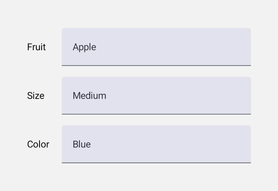
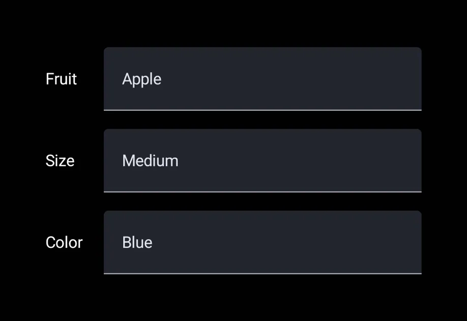
Picker 是一个单选输入。你可以使用 <Picker.Item label value /> 子元素来声明选项,这样父级 Picker 就会读取它们,并渲染一个适合平台的下拉菜单或转轮。
通用的 Picker 与 @expo/ui/community/picker 相互独立,后者仍然是 @react-native-picker/picker 的兼容适配层。对于新代码,除非你确实需要 RN-Picker 的 API 表面,否则应优先使用这个通用 Picker。
安装
If you are installing this in an existing React Native app, make sure to install expo in your project.
用法
菜单外观(默认)
转轮外观
appearance="wheel" 会在 iOS 上渲染一个内联可滚动的转轮。在 Android 和 web 上,这会回退到平台默认的下拉菜单(Material 3 不提供轮盘样式的 Picker)。
API
import { Picker } from '@expo/ui';
Component
Type: React.Element<PickerProps<T>>
A single-selection input.
Declare options via <Picker.Item label value /> children.
Props for the Picker component, a single-selection input.
PickerAppearance • Default: 'menu'Visual appearance of the picker.
See PickerAppearance.
ReactNode<Picker.Item> children that declare the available options.
TThe currently selected value.
Must match the value of one of the <Picker.Item> children.
Interfaces
Types
Literal type: string
Visual appearance of the picker.
'menu'— Compact button that opens a popup/dropdown on tap. Cross-platform default.'wheel'— Scrollable rotor UI that's always visible inline. iOS only; on Android and web this falls back to the platform's default dropdown.
Acceptable values are: 'wheel' | 'menu'
Literal type: union
The type of values a Picker.Item can carry.
Acceptable values are: string | number