This documentation is available as Markdown for AI agents and LLMs. See the full Markdown index or append .md to any documentation URL.
间隔器
一个布局间隔器,用于在相邻元素之间生成空白空间。
在 Row 或 Column 内部,在兄弟组件之间生成空白空间的布局间隔器。使用 size 创建固定间隙,或使用 flexible 填充剩余的主轴空间。
安装
If you are installing this in an existing React Native app, make sure to install expo in your project.
用法
固定大小间隔
弹性间隔
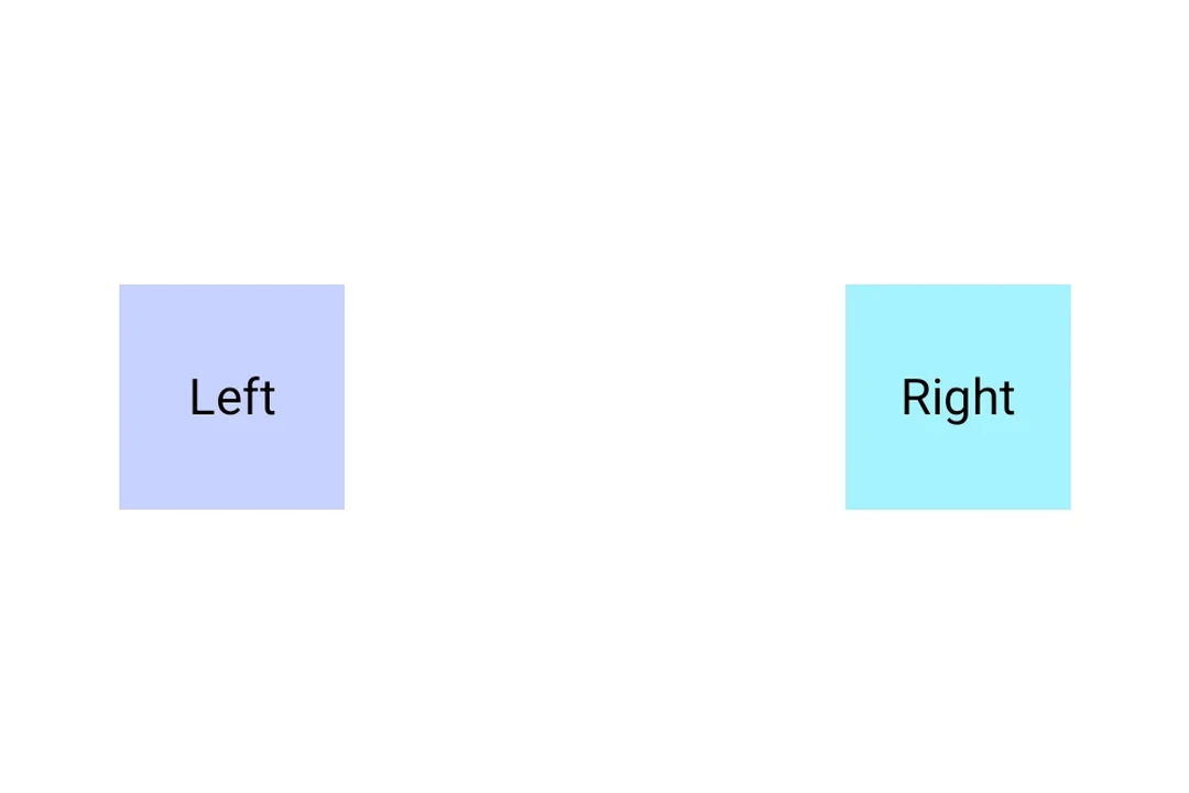
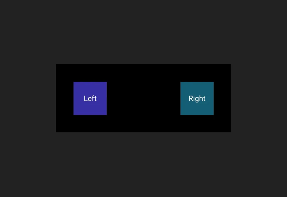
弹性间隔会沿其父元素的主轴填充剩余空间,将周围内容推到两端。
API
import { Spacer } from '@expo/ui';
Component
Type: React.Element<SpacerProps>
A layout spacer that produces empty space between siblings in a
Row or Column.
Props for the Spacer component.
A Spacer produces empty space between siblings in a Row or
Column. Use size for a fixed amount of space, or flexible
to fill the remaining space along the parent's main axis.
booleanWhether the component is disabled. Disabled components do not respond to user interaction.
boolean • Default: falseWhen true, the spacer expands to fill the available space along the
parent's main axis, pushing sibling content to the opposite end.
ModifierConfig[]Platform-specific modifier escape hatch. Pass an array of modifier configs
from @expo/ui/swift-ui/modifiers or @expo/ui/jetpack-compose/modifiers.
A modifier supplied here replaces any modifier of the same type that the
component derives from style or other props.
() => voidCalled when the component is removed from screen.
numberFixed size in density-independent pixels. Interpreted as width in a horizontal container and as height in a vertical container.
Pick<ViewStyle, 'padding' | 'paddingHorizontal' | 'paddingVertical' | 'paddingTop' | 'paddingBottom' | 'paddingLeft' | 'paddingRight' | 'backgroundColor' | 'borderRadius' | 'borderWidth' | 'borderColor' | 'opacity' | 'width' | 'height'>Platform-agnostic style properties. These are translated to SwiftUI modifiers on iOS and Jetpack Compose modifiers on Android.