This documentation is available as Markdown for AI agents and LLMs. See the full Markdown index or append .md to any documentation URL.
开关
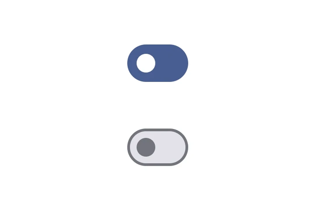
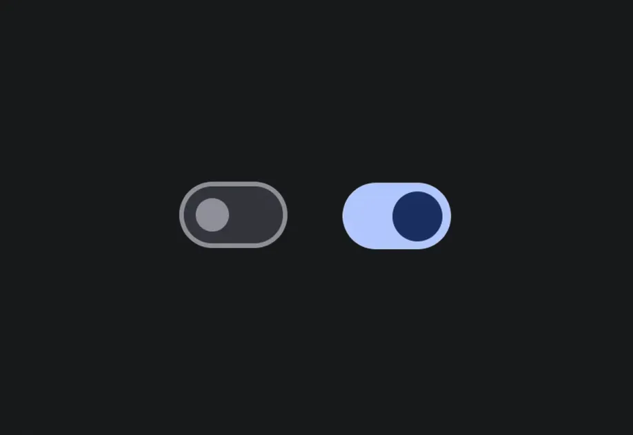
在开启和关闭状态之间切换的切换控件。
一个受控切换。将 value 与 onValueChange 配对,以从 React 管理状态。
安装
If you are installing this in an existing React Native app, make sure to install expo in your project.
用法
基本开关
带标签
当提供 label 时,开关会与其文本一起以带标签的行形式渲染。
API
import { Switch } from '@expo/ui';
Component
Type: React.Element<SwitchProps>
A toggle control that switches between on and off states.
Props for the Switch component, a toggle control.
booleanWhether the switch is disabled. Disabled switches do not respond to user interaction.
ModifierConfig[]Platform-specific modifier escape hatch. Pass an array of modifier configs
from @expo/ui/swift-ui/modifiers or @expo/ui/jetpack-compose/modifiers.
stringIdentifier used to locate the component in end-to-end tests.