Reference version

This documentation is available as Markdown for AI agents and LLMs. See the full Markdown index or append .md to any documentation URL.

FieldGroup

可滚动的分组设置样式行容器。

Android
iOS
Web
Included in Expo Go
Recommended version:
~57.0.0

一个可滚动的容器,用于分组的设置样式行,外观类似 iOS 设置界面。将 FieldGroup.Section(用于显式分组)、FieldGroup.SectionHeaderFieldGroup.SectionFooter 插槽放置其中。

安装

Terminal
npx expo install @expo/ui

If you are installing this in an existing React Native app, make sure to install expo in your project.

用法

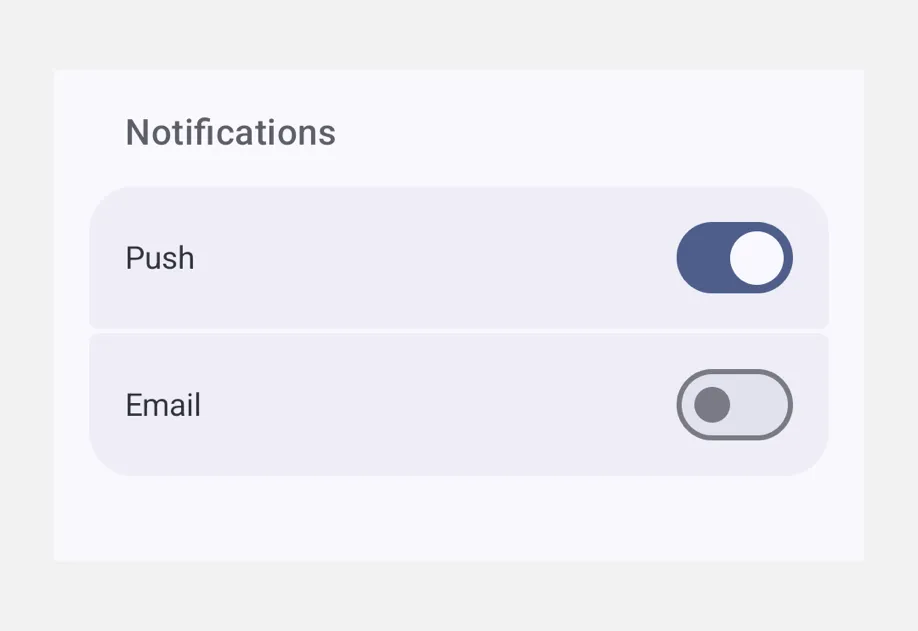
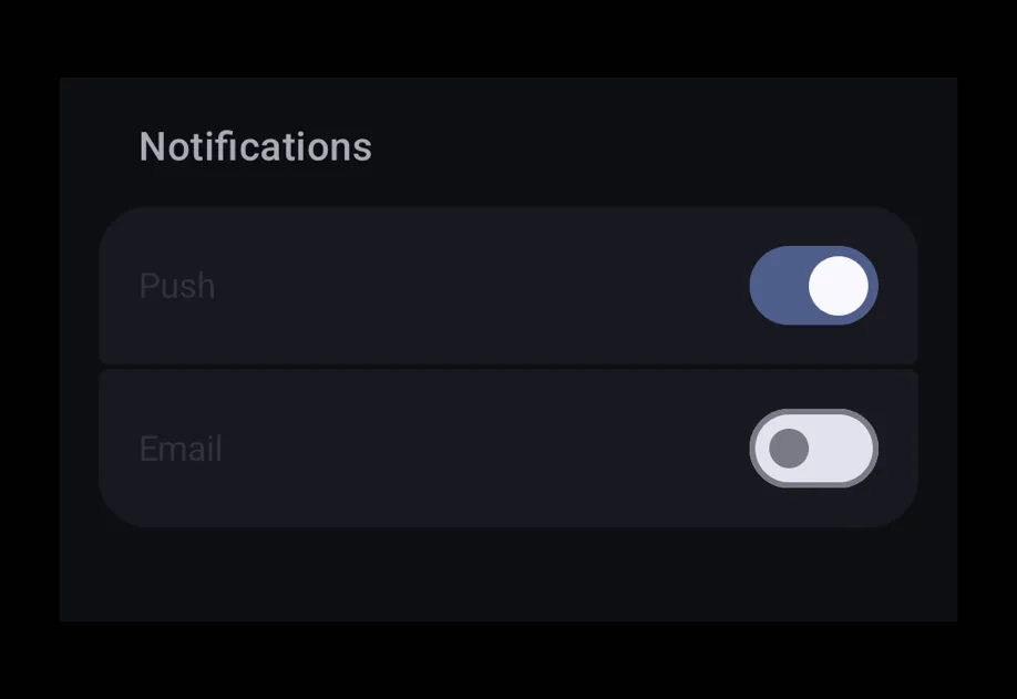
分组表单

FieldGroupExample.tsx
import { useState } from 'react'; import { Host, FieldGroup, Switch, Text } from '@expo/ui'; export default function FieldGroupExample() { const [notifications, setNotifications] = useState(true); const [analytics, setAnalytics] = useState(false); return ( <Host style={{ flex: 1 }}> <FieldGroup> <FieldGroup.Section title="通知"> <Switch label="推送" value={notifications} onValueChange={setNotifications} /> <Switch label="电子邮件" value={analytics} onValueChange={setAnalytics} /> </FieldGroup.Section> <FieldGroup.Section title="关于"> <Text>版本 1.0.0</Text> </FieldGroup.Section> </FieldGroup> </Host> ); }

自定义分区标题和页脚

使用 FieldGroup.SectionHeaderFieldGroup.SectionFooter,可以在默认 title 文本的位置渲染完全样式化的标题/页脚插槽。

FieldGroupSlotsExample.tsx
import { useState } from 'react'; import { Host, FieldGroup, Switch, Text } from '@expo/ui'; export default function FieldGroupSlotsExample() { const [enabled, setEnabled] = useState(false); return ( <Host style={{ flex: 1 }}> <FieldGroup> <FieldGroup.Section> <FieldGroup.SectionHeader> <Text textStyle={{ fontSize: 16, fontWeight: '700' }}>隐私</Text> </FieldGroup.SectionHeader> <Switch label="共享使用情况" value={enabled} onValueChange={setEnabled} /> <FieldGroup.SectionFooter> <Text textStyle={{ fontSize: 12, color: '#8E8E93' }}> 帮助我们改进应用。你可以随时关闭此功能。 </Text> </FieldGroup.SectionFooter> </FieldGroup.Section> </FieldGroup> </Host> ); }

API

import { FieldGroup } from '@expo/ui';

Components

FieldGroup

Type: React.Element<FieldGroupProps>

A scrollable container for grouped settings-style rows, mirroring the look of an iOS Settings screen. Render one or more FieldGroup.Section components inside. Direct non-section children are automatically grouped into an implicit section, matching SwiftUI Form behavior.

Props for the FieldGroup component, a scrollable container of grouped settings-style rows.

FieldGroupProps

children

Optional • Type: ReactNode

A collection of FieldGroup.Section components that make up the group. Non-section children are rendered inline between sections, matching SwiftUI Form behavior.

disabled

Only for:
Android
iOS
Web

Optional • Type: boolean

Whether the component is disabled. Disabled components do not respond to user interaction.

hidden

Only for:
Android
iOS
Web

Optional • Type: boolean

Whether the component is hidden.

modifiers

Only for:
Android
iOS

Optional • Type: ModifierConfig[]

Platform-specific modifier escape hatch. Pass an array of modifier configs from @expo/ui/swift-ui/modifiers or @expo/ui/jetpack-compose/modifiers. A modifier supplied here replaces any modifier of the same type that the component derives from style or other props.

onAppear

Only for:
Android
iOS
Web

Optional • Type: () => void

Called when the component appears on screen.

onDisappear

Only for:
Android
iOS
Web

Optional • Type: () => void

Called when the component is removed from screen.

onPress

Only for:
Android
iOS
Web

Optional • Type: () => void

Called when the component is pressed.

style

Only for:
Android
iOS
Web

Optional • Type: Pick<ViewStyle, 'padding' | 'paddingHorizontal' | 'paddingVertical' | 'paddingTop' | 'paddingBottom' | 'paddingLeft' | 'paddingRight' | 'backgroundColor' | 'borderRadius' | 'borderWidth' | 'borderColor' | 'opacity' | 'width' | 'height'>

Platform-agnostic style properties. These are translated to SwiftUI modifiers on iOS and Jetpack Compose modifiers on Android.

testID

Only for:
Android
iOS
Web

Optional • Type: string

Identifier used to locate the component in end-to-end tests.

FieldGroup.Section

Type: React.Element<FC<FieldSectionProps>>

Props for the FieldGroup.Section component, a grouped list of rows within a FieldGroup.

FieldSectionProps

children

Optional • Type: ReactNode

The rows of the section, optionally interleaved with a single <FieldGroup.SectionHeader> and/or <FieldGroup.SectionFooter> child to customize the header / footer slots.

disabled

Only for:
Android
iOS
Web

Optional • Type: boolean

Whether the component is disabled. Disabled components do not respond to user interaction.

hidden

Only for:
Android
iOS
Web

Optional • Type: boolean

Whether the component is hidden.

modifiers

Only for:
Android
iOS

Optional • Type: ModifierConfig[]

Platform-specific modifier escape hatch. Pass an array of modifier configs from @expo/ui/swift-ui/modifiers or @expo/ui/jetpack-compose/modifiers. A modifier supplied here replaces any modifier of the same type that the component derives from style or other props.

onAppear

Only for:
Android
iOS
Web

Optional • Type: () => void

Called when the component appears on screen.

onDisappear

Only for:
Android
iOS
Web

Optional • Type: () => void

Called when the component is removed from screen.

onPress

Only for:
Android
iOS
Web

Optional • Type: () => void

Called when the component is pressed.

style

Only for:
Android
iOS
Web

Optional • Type: Pick<ViewStyle, 'padding' | 'paddingHorizontal' | 'paddingVertical' | 'paddingTop' | 'paddingBottom' | 'paddingLeft' | 'paddingRight' | 'backgroundColor' | 'borderRadius' | 'borderWidth' | 'borderColor' | 'opacity' | 'width' | 'height'>

Platform-agnostic style properties. These are translated to SwiftUI modifiers on iOS and Jetpack Compose modifiers on Android.

testID

Only for:
Android
iOS
Web

Optional • Type: string

Identifier used to locate the component in end-to-end tests.

title

Optional • Type: string

A plain-text section title, rendered as the default styled header above the group. Ignored when a <FieldGroup.SectionHeader> child is provided.

titleUppercase

Optional • Type: boolean • Default: false

Whether the default title header is rendered in uppercase. Ignored when a <FieldGroup.SectionHeader> child is provided, and ignored on iOS (SwiftUI Form decides the header case based on the list style).

FieldGroup.SectionFooter

Type: React.Element<FC<FieldSectionFooterProps>>

Props for the FieldGroup.SectionFooter slot marker.

FieldSectionFooterProps

children

Optional • Type: ReactNode

Content rendered as the section's footer.

FieldGroup.SectionHeader

Type: React.Element<FC<FieldSectionHeaderProps>>

Props for the FieldGroup.SectionHeader slot marker.

FieldSectionHeaderProps

children

Optional • Type: ReactNode

Content rendered as the section's header.

Methods

FieldGroup.getFieldItemPosition(index, total)

ParameterType
indexnumber
totalnumber

Computes the position of a row given its index within a section of total rows.

Types

FieldItemPosition

Literal type: string

Position of a row within a FieldGroup.Section, used to compute grouped-list corner radii.

Acceptable values are: 'leading' | 'middle' | 'trailing' | 'only'