Reference version

This documentation is available as Markdown for AI agents and LLMs. See the full Markdown index or append .md to any documentation URL.

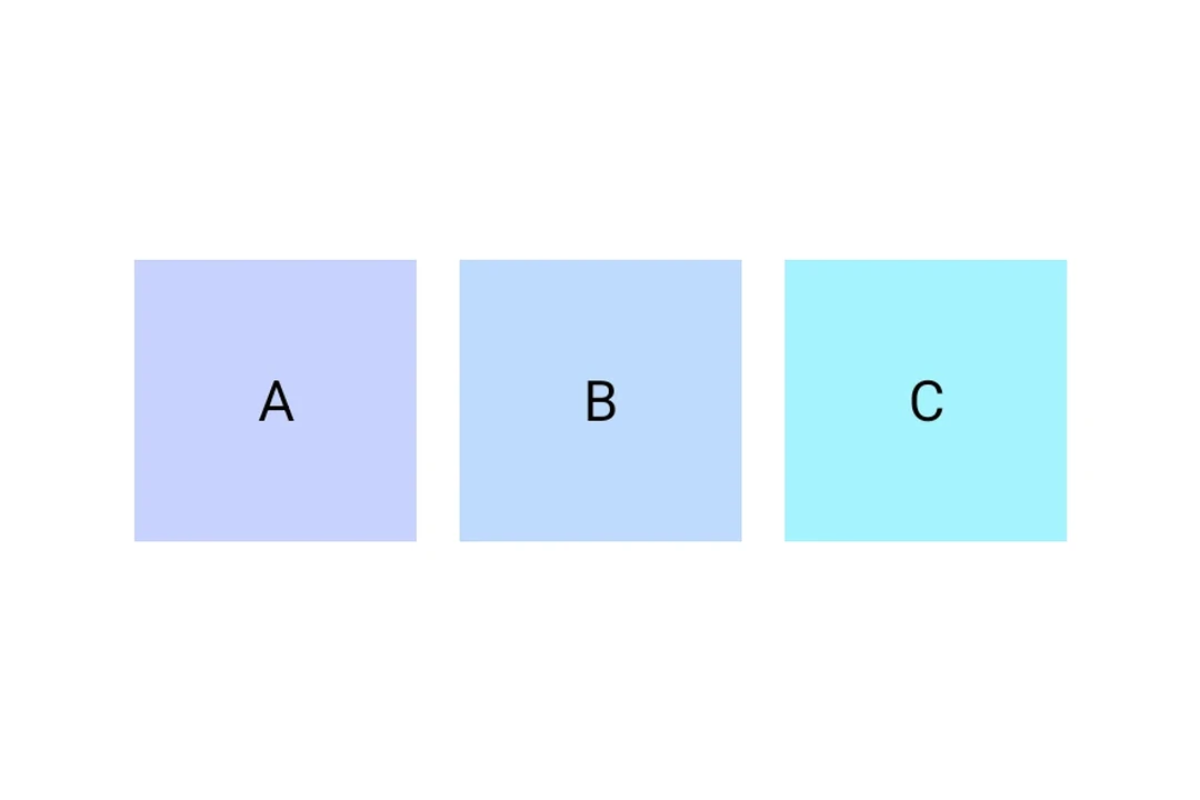
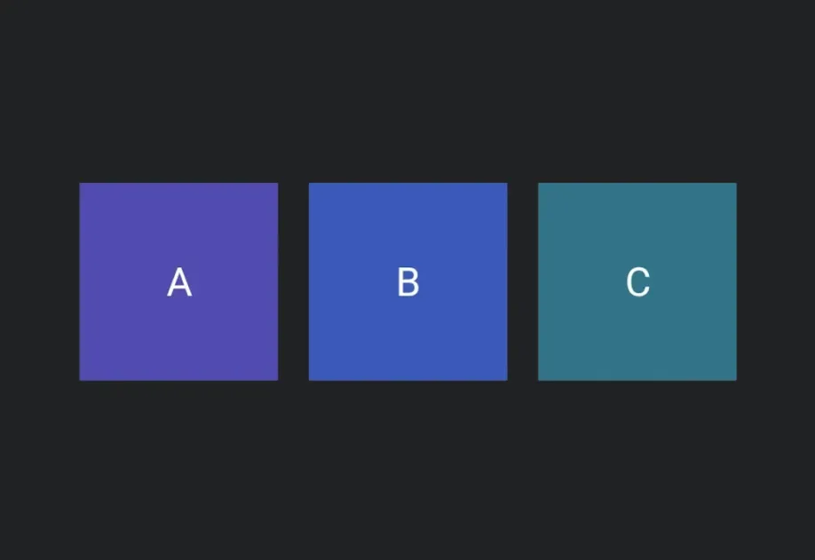
用于通用 @expo/ui 组件的水平布局容器。

Android
iOS
Web
Included in Expo Go
Recommended version:
~57.0.0

一个水平布局容器,将其子项从起始到结束排列。在 Android 上委托给 Jetpack Compose 的 Row,在 iOS 上委托给 SwiftUI 的 HStack,在 web 上委托给 flex View

安装

Terminal
npx expo install @expo/ui

If you are installing this in an existing React Native app, make sure to install expo in your project.

用法

基础行

RowExample.tsx
import { Host, Row, Text } from '@expo/ui'; export default function RowExample() { return ( <Host matchContents> <Row spacing={8}> <Text></Text> <Text></Text> <Text></Text> </Row> </Host> ); }

对齐

使用 alignment 沿交叉轴(垂直轴)定位子元素。

RowAlignmentExample.tsx
import { Host, Row, Text } from '@expo/ui'; export default function RowAlignmentExample() { return ( <Host style={{ flex: 1 }}> <Row spacing={8} alignment="center"> <Text>居中</Text> <Text>居中</Text> </Row> </Host> ); }

使用 Spacer 拉开内容

Row 与可伸缩的 Spacer 搭配使用,把子元素推到两端。

RowSpacerExample.tsx
import { Host, Row, Text, Spacer } from '@expo/ui'; export default function RowSpacerExample() { return ( <Host style={{ flex: 1 }}> <Row> <Text>前导</Text> <Spacer flexible /> <Text>尾随</Text> </Row> </Host> ); }

API

import { Row } from '@expo/ui';

Component

Row

Type: React.Element<RowProps>

A horizontal layout container that arranges its children from start to end.

Props for the Row component, a horizontal layout container.

RowProps

alignment

Optional • Literal type: string • Default: 'start'

Cross-axis (vertical) alignment of children.

Acceptable values are: 'start' | 'center' | 'end'

children

Optional • Type: ReactNode

Content to render inside the row.

disabled

Only for:
Android
iOS
Web

Optional • Type: boolean

Whether the component is disabled. Disabled components do not respond to user interaction.

hidden

Only for:
Android
iOS
Web

Optional • Type: boolean

Whether the component is hidden.

modifiers

Only for:
Android
iOS

Optional • Type: ModifierConfig[]

Platform-specific modifier escape hatch. Pass an array of modifier configs from @expo/ui/swift-ui/modifiers or @expo/ui/jetpack-compose/modifiers. A modifier supplied here replaces any modifier of the same type that the component derives from style or other props.

onAppear

Only for:
Android
iOS
Web

Optional • Type: () => void

Called when the component appears on screen.

onDisappear

Only for:
Android
iOS
Web

Optional • Type: () => void

Called when the component is removed from screen.

onPress

Only for:
Android
iOS
Web

Optional • Type: () => void

Called when the component is pressed.

spacing

Optional • Type: number

Horizontal spacing between children, in density-independent pixels.

style

Only for:
Android
iOS
Web

Optional • Type: Pick<ViewStyle, 'padding' | 'paddingHorizontal' | 'paddingVertical' | 'paddingTop' | 'paddingBottom' | 'paddingLeft' | 'paddingRight' | 'backgroundColor' | 'borderRadius' | 'borderWidth' | 'borderColor' | 'opacity' | 'width' | 'height'>

Platform-agnostic style properties. These are translated to SwiftUI modifiers on iOS and Jetpack Compose modifiers on Android.

testID

Only for:
Android
iOS
Web

Optional • Type: string

Identifier used to locate the component in end-to-end tests.