This documentation is available as Markdown for AI agents and LLMs. See the full Markdown index or append .md to any documentation URL.
按钮
一个可按压的按钮,具有多种视觉变体。
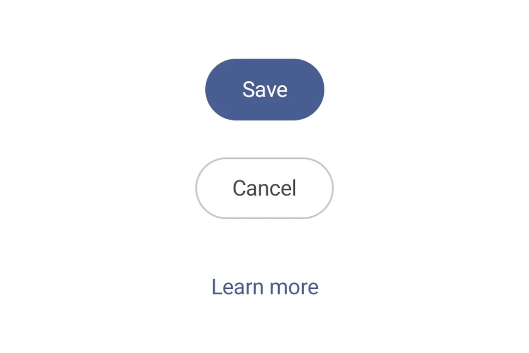
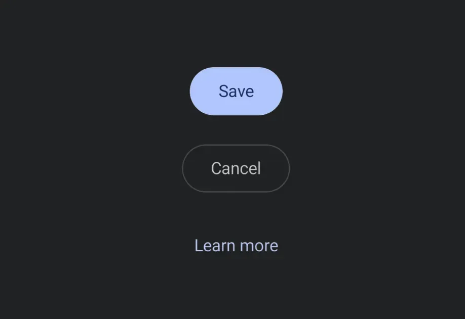
一个可按压的按钮,可在 Android、iOS 和 web 上保持一致渲染。支持 filled、outlined 和 text 三种视觉变体。
安装
If you are installing this in an existing React Native app, make sure to install expo in your project.
用法
基本按钮
变体
使用 variant 属性选择一种视觉变体。
自定义内容
传入 children 可完全自定义按钮内容。提供 children 时会忽略 label 属性。
禁用
API
import { Button } from '@expo/ui';
Component
Type: React.Element<ButtonProps>
A pressable button that supports multiple visual variants.
Props for the Button component.
ReactNodeCustom content rendered inside the button. When provided, label is ignored.
booleanWhether the component is disabled. Disabled components do not respond to user interaction.
stringText label displayed inside the button. Ignored when children is provided.
ModifierConfig[]Platform-specific modifier escape hatch. Pass an array of modifier configs
from @expo/ui/swift-ui/modifiers or @expo/ui/jetpack-compose/modifiers.
A modifier supplied here replaces any modifier of the same type that the
component derives from style or other props.
() => voidCalled when the component is removed from screen.
Pick<ViewStyle, 'padding' | 'paddingHorizontal' | 'paddingVertical' | 'paddingTop' | 'paddingBottom' | 'paddingLeft' | 'paddingRight' | 'backgroundColor' | 'borderRadius' | 'borderWidth' | 'borderColor' | 'opacity' | 'width' | 'height'>Platform-agnostic style properties. These are translated to SwiftUI modifiers on iOS and Jetpack Compose modifiers on Android.
stringIdentifier used to locate the component in end-to-end tests.
Types
Literal type: string
Visual variant of a Button.
'filled'— solid background color (default).'outlined'— transparent background with a border.'text'— no background or border, text only.
Acceptable values are: 'filled' | 'outlined' | 'text'