This documentation is available as Markdown for AI agents and LLMs. See the full Markdown index or append .md to any documentation URL.
滑块
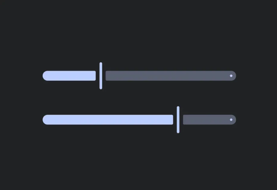
用于从连续或分段范围中选择一个值的控件。
一个用于在范围内选择数值的受控滑块。将 value 与 onValueChange 配对,以从 React 管理状态。

安装
If you are installing this in an existing React Native app, make sure to install expo in your project.
用法
连续滑块
默认范围是 [0, 1]。
带自定义范围的分段滑块
使用 min、max 和 step 来限制滑块生成的值。
API
import { Slider } from '@expo/ui';
Component
Type: React.Element<SliderProps>
A control for selecting a value from a continuous or stepped range.
Props for the Slider component.
booleanWhether the slider is disabled. Disabled sliders do not respond to user interaction.
ModifierConfig[]Platform-specific modifier escape hatch. Pass an array of modifier configs
from @expo/ui/swift-ui/modifiers or @expo/ui/jetpack-compose/modifiers.
(value: number) => voidCalled when the user changes the slider value.
numberIncrement size. For example, step={10} with min={0} and max={100} produces values 0, 10, 20, …, 100.
stringIdentifier used to locate the component in end-to-end tests.