Reference version

This documentation is available as Markdown for AI agents and LLMs. See the full Markdown index or append .md to any documentation URL.

可折叠

一个带标签的可点击标题,用于切换其内容的可见性。

Android
iOS
Web
Included in Expo Go
Recommended version:
~57.0.0

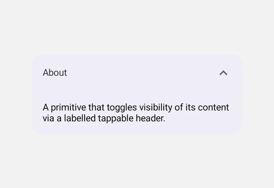
Collapsible 是一种原始组件,可通过点击带标签的标题来显示或隐藏其内容。通过 isOpenonOpenChange 进行受控——每个 Collapsible 都管理独立的状态。
安装

Terminal
npx expo install @expo/ui

If you are installing this in an existing React Native app, make sure to install expo in your project.

用法

基础可折叠

CollapsibleExample.tsx
import { useState } from 'react'; import { Host, Column, Collapsible, Text } from '@expo/ui'; export default function CollapsibleExample() { const [open, setOpen] = useState(false); return ( <Host style={{ flex: 1 }}> <Column spacing={8} style={{ padding: 16 }}> <Collapsible isOpen={open} onOpenChange={setOpen} label="关于"> <Text> 通过带标签的可点击标题切换其内容可见性的原语。 </Text> </Collapsible> </Column> </Host> ); }

手风琴(一次只展开一个部分)

将每个 CollapsibleisOpen 绑定到共享的父级值。该组件不会强制互斥——如何组合取决于使用者。

CollapsibleAccordionExample.tsx
import { useState } from 'react'; import { Host, Column, Collapsible, Text } from '@expo/ui'; type Section = 'a' | 'b' | 'c' | null; export default function CollapsibleAccordionExample() { const [openSection, setOpenSection] = useState<Section>('a'); return ( <Host style={{ flex: 1 }}> <Column spacing={8} style={{ padding: 16 }}> <Collapsible isOpen={openSection === 'a'} onOpenChange={open => setOpenSection(open ? 'a' : null)} label="部分 A"> <Text>打开 B 或 C 会关闭此项。</Text> </Collapsible> <Collapsible isOpen={openSection === 'b'} onOpenChange={open => setOpenSection(open ? 'b' : null)} label="部分 B"> <Text>打开 A 或 C 会关闭此项。</Text> </Collapsible> <Collapsible isOpen={openSection === 'c'} onOpenChange={open => setOpenSection(open ? 'c' : null)} label="部分 C"> <Text>打开 A 或 B 会关闭此项。</Text> </Collapsible> </Column> </Host> ); }

API

import { Collapsible } from '@expo/ui';

Component

Collapsible

Type: React.Element<CollapsibleProps>

A primitive that toggles visibility of its content via a labelled tappable header. Controlled via isOpen + onOpenChange.

Props for the Collapsible component, a primitive that shows or hides its content with a tap on a labelled header.

CollapsibleProps

children

Optional • Type: ReactNode

Content rendered when isOpen is true.

isOpen

Type: boolean

Whether the content is currently expanded.

label

Optional • Type: string

Text rendered in the tappable header.

labelStyle

Optional • Type: { color: string, fontFamily: string, fontSize: number, fontWeight: 'normal' | 'bold' | '100' | '200' | '300' | '400' | '500' | '600' | '700' | '800' | '900', letterSpacing: number, lineHeight: number, textAlign: 'center' | 'left' | 'right' }

Text-specific styling for the tappable header label.

onOpenChange

Type: (isOpen: boolean) => void

Called when the user taps the header to toggle the open state.