This documentation is available as Markdown for AI agents and LLMs. See the full Markdown index or append .md to any documentation URL.
Jetpack Compose
使用 @expo/ui 构建原生 Android 界面的 Jetpack Compose 组件。
@expo/ui/jetpack-compose 中的 Jetpack Compose 组件允许你从 React Native 使用 Jetpack Compose 构建完全原生的 Android 界面。
安装
If you are installing this in an existing React Native app, make sure to install expo in your project.
用法
使用 @expo/ui/jetpack-compose 中的组件需要将其包裹在 Host 组件中。Host 是 Jetpack Compose 视图的容器。
import { Host, Button } from '@expo/ui/jetpack-compose';

export function SaveButton() {
  return (
    <Host matchContents>
      <Button onClick={() => alert('Saved!')}>保存更改</Button>
    </Host>
  );
}
创建可与 Expo UI 集成的自定义 Jetpack Compose 组件和修饰符。
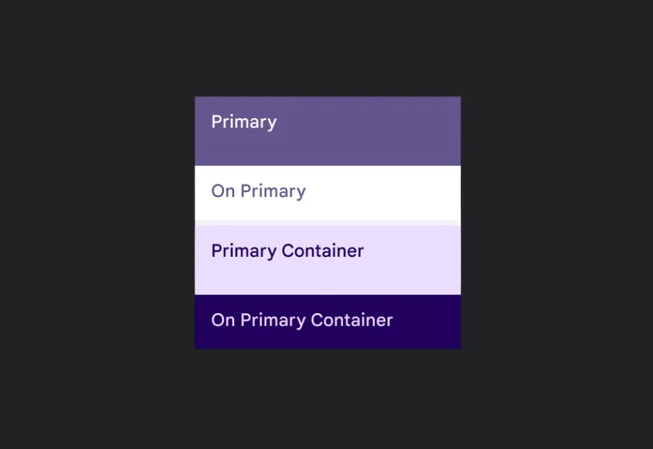
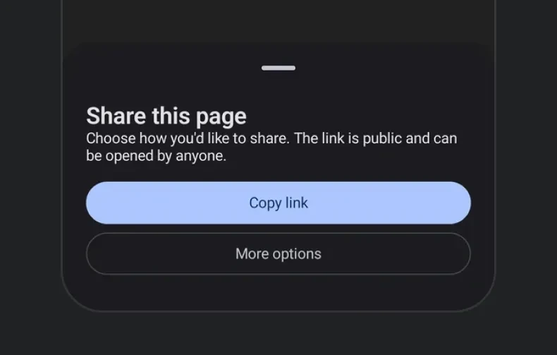
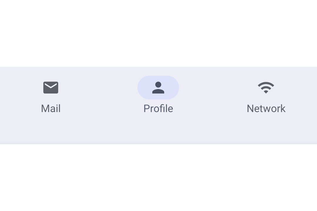
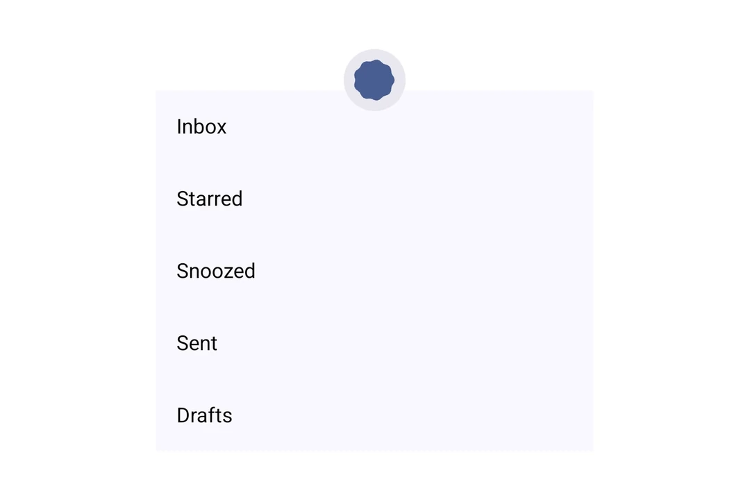
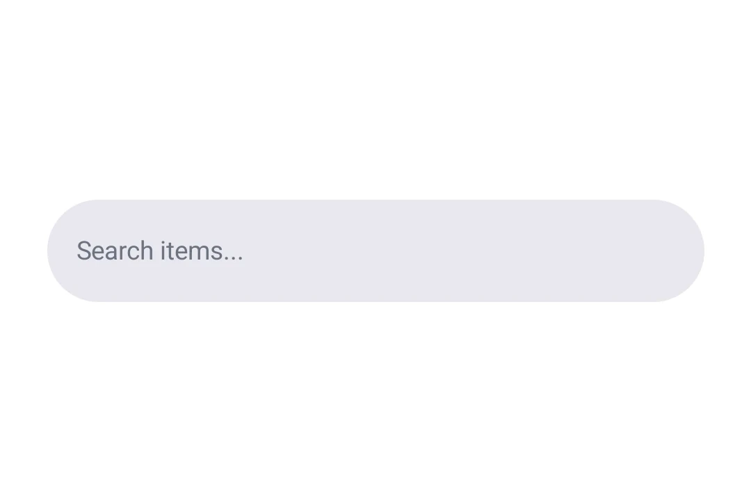
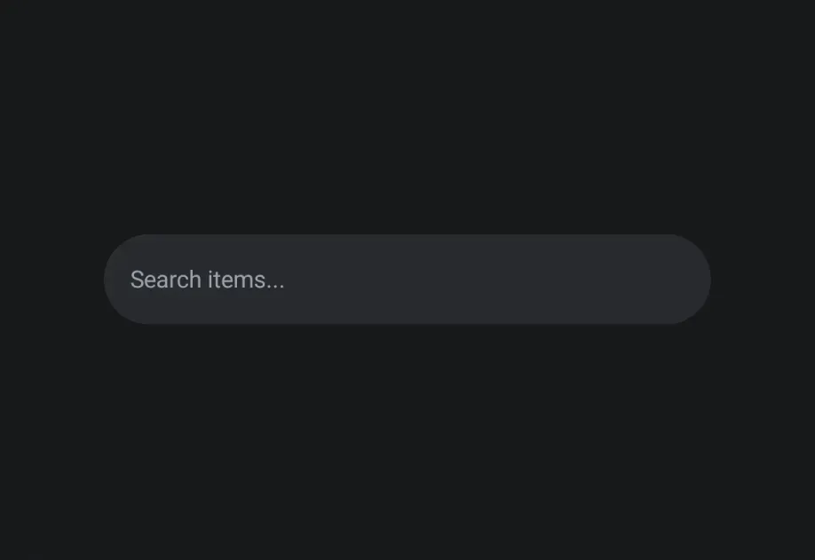
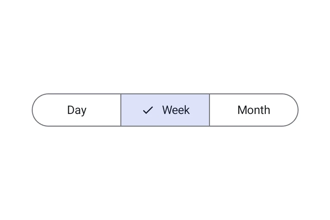
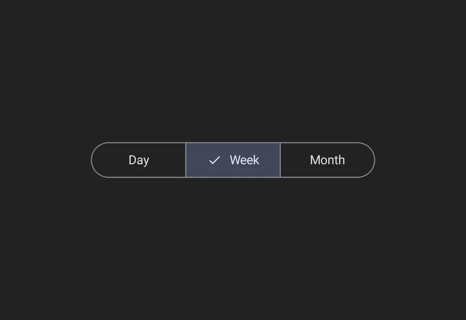
可用组件
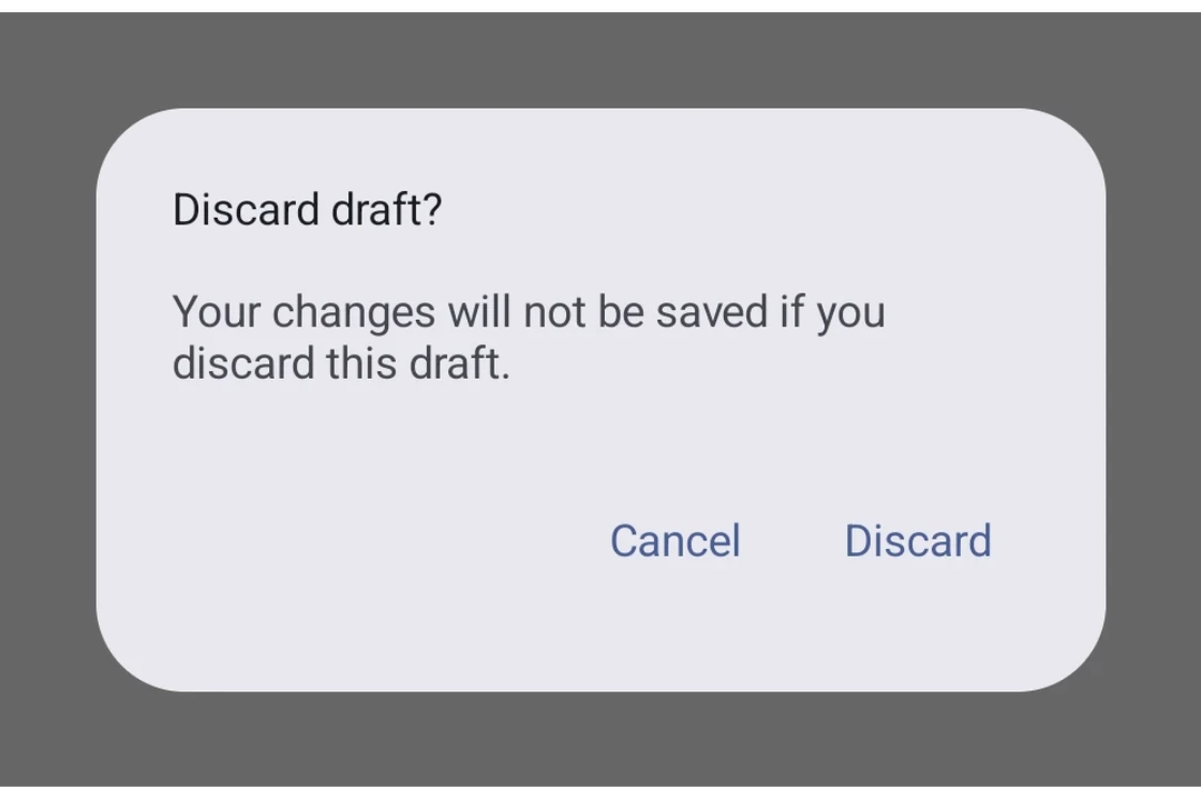
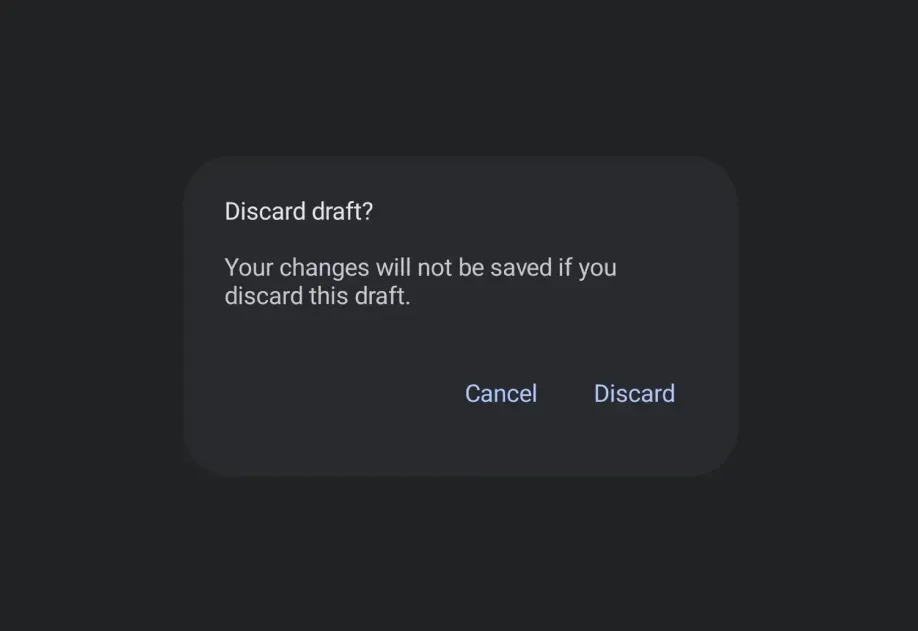




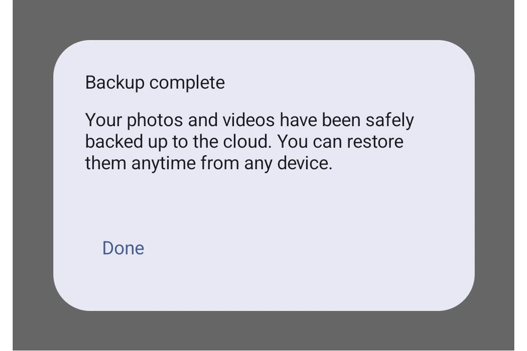
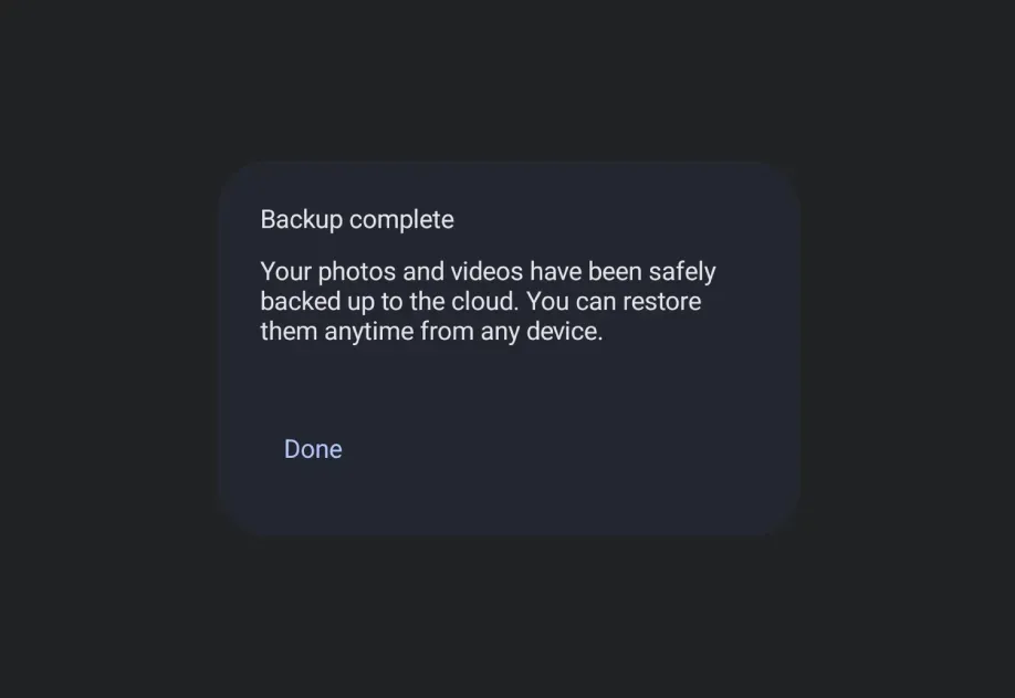


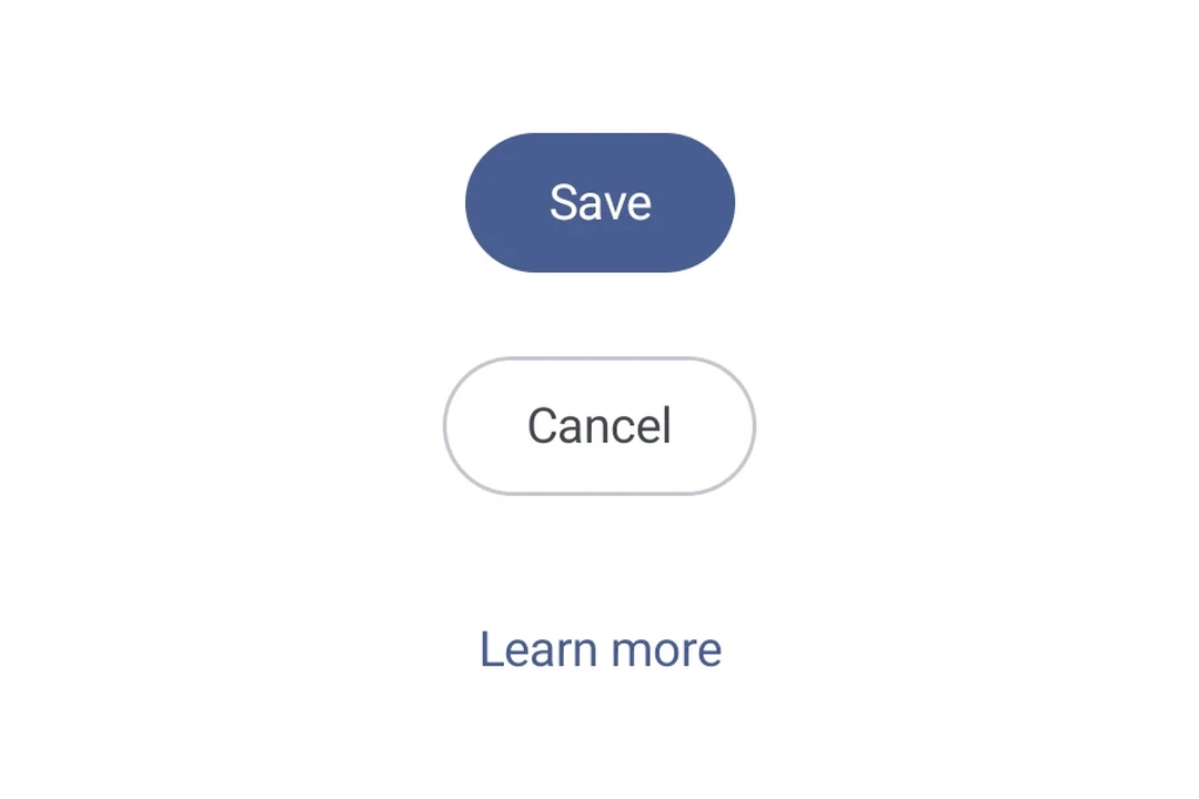
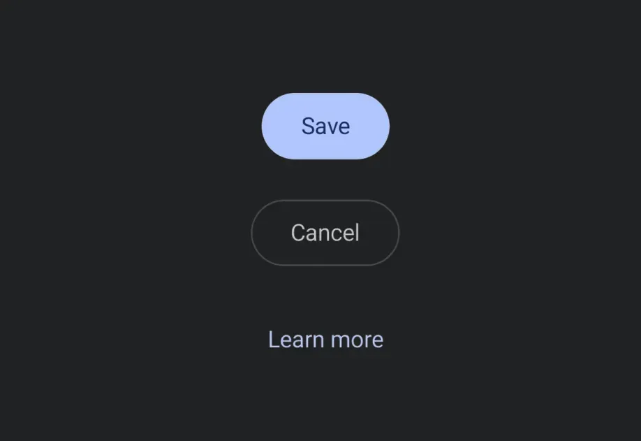
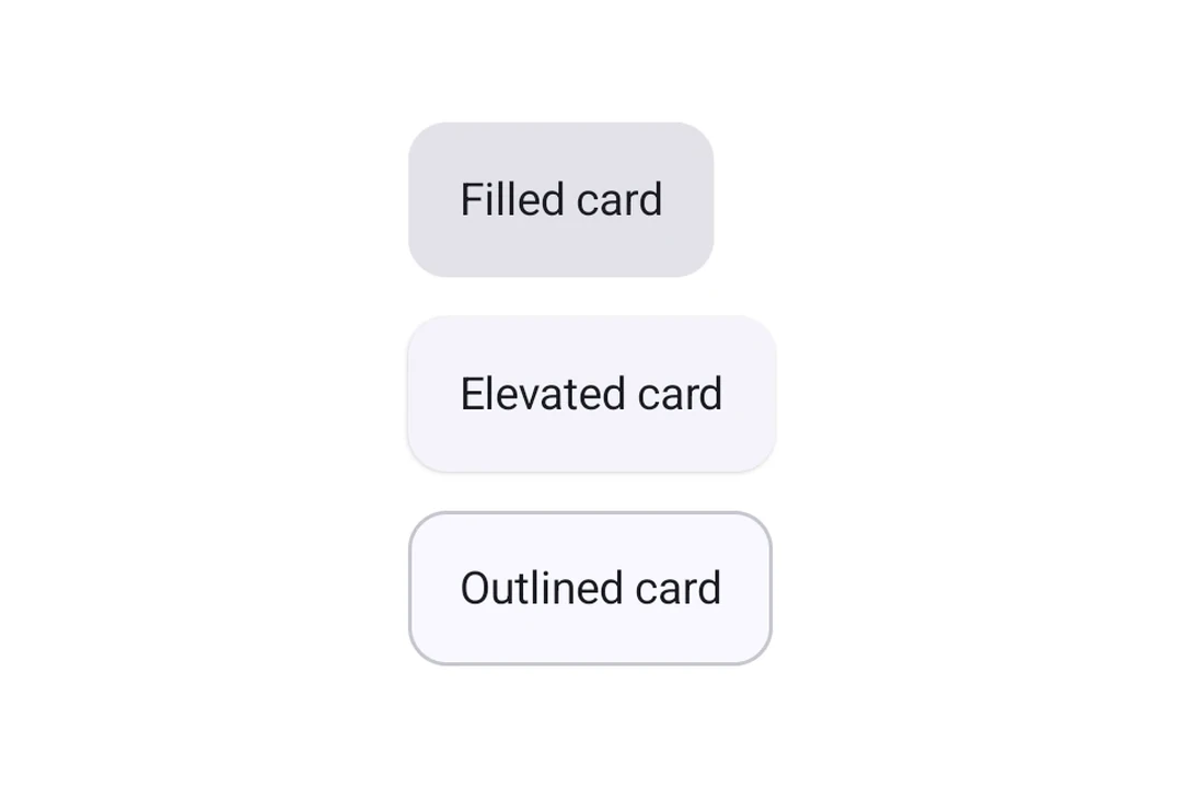
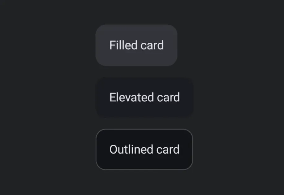


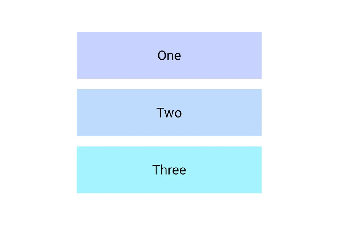
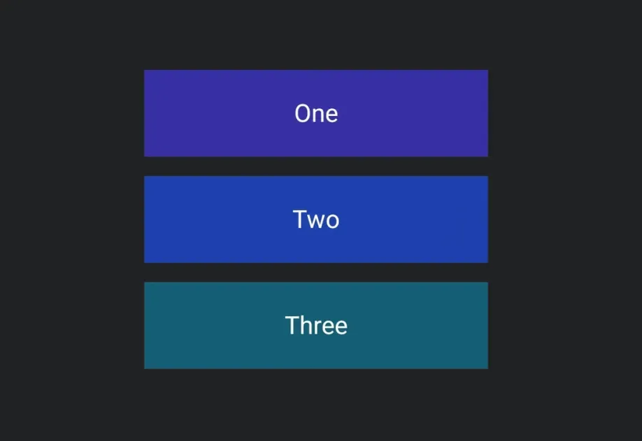
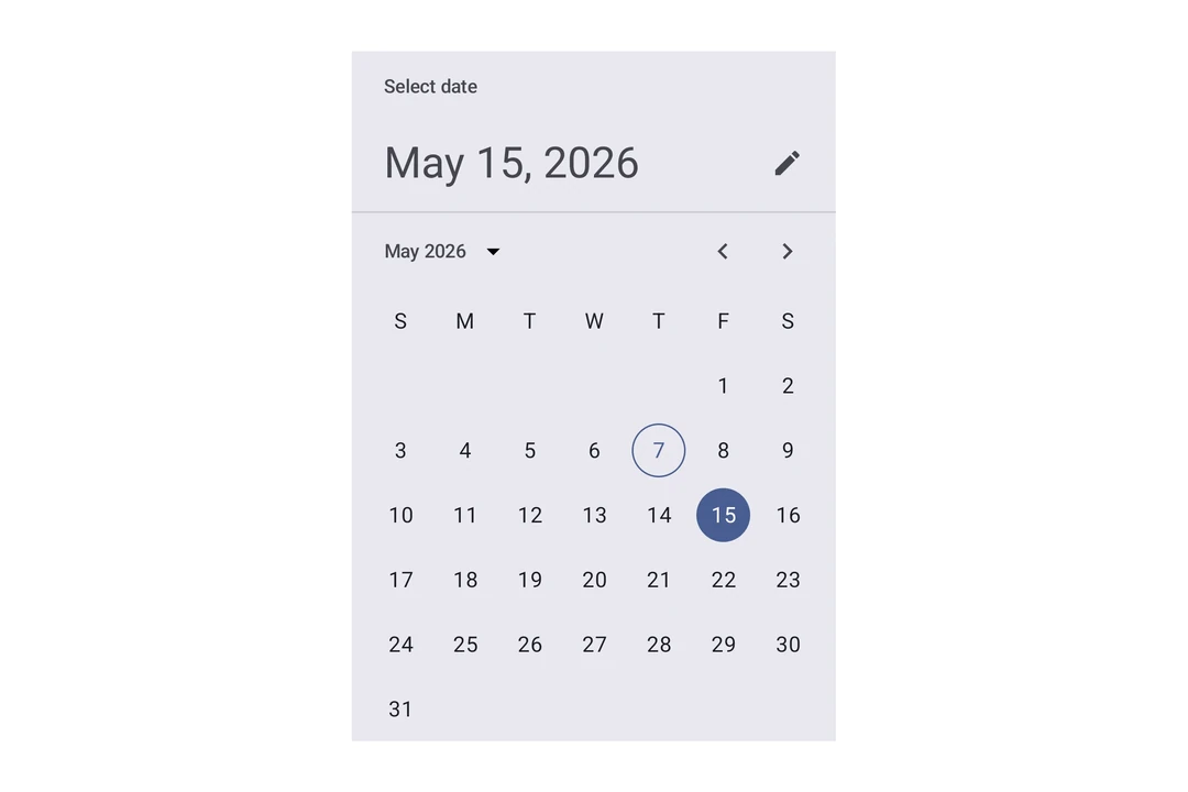
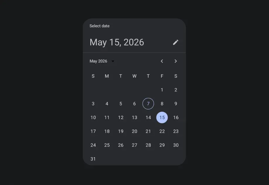
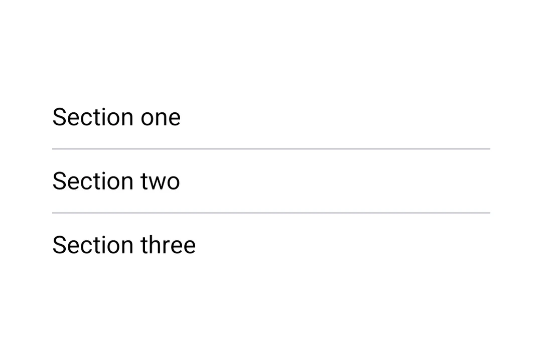
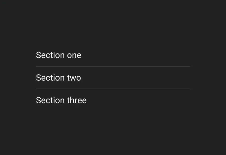
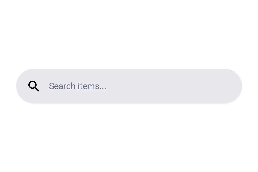
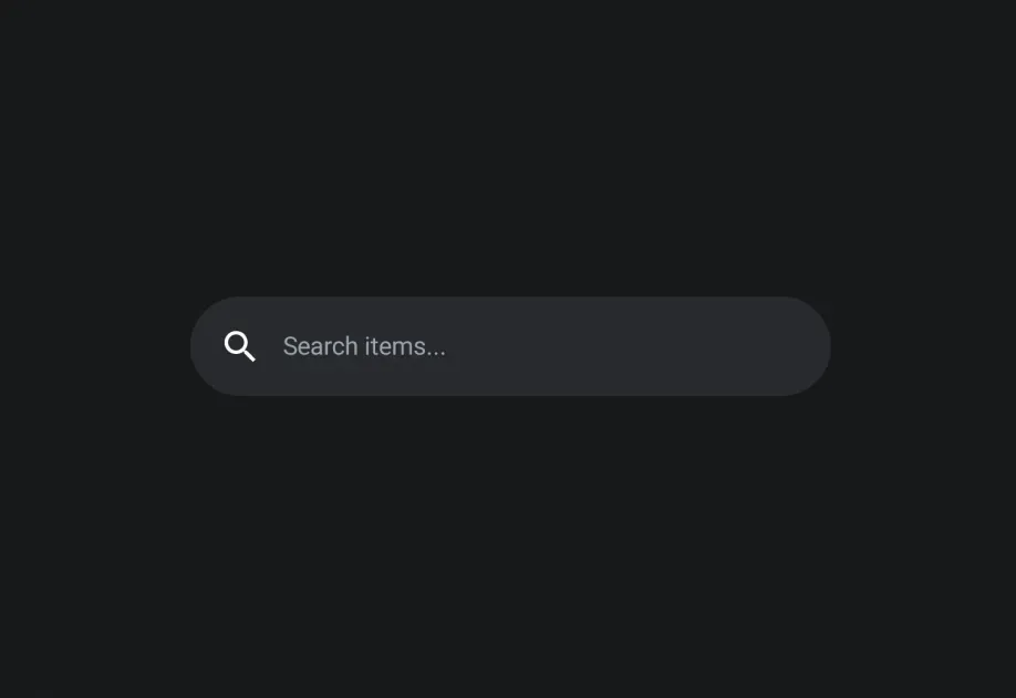
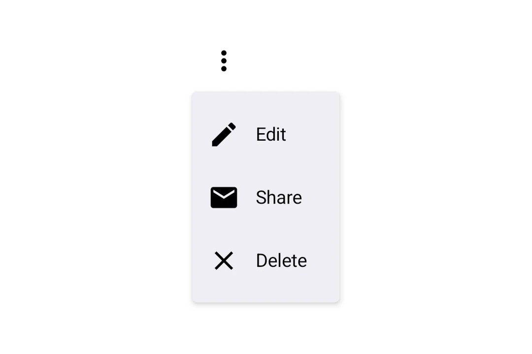
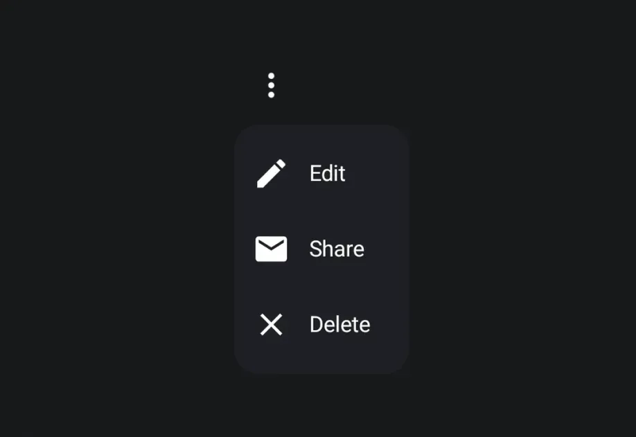
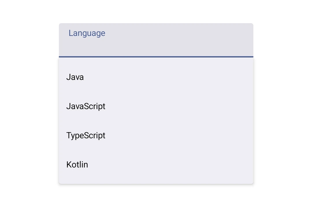
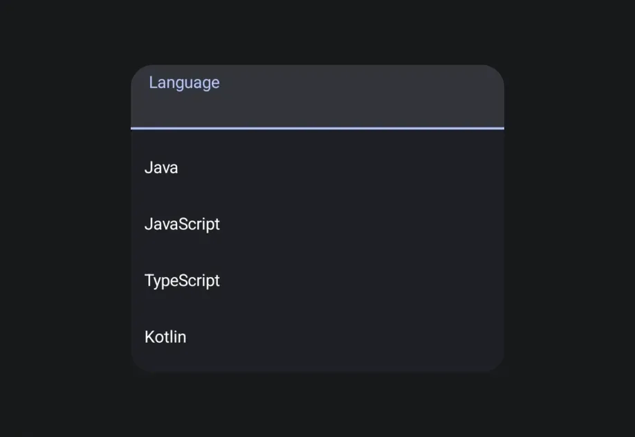
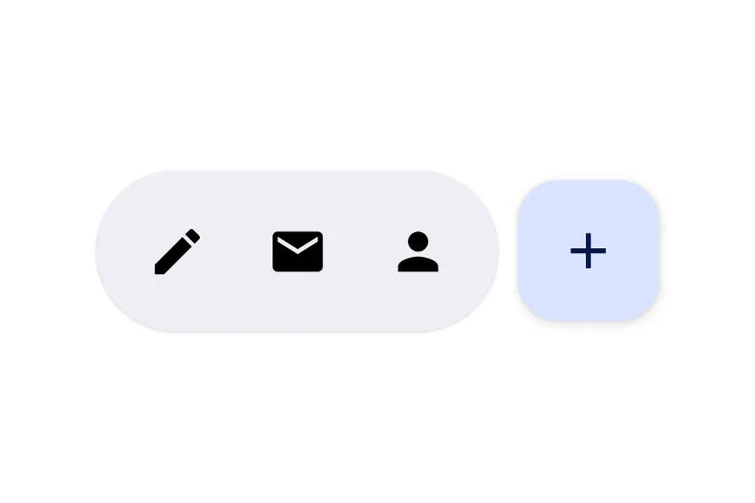
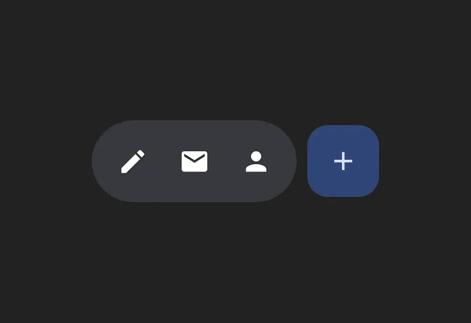


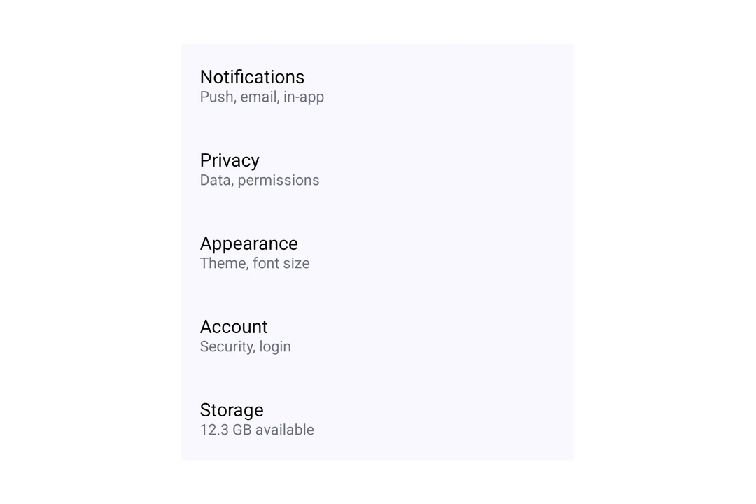
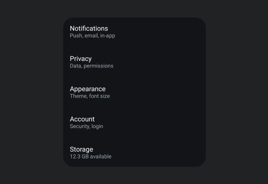










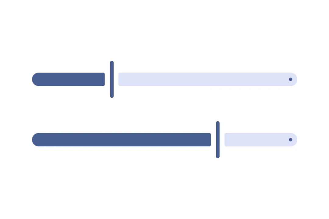
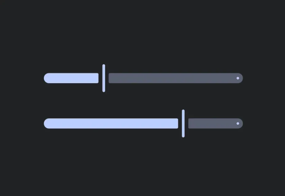
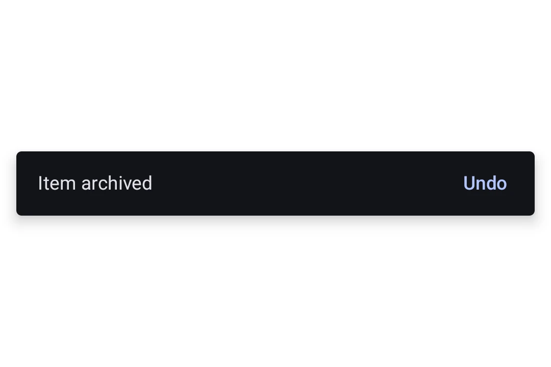
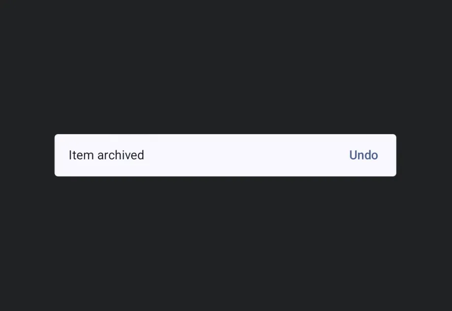
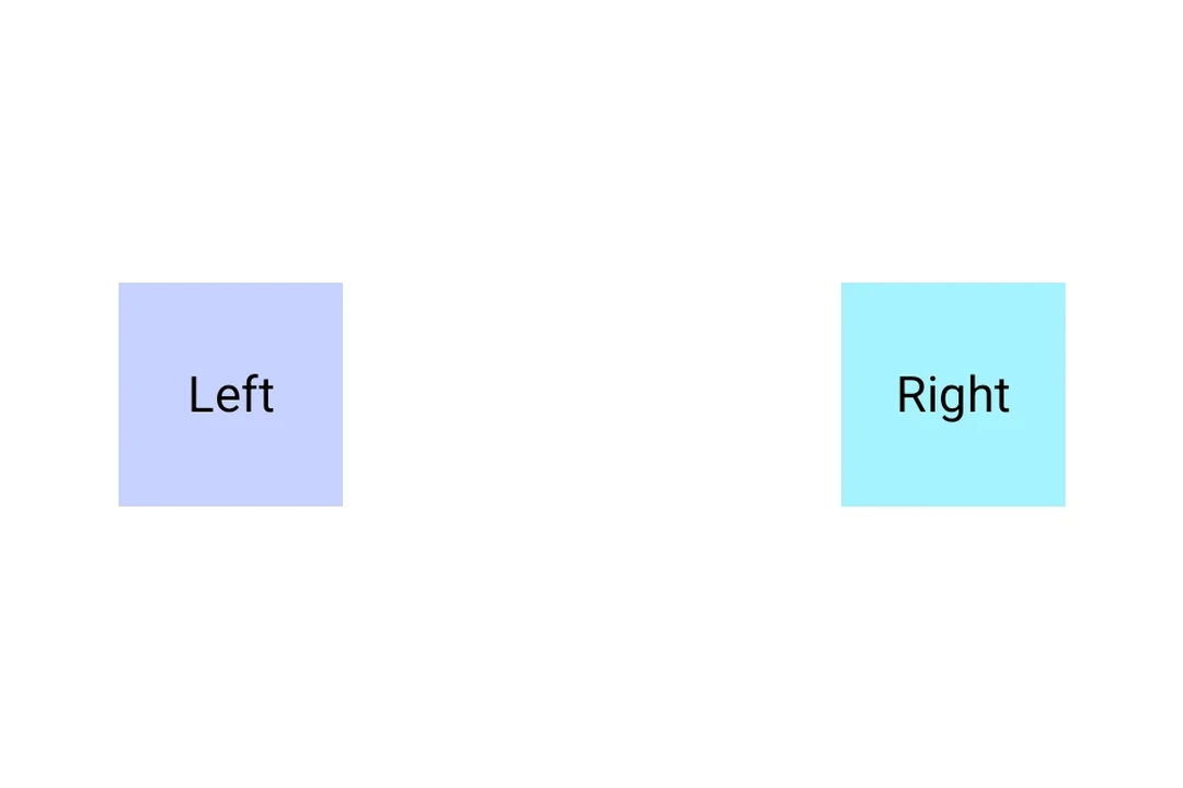
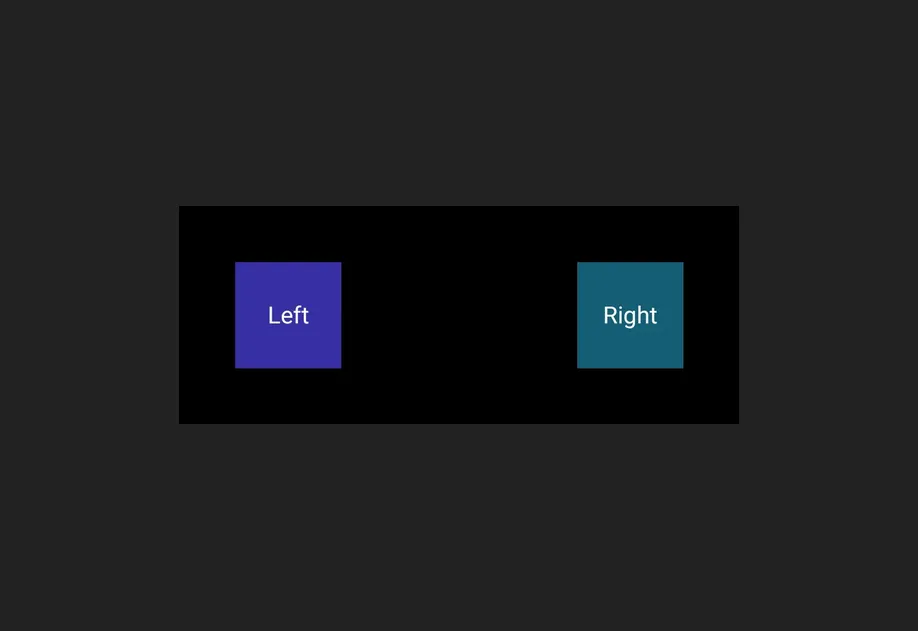
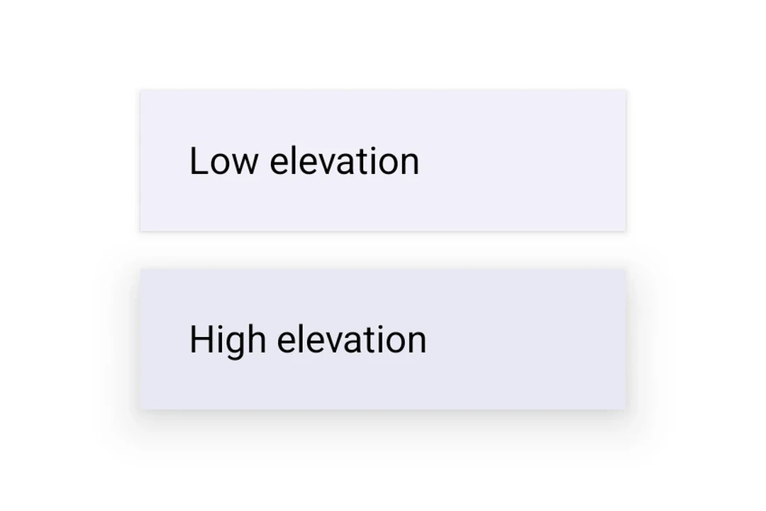
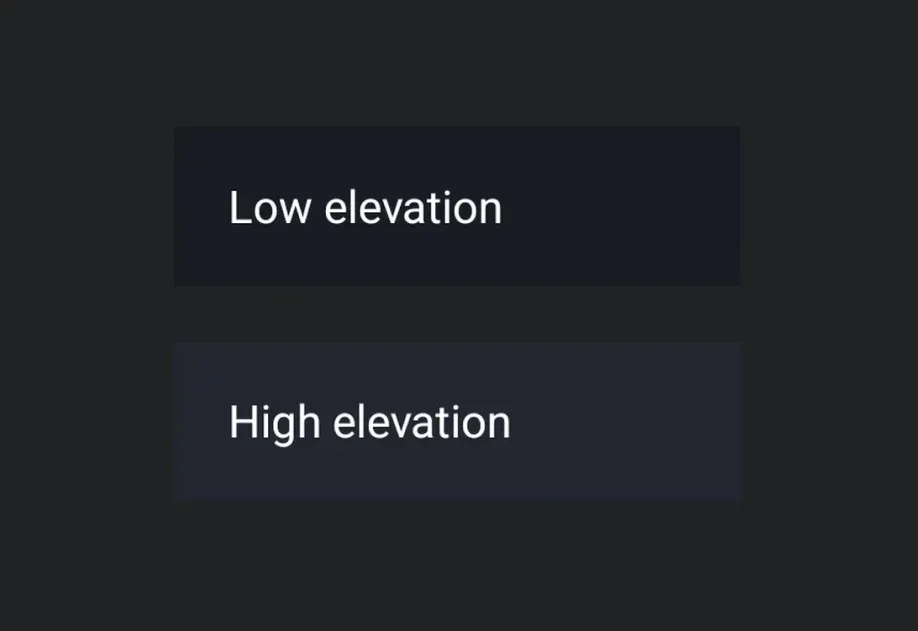
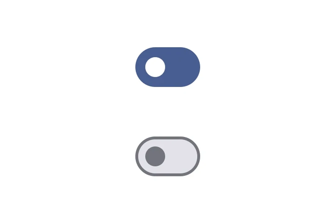
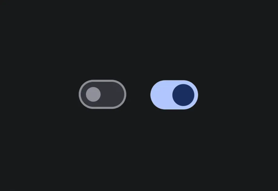
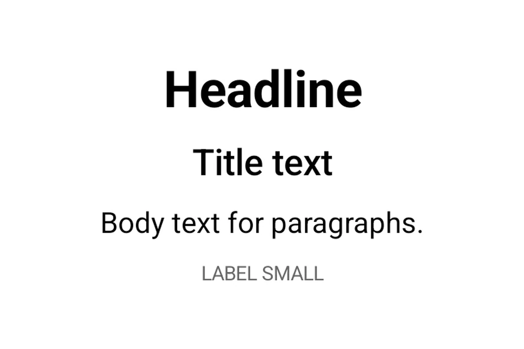

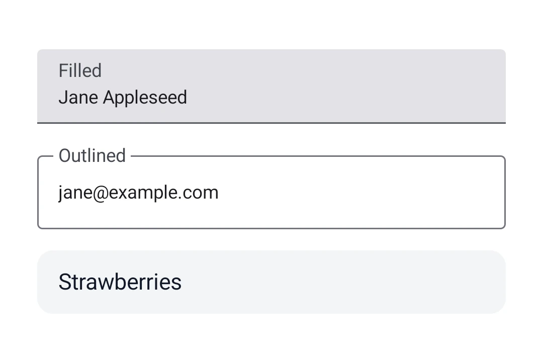
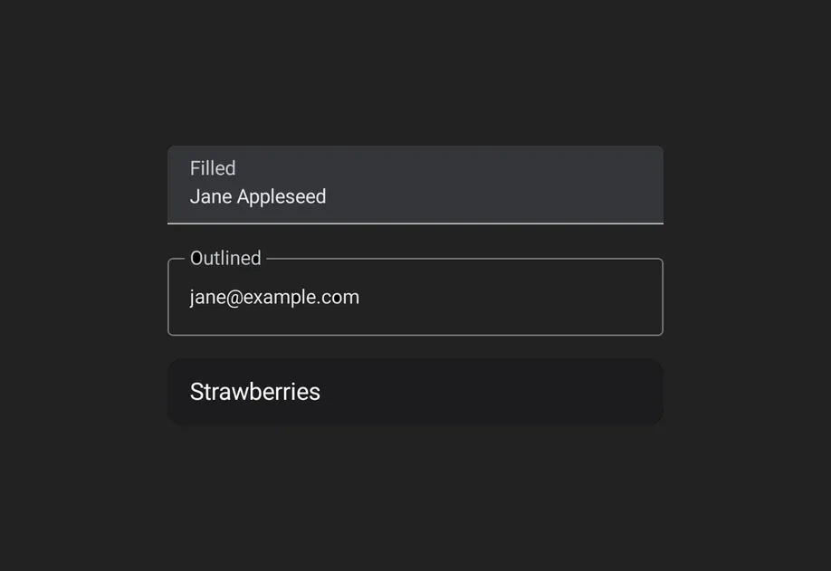
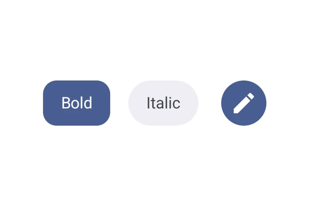
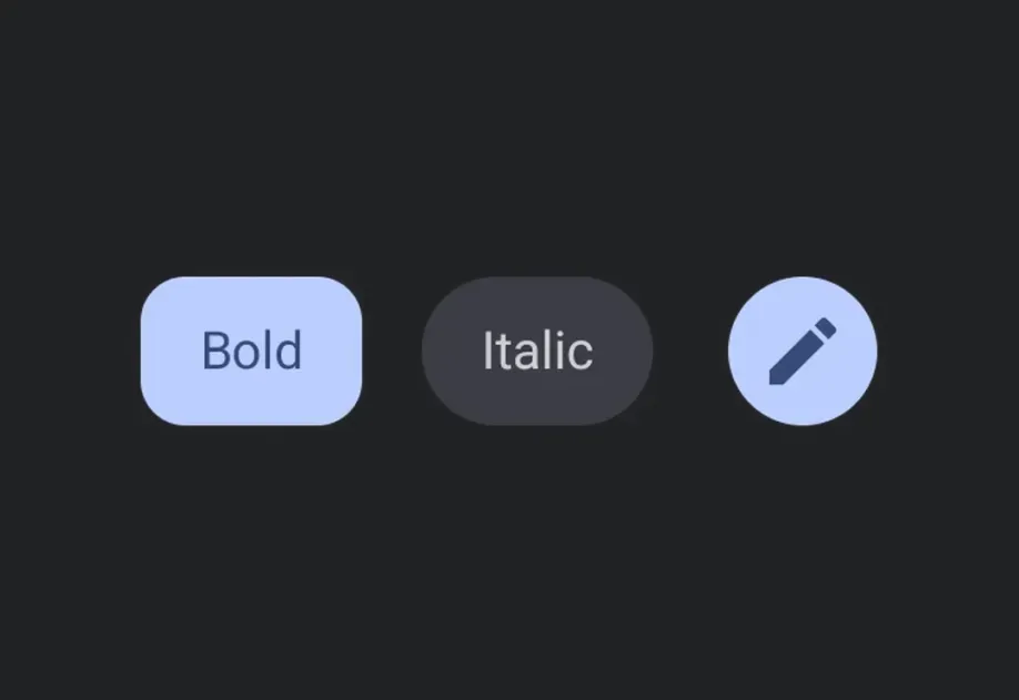
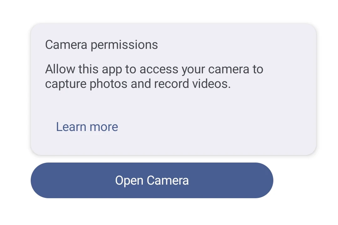
示例
修饰符
修饰符通过 modifiers 属性按数组顺序应用。将 background 放在 paddingAll 之前,这样内边距就位于背景内部,而不是外部。
设置屏幕
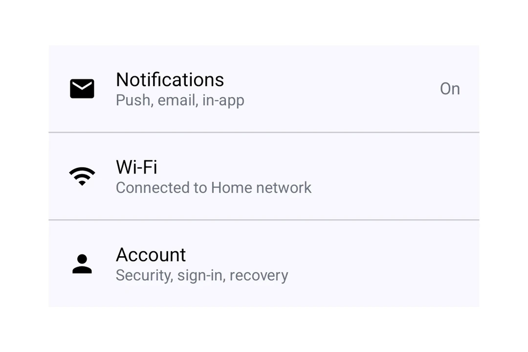
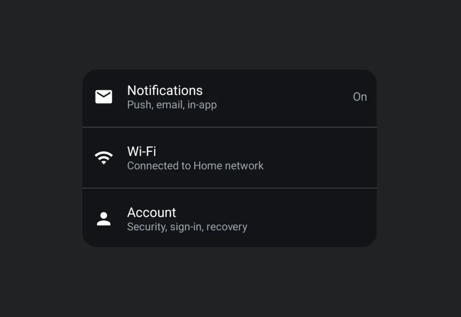
将 ListItem 插槽与 Switch 和 Icon 组合,构建 Material 3 设置屏幕。
亮度行
亮度或音量控制中常见的一种模式是在 Slider 两侧放置图标。为 Slider 添加 weight 修饰符,使其占据图标之外的剩余空间。
次要文本
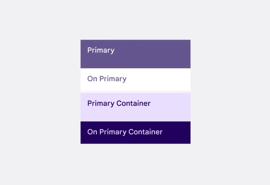
使用 ListItem.SupportingContent 显示第二行,并使用 useMaterialColors 获取随浅色和深色主题变化的文本颜色。