This documentation is available as Markdown for AI agents and LLMs. See the full Markdown index or append .md to any documentation URL.
AlertDialog
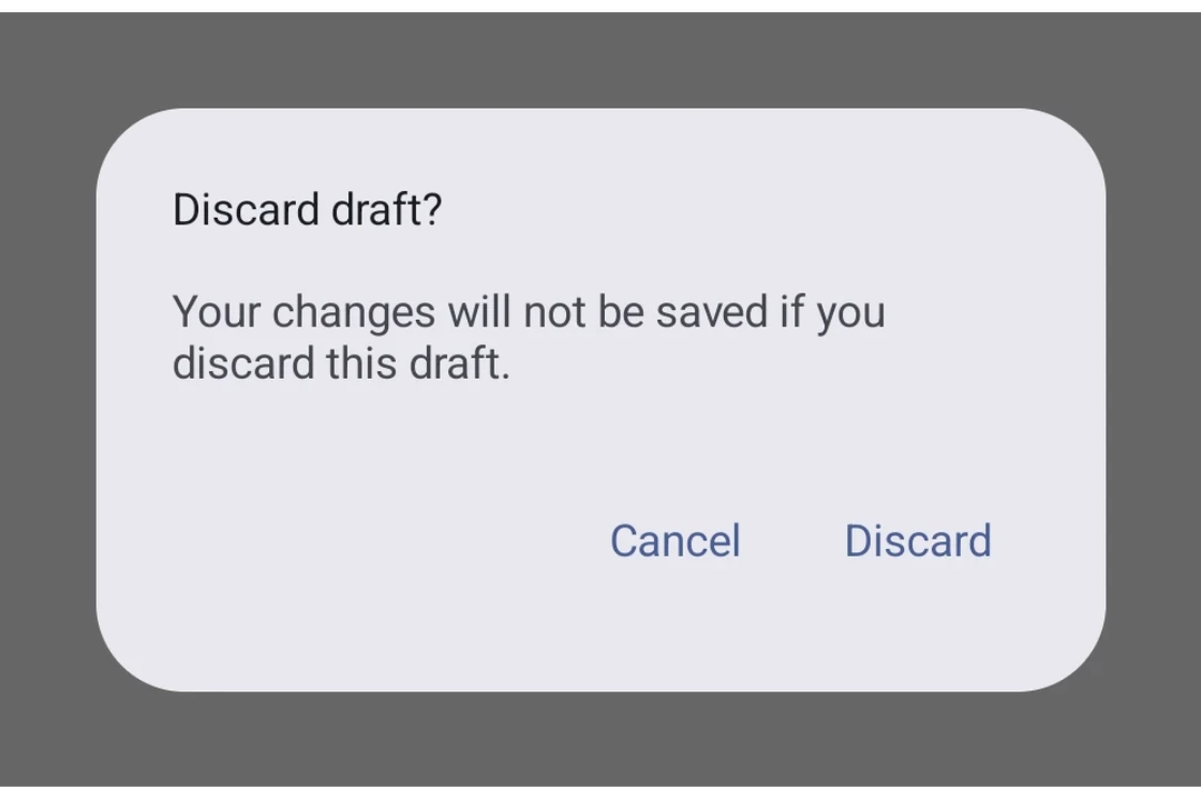
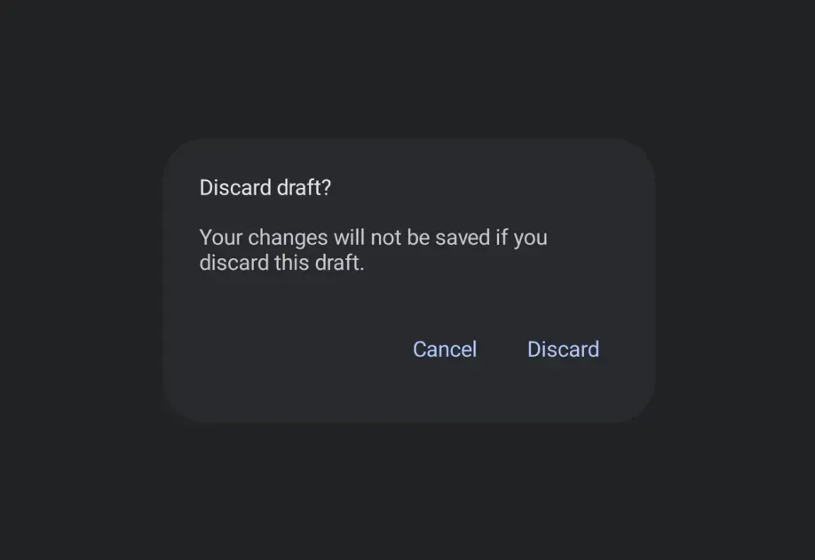
一个用于显示原生警报对话框的 Jetpack Compose AlertDialog 组件。
Expo UI AlertDialog 与官方 Jetpack Compose AlertDialog API 保持一致。内容通过插槽式子组件(AlertDialog.Title、AlertDialog.Text、AlertDialog.ConfirmButton、AlertDialog.DismissButton、AlertDialog.Icon)提供,并直接映射到 Compose 的插槽参数。
安装
If you are installing this in an existing React Native app, make sure to install expo in your project.
用法
基础警告对话框
自定义颜色
带图标
API
import { AlertDialog } from '@expo/ui/jetpack-compose';
Component
Type: React.Element<AlertDialogProps>
Renders an AlertDialog component with slot-based content matching the Compose API.
Content is provided via slot sub-components: AlertDialog.Title, AlertDialog.Text,
AlertDialog.ConfirmButton, AlertDialog.DismissButton, and AlertDialog.Icon.
ReactNodeChildren containing slot sub-components (AlertDialog.Title, AlertDialog.Text,
AlertDialog.ConfirmButton, AlertDialog.DismissButton, AlertDialog.Icon).
() => voidCallback that is called when the user tries to dismiss the dialog (for example, by tapping outside of it or pressing the back button).