HorizontalFloatingToolbar
一个用于显示浮动操作栏的 Jetpack Compose HorizontalFloatingToolbar 组件。
For the complete documentation index, see llms.txt. Use this file to discover all available pages.
Expo UI HorizontalFloatingToolbar 封装了官方的 Jetpack Compose HorizontalFloatingToolbar,并显示一个悬浮在内容上方的水平工具栏,包含操作按钮。
**注意:**如果你只需要一个悬浮按钮,请改用
FloatingActionButton。
安装
- npx expo install @expo/uiIf you are installing this in an existing React Native app, make sure to install expo in your project.
用法
可随滚动内容悬浮的工具栏
将工具栏放在带有 floatingToolbarExitAlwaysScrollBehavior 的 Box 内,以获得随滚动隐藏/显示的行为。使用 align('bottomCenter') 将工具栏定位在屏幕底部。整个布局都保留在 Compose 层中——不需要 React Native 的绝对定位。
import {
  Box,
  HorizontalFloatingToolbar,
  Host,
  Icon,
  IconButton,
  LazyColumn,
  ListItem,
} from '@expo/ui/jetpack-compose';
import { align, fillMaxSize, fillMaxWidth, offset } from '@expo/ui/jetpack-compose/modifiers';

export default function FloatingToolbarExample() {
  return (
    <Host style={{ flex: 1 }}>
      <Box modifiers={[fillMaxSize()]} floatingToolbarExitAlwaysScrollBehavior="bottom">
        <LazyColumn modifiers={[fillMaxSize()]}>{/* ...列表项... */}</LazyColumn>

        <HorizontalFloatingToolbar
          variant="vibrant"
          modifiers={[align('bottomCenter'), offset(0, -16)]}>
          <IconButton onClick={() => console.log('Edit pressed')}>
            <Icon source={require('./assets/edit.xml')} />
          </IconButton>
          <HorizontalFloatingToolbar.FloatingActionButton
            onClick={() => console.log('Add pressed')}>
            <Icon source={require('./assets/add.xml')} />
          </HorizontalFloatingToolbar.FloatingActionButton>
        </HorizontalFloatingToolbar>
      </Box>
    </Host>
  );
}
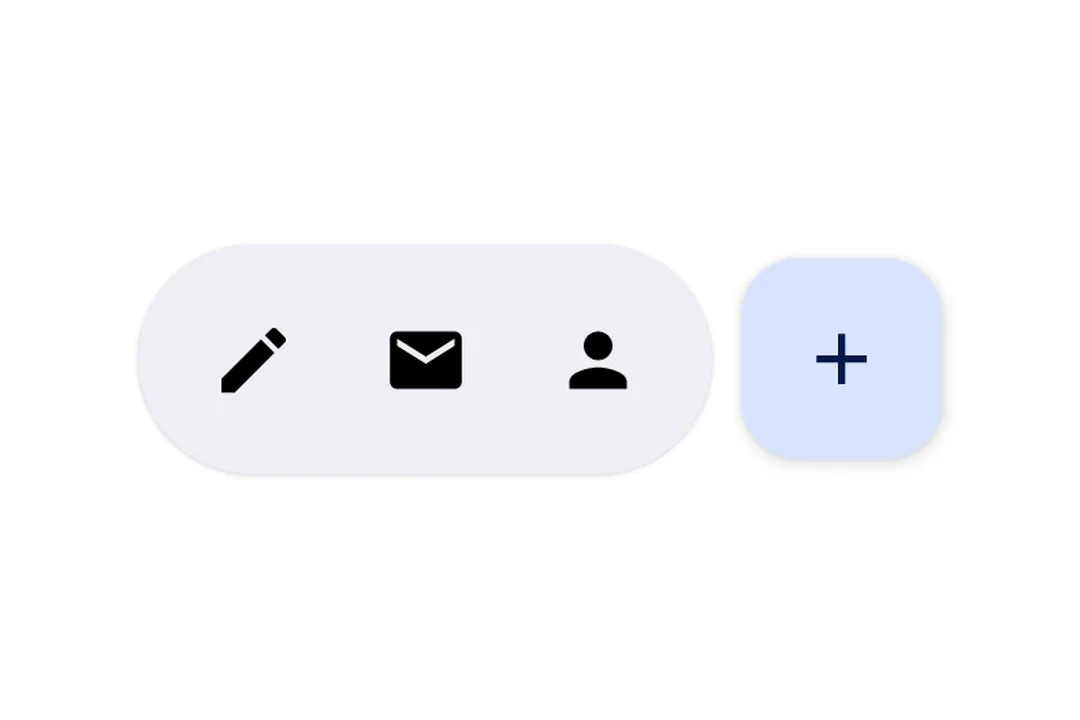
带有 FloatingActionButton 的工具栏
将 IconButton 作为工具栏项的直接子元素使用,并将 HorizontalFloatingToolbar.FloatingActionButton 用作主操作按钮。
import { Host, HorizontalFloatingToolbar, IconButton, Icon } from '@expo/ui/jetpack-compose';

export default function ToolbarWithFABExample() {
  return (
    <Host matchContents>
      <HorizontalFloatingToolbar>
        <IconButton onClick={() => console.log('Edit pressed')}>
          <Icon source={require('./assets/edit.xml')} contentDescription="编辑" />
        </IconButton>
        <IconButton onClick={() => console.log('Share pressed')}>
          <Icon source={require('./assets/share.xml')} contentDescription="分享" />
        </IconButton>
        <HorizontalFloatingToolbar.FloatingActionButton onPress={() => console.log('Add pressed')}>
          <Icon source={require('./assets/add.xml')} contentDescription="添加" />
        </HorizontalFloatingToolbar.FloatingActionButton>
      </HorizontalFloatingToolbar>
    </Host>
  );
}
API
import { HorizontalFloatingToolbar } from '@expo/ui/jetpack-compose';
Components
Type: React.Element<HorizontalFloatingToolbarProps>
Renders a HorizontalFloatingToolbar component.
A horizontal toolbar that floats above content, typically used for action buttons.
HorizontalFloatingToolbarColorsPer-slot color overrides. Any field set here replaces the corresponding color from the variant default; unset fields fall back to the variant.
Type: React.Element<HorizontalFloatingToolbarFloatingActionButtonProps>
FloatingActionButton component for HorizontalFloatingToolbar. This component marks its children to be rendered in the FAB slot.
Types
| Property | Type | Description |
|---|---|---|
| fabContainerColor(optional) | ColorValue | Color of the floating action button container (background). |
| fabContentColor(optional) | ColorValue | Color of the floating action button content (icon). |
| toolbarContainerColor(optional) | ColorValue | Color of the toolbar container (background). |
| toolbarContentColor(optional) | ColorValue | Color of the toolbar content (icons/text). |