Reference version

This documentation is available as Markdown for AI agents and LLMs. See the full Markdown index or append .md to any documentation URL.

文本

一个用于显示样式化文本并支持嵌套文本的 SwiftUI Text 组件。

iOS
tvOS
Included in Expo Go
Recommended version:
~58.0.1

Expo UI Text 匹配官方 SwiftUI Text API。

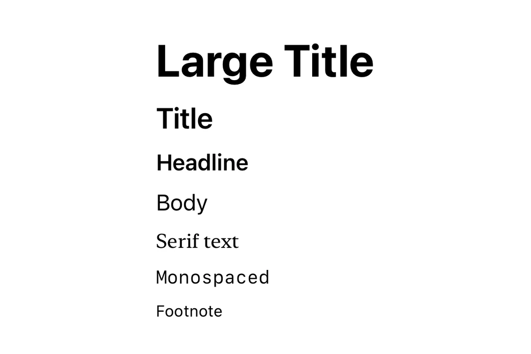
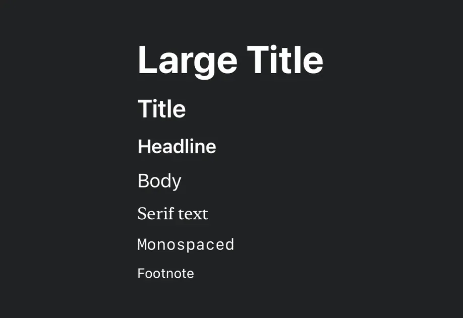
使用不同字体大小、粗细和层级辅助样式渲染的 Text使用不同字体大小、粗细和层级辅助样式渲染的 Text

安装

Terminal
- npx expo install @expo/ui
- yarn expo install @expo/ui
- pnpm expo install @expo/ui
- bun expo install @expo/ui

If you are installing this in an existing React Native app, make sure to install expo in your project.

使用

基本文本

BasicTextExample.tsx
import { Host, Text } from '@expo/ui/swift-ui'; export default function BasicTextExample() { return ( <Host style={{ flex: 1 }}> <Text>Hello world</Text> </Host> ); }

带修饰符的文本

使用修饰符设置整个文本的样式。

StyledTextExample.tsx
import { Host, Text } from '@expo/ui/swift-ui'; import { font, foregroundStyle } from '@expo/ui/swift-ui/modifiers'; export default function StyledTextExample() { return ( <Host style={{ flex: 1 }}> <Text modifiers={[ font({ size: 24, weight: 'bold' }), foregroundStyle('blue'), ]}> Large Bold Blue Text </Text> </Host> ); }

嵌套文本(按片段设置样式)

嵌套 Text 组件,为不同片段设置不同样式。这适用于行内格式设置,例如在句子中使用粗体或彩色文字。

NestedTextExample.tsx
import { Host, Text } from '@expo/ui/swift-ui'; import { bold, italic, foregroundStyle, } from '@expo/ui/swift-ui/modifiers'; export default function NestedTextExample() { return ( <Host style={{ flex: 1 }}> <Text> Hello{' '} <Text modifiers={[bold(), foregroundStyle('red')]}> world </Text> ! </Text> </Host> ); }

混合行内样式

组合多个带样式的片段,实现丰富的文本格式。

MixedStylesExample.tsx
import { Host, Text } from '@expo/ui/swift-ui'; import { bold, italic, foregroundStyle, font, } from '@expo/ui/swift-ui/modifiers'; export default function MixedStylesExample() { return ( <Host matchContents> <Text> This is <Text modifiers={[bold()]}>bold</Text>,{' '} <Text modifiers={[italic()]}>italic</Text>, and{' '} <Text modifiers={[foregroundStyle('orange')]}>colored</Text>{' '} text. </Text> </Host> ); }

字体粗细

使用 font 修饰符应用不同的字体粗细。

FontWeightsExample.tsx
import { Host, Text, VStack } from '@expo/ui/swift-ui'; import { font } from '@expo/ui/swift-ui/modifiers'; export default function FontWeightsExample() { return ( <Host style={{ flex: 1 }}> <VStack spacing={4}> <Text modifiers={[font({ weight: 'ultraLight' })]}> Ultra Light </Text> <Text modifiers={[font({ weight: 'light' })]}>Light</Text> <Text modifiers={[font({ weight: 'regular' })]}> Regular </Text> <Text modifiers={[font({ weight: 'medium' })]}>Medium</Text> <Text modifiers={[font({ weight: 'semibold' })]}> Semibold </Text> <Text modifiers={[font({ weight: 'bold' })]}>Bold</Text> <Text modifiers={[font({ weight: 'heavy' })]}>Heavy</Text> <Text modifiers={[font({ weight: 'black' })]}>Black</Text> </VStack> </Host> ); }

字体设计

使用 font 修饰符应用不同的字体设计。

FontDesignsExample.tsx
import { Host, Text, VStack } from '@expo/ui/swift-ui'; import { font } from '@expo/ui/swift-ui/modifiers'; export default function FontDesignsExample() { return ( <Host style={{ flex: 1 }}> <VStack spacing={4}> <Text modifiers={[font({ design: 'default', size: 18 })]}> Default Design </Text> <Text modifiers={[font({ design: 'rounded', size: 18 })]}> Rounded Design </Text> <Text modifiers={[font({ design: 'serif', size: 18 })]}> Serif Design </Text> <Text modifiers={[font({ design: 'monospaced', size: 18 })]}> Monospaced Design </Text> </VStack> </Host> ); }

自定义字体

使用带有 family 参数的 font 修饰符来使用自定义字体。你可以使用 expo-font 库加载自定义字体。

CustomFontExample.tsx
import { Host, Text, VStack } from '@expo/ui/swift-ui'; import { font } from '@expo/ui/swift-ui/modifiers'; export default function CustomFontExample() { return ( <Host matchContents style={{ alignSelf: 'center' }}> <VStack spacing={4}> <Text modifiers={[font({ family: 'Inter-Bold', size: 18 })]}> Inter Bold </Text> <Text modifiers={[font({ family: 'Inter-Regular', size: 18 })]}> Inter Regular </Text> </VStack> </Host> ); }

带行数限制的文本

使用 lineLimit 修饰符,在达到指定行数后截断文本。

LineLimitExample.tsx
import { Host, Text } from '@expo/ui/swift-ui'; import { lineLimit } from '@expo/ui/swift-ui/modifiers'; export default function LineLimitExample() { const longText = 'This is a very long text that will be truncated after two lines. '.repeat( 5 ); return ( <Host style={{ flex: 1 }}> <Text modifiers={[lineLimit(2)]}>{longText}</Text> </Host> ); }

Markdown

使用 markdownEnabled 属性,为文本内容启用 Markdown 格式。

MarkdownTextExample.tsx
import { Host, Text, VStack } from '@expo/ui/swift-ui'; export default function MarkdownTextExample() { return ( <Host style={{ flex: 1 }}> <VStack spacing={4}> <Text markdownEnabled>Regular text.</Text> <Text markdownEnabled> This is **bold text**, *italic text* and ***text in both bold and italic***. </Text> <Text markdownEnabled>~~Strikethrough text~~</Text> <Text markdownEnabled>`This is monospaced text`</Text> <Text markdownEnabled> Visit the [Expo Docs](https://docs.expo.dev/versions/latest/sdk/ui/) to learn more about Expo UI </Text> </VStack> </Host> ); }

自动更新的日期

使用 date 和 dateStyle 属性显示会随着时间推移自动更新的日期。这在 widgets 和 Live Activities 中尤其有用。

DateTextExample.tsx
import { Host, Text } from '@expo/ui/swift-ui'; export default function DateTextExample() { return ( <Host style={{ flex: 1 }}> <Text date={new Date(Date.now() + 300000)} dateStyle="timer" /> </Host> ); }

计时器间隔

使用 timerInterval 显示实时倒计时或正计时器。这需要 iOS/tvOS 16+。

TimerIntervalExample.tsx
import { Host, Text } from '@expo/ui/swift-ui'; export default function TimerIntervalExample() { return ( <Host style={{ flex: 1 }}> <Text timerInterval={{ lower: new Date(), upper: new Date(Date.now() + 600000), }} countsDown /> </Host> ); }

API

import { Text } from '@expo/ui/swift-ui';

Component

Text

iOS
tvOS

Type: React.Element<TextProps>

TextProps

children

iOS
tvOS
Optional • Type: ReactNode

Text content or nested Text components.

countsDown

iOS 16.0+
tvOS 16.0+
Optional • Type: boolean • Default: true

Whether the timer counts down (true) or up (false).

date

iOS
tvOS
Optional • Type: Date

A date to display using the specified dateStyle. The text auto-updates as time passes.

dateStyle

iOS
tvOS
Optional • Type: TextDateStyle • Default: 'date'

The style used to format the date prop.

markdownEnabled

iOS
tvOS
Optional • Type: boolean

Enables Markdown formatting for the text content using SwiftUI LocalizedStringKey.

pauseTime

iOS 16.0+
tvOS 16.0+
Optional • Type: Date

A date at which the timer should appear paused.

timerInterval

iOS 16.0+
tvOS 16.0+
Optional • Type: ClosedRangeDate

A time interval to display as a live-updating timer.

Types

TextDateStyle

iOS
tvOS

Literal type: string

The style used to format a date in a SwiftUI Text view.

Acceptable values are: 'timer' | 'relative' | 'offset' | 'date' | 'time'