Reference version

This documentation is available as Markdown for AI agents and LLMs. See the full Markdown index or append .md to any documentation URL.

Section

用于在列表和表单中对内容进行分组的 SwiftUI Section 组件。

iOS
tvOS
Included in Expo Go
Recommended version:
~58.0.1

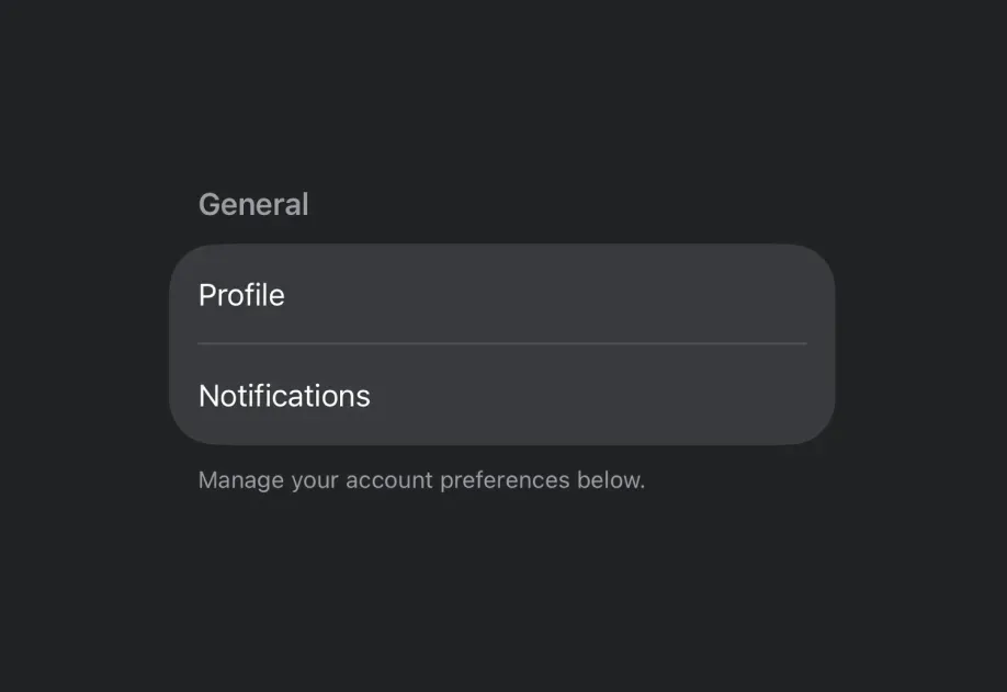
Expo UI Section matches the official SwiftUI Section API,用于在 List、Form 或 Picker 组件中对相关内容进行分组。
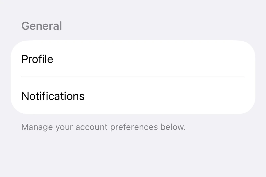
Form 中的两个 Section,每个都有一个标题和分组的 ToggleForm 中的两个 Section,每个都有一个标题和分组的 Toggle

安装

Terminal
- npx expo install @expo/ui
- yarn expo install @expo/ui
- pnpm expo install @expo/ui
- bun expo install @expo/ui

If you are installing this in an existing React Native app, make sure to install expo in your project.

用法

带标题的基本 Section

使用 title prop 创建带有文本标题的简单 Section。

BasicSectionExample.tsx
import { Host, List, Section, Text } from '@expo/ui/swift-ui'; export default function BasicSectionExample() { return ( <Host style={{ flex: 1 }}> <List> <Section title="Settings"> <Text>General</Text> <Text>Privacy</Text> <Text>Notifications</Text> </Section> </List> </Host> ); }

自定义标题和页脚的 Section

使用 header 和 footer props 创建自定义视图。仅当未提供 title 时才会使用这些 props。

CustomHeaderFooterExample.tsx
import { Host, List, Section, Toggle, Text, HStack, Image, } from '@expo/ui/swift-ui'; import { useState } from 'react'; export default function CustomHeaderFooterExample() { const [locationEnabled, setLocationEnabled] = useState(false); return ( <Host style={{ flex: 1 }}> <List> <Section header={ <HStack> <Image systemName="location.fill" color="blue" size={16} /> <Text>Location Services</Text> </HStack> } footer={ <Text> Enabling location services allows the app to provide personalized recommendations. </Text> }> <Toggle label="Enable location" isOn={locationEnabled} onIsOnChange={setLocationEnabled} /> </Section> </List> </Host> ); }

可折叠的 Section

使用 isExpanded prop 控制 Section 是展开还是折叠。提供该 prop 后,Section 将变为可折叠。使用 onIsExpandedChange 处理状态变化。

CollapsibleSectionExample.tsx
import { useState } from 'react'; import { Host, List, Section, Text } from '@expo/ui/swift-ui'; import { listStyle } from '@expo/ui/swift-ui/modifiers'; export default function CollapsibleSectionExample() { const [favoritesExpanded, setFavoritesExpanded] = useState(false); const [recentsExpanded, setRecentsExpanded] = useState(false); return ( <Host style={{ flex: 1 }}> <List modifiers={[listStyle('sidebar')]}> <Section title="Favorites" isExpanded={favoritesExpanded} onIsExpandedChange={setFavoritesExpanded}> <Text>Home</Text> <Text>Work</Text> <Text>Gym</Text> </Section> <Section title="Recents" isExpanded={recentsExpanded} onIsExpandedChange={setRecentsExpanded}> <Text>Coffee Shop</Text> <Text>Library</Text> <Text>Park</Text> </Section> </List> </Host> ); }

Form 中的多个 Section

Section 可以在 Form 组件中使用,将表单控件组织成逻辑分组。

FormSectionsExample.tsx
import { useState } from 'react'; import { Host, Form, Section, Toggle, Picker, Text, Button, } from '@expo/ui/swift-ui'; import { pickerStyle, tag } from '@expo/ui/swift-ui/modifiers'; export default function FormSectionsExample() { const [darkMode, setDarkMode] = useState(false); const [notifications, setNotifications] = useState(true); const [language, setLanguage] = useState(0); const languages = ['English', 'Spanish', 'French', 'German']; return ( <Host style={{ flex: 1 }}> <Form> <Section title="Appearance"> <Toggle label="Dark Mode" isOn={darkMode} onIsOnChange={setDarkMode} /> <Picker label="Language" selection={language} onSelectionChange={setLanguage} modifiers={[pickerStyle('menu')]}> {languages.map((lang, index) => ( <Text key={index} modifiers={[tag(index)]}> {lang} </Text> ))} </Picker> </Section> <Section title="Notifications"> <Toggle label="Push Notifications" isOn={notifications} onIsOnChange={setNotifications} /> </Section> <Section title="Account"> <Button label="Sign out" role="destructive" onPress={() => alert('Signed out')} /> </Section> </Form> </Host> ); }

API

import { Section } from '@expo/ui/swift-ui';

Component

Section

iOS
tvOS

Type: React.Element<SectionProps>

Section component uses the native Section component.

SectionProps

children

iOS
tvOS
Type: ReactNode

The content of the section.

iOS
tvOS
Optional • Type: ReactNode

Sets a custom footer for the section.

iOS
tvOS
Optional • Type: ReactNode

Sets a custom header for the section.

isExpanded

iOS 17.0+
tvOS 17.0+
Optional • Type: boolean

Controls whether the section is expanded or collapsed. When provided, the section becomes collapsible.

onIsExpandedChange

iOS 17.0+
tvOS 17.0+
Optional • Type: (isExpanded: boolean) => void

Callback triggered when the section's expanded state changes.

title

iOS
tvOS
Optional • Type: string

The title of the section.