Reference version

This documentation is available as Markdown for AI agents and LLMs. See the full Markdown index or append .md to any documentation URL.

Alert

用于呈现原生 iOS 警告对话框的 SwiftUI 警告组件。

iOS
tvOS
Included in Expo Go
Recommended version:
~58.0.1

Expo UI Alert 与官方 SwiftUI alert API 相匹配,并呈现一个原生 iOS 警告对话框,包含标题、操作按钮和可选消息。
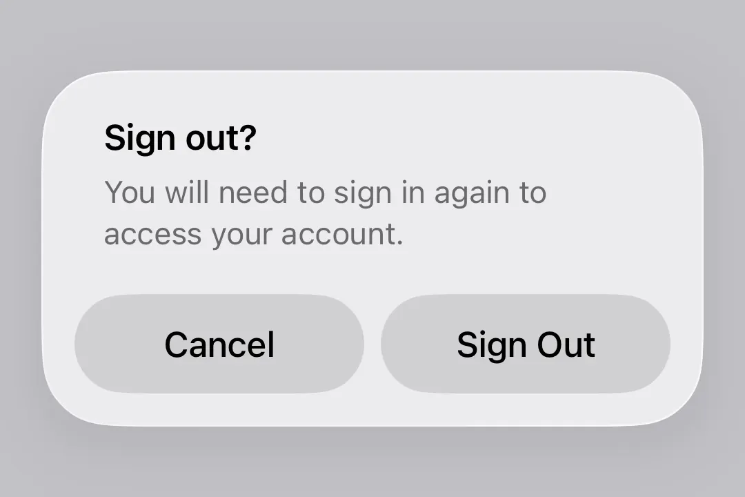
提醒用户确认退出登录的警告提醒用户确认退出登录的警告

Alert 是 ConfirmationDialog 的居中模态对应组件,后者会从屏幕底部显示为操作表。两者使用相同的触发器/操作/消息插槽模型,因此调用方只需更改组件名称即可在两者之间切换。

安装

Terminal
- npx expo install @expo/ui
- yarn expo install @expo/ui
- pnpm expo install @expo/ui
- bun expo install @expo/ui

If you are installing this in an existing React Native app, make sure to install expo in your project.

用法

基本警告

使用 Alert.Trigger 定义可见元素,并使用 Alert.Actions 提供对话框按钮。

BasicAlertExample.tsx
import { useState } from 'react'; import { Host, Alert, Button } from '@expo/ui/swift-ui'; export default function BasicAlertExample() { const [isPresented, setIsPresented] = useState(false); return ( <Host style={{ flex: 1 }}> <Alert title="Saved" isPresented={isPresented} onIsPresentedChange={setIsPresented}> <Alert.Trigger> <Button label="Show alert" onPress={() => setIsPresented(true)} /> </Alert.Trigger> <Alert.Actions> <Button label="OK" onPress={() => setIsPresented(false)} /> </Alert.Actions> </Alert> </Host> ); }

取消和确认

结合使用 role="cancel" 和确认按钮,构建标准的是/否警告。

CancelConfirmAlertExample.tsx
import { useState } from 'react'; import { Host, Alert, Button, Text } from '@expo/ui/swift-ui'; export default function CancelConfirmAlertExample() { const [isPresented, setIsPresented] = useState(false); return ( <Host style={{ flex: 1 }}> <Alert title="Sign out?" isPresented={isPresented} onIsPresentedChange={setIsPresented}> <Alert.Trigger> <Button label="Sign out" onPress={() => setIsPresented(true)} /> </Alert.Trigger> <Alert.Actions> <Button label="Sign out" onPress={() => console.log('Signed out')} /> <Button label="Cancel" role="cancel" /> </Alert.Actions> <Alert.Message> <Text> You will need to sign in again to access your account. </Text> </Alert.Message> </Alert> </Host> ); }

破坏性操作

在 Alert.Actions 内的 Button 上使用 role="destructive",将其样式设为破坏性操作。

DestructiveAlertExample.tsx
import { useState } from 'react'; import { Host, Alert, Button, Text } from '@expo/ui/swift-ui'; export default function DestructiveAlertExample() { const [isPresented, setIsPresented] = useState(false); return ( <Host style={{ flex: 1 }}> <Alert title="Delete account?" isPresented={isPresented} onIsPresentedChange={setIsPresented}> <Alert.Trigger> <Button label="Delete account" role="destructive" onPress={() => setIsPresented(true)} /> </Alert.Trigger> <Alert.Actions> <Button label="Delete" role="destructive" onPress={() => { console.log('Deleted'); setIsPresented(false); }} /> <Button label="Cancel" role="cancel" /> </Alert.Actions> <Alert.Message> <Text> This permanently deletes your account and all data. This cannot be undone. </Text> </Alert.Message> </Alert> </Host> ); }

API

import { Alert } from '@expo/ui/swift-ui';

Component

Alert

iOS
tvOS

Type: React.Element<AlertProps>

Alert presents a SwiftUI alert with a title, optional message, and action buttons.

Props of the Alert component.

AlertProps

children

iOS
tvOS
Type: React.ReactNode

The contents of the alert. Should include Alert.Trigger, Alert.Actions, and optionally Alert.Message.

isPresented

iOS
tvOS
Optional • Type: boolean

Whether the alert is presented.

onIsPresentedChange

iOS
tvOS
Optional • Type: (isPresented: boolean) => void

A callback that is called when the isPresented state changes.

title

iOS
tvOS
Type: string

The title of the alert.

.