This documentation is available as Markdown for AI agents and LLMs. See the full Markdown index or append .md to any documentation URL.
Slider
用于从范围中选择值的 SwiftUI Slider 组件。
如需跨平台使用,请参阅通用
Slider— 它会根据平台渲染相应的原生组件。
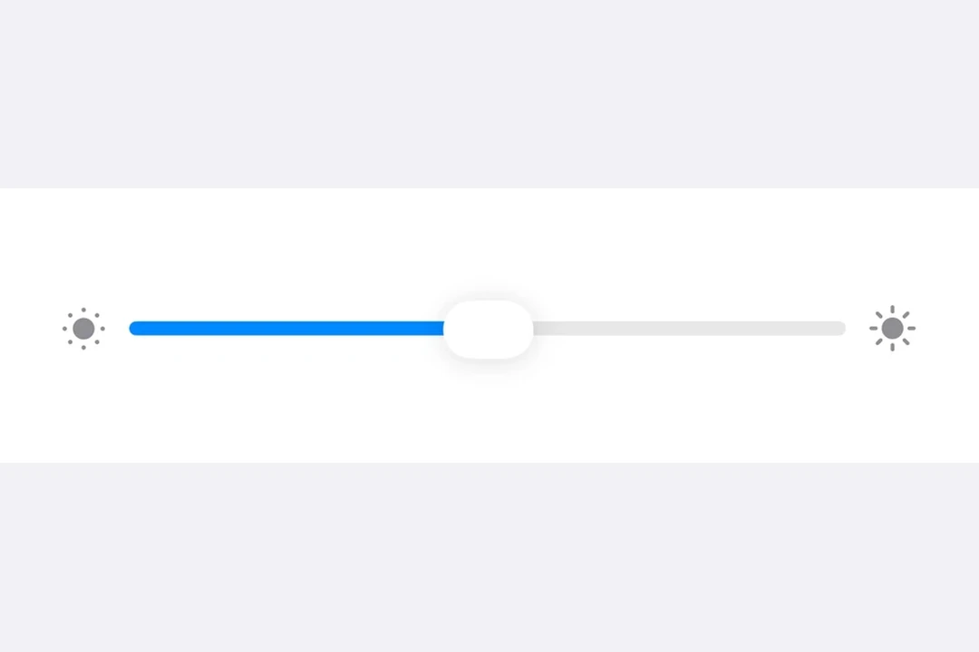
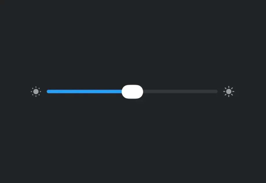
Expo UI Slider 与官方 SwiftUI Slider API 相匹配,可用于从有界范围内选择值。
安装
If you are installing this in an existing React Native app, make sure to install expo in your project.
用法
注意:
Slider是一个宽度灵活的组件,会扩展以填充可用的水平空间,并且没有固有宽度。对Host使用matchContents时,应在Slider上应用frame修饰符,为其指定明确的宽度。或者,使用style为Host指定明确的尺寸(例如style={{ width: 300 }}或style={{ flex: 1 }}),也可以将Slider放在Form等可提供宽度约束的 SwiftUI 容器中。
基本 Slider
带自定义范围的 Slider
带步长的 Slider
使用 step 属性定义离散增量。将 step 设为 0 可使用连续值。
带标签的 Slider
你可以添加标签来说明 Slider 的用途,并标记最小值和最大值的位置。
API
import { Slider } from '@expo/ui/swift-ui';
Component
Type: React.Element<SliderProps>
numberLower limit the user can drag the thumb to. The visible track still
spans min..max, but the thumb stops at lowerLimit during drag.
numberThe maximum value of the slider. Updating this value does not trigger callbacks if the current value is above max.
numberThe minimum value of the slider. Updating this value does not trigger callbacks if the current value is below min.
(isEditing: boolean) => voidCallback triggered when the user starts or ends editing the slider.
(value: number) => voidCallback triggered on dragging along the slider.
numberUpper limit the user can drag the thumb to. The visible track still
spans min..max, but the thumb stops at upperLimit during drag.