This documentation is available as Markdown for AI agents and LLMs. See the full Markdown index or append .md to any documentation URL.
ControlGroup
用于对交互式控件进行分组的 SwiftUI ControlGroup 组件。
Expo UI ControlGroup 与官方 SwiftUI ControlGroup API 相对应。放在 Menu 中时,子元素会显示为一行紧凑的水平按钮。

注意: 在 tvOS 上,
ControlGroup需要 tvOS 17.0 或更高版本。
安装
If you are installing this in an existing React Native app, make sure to install expo in your project.
用法
基本控制组
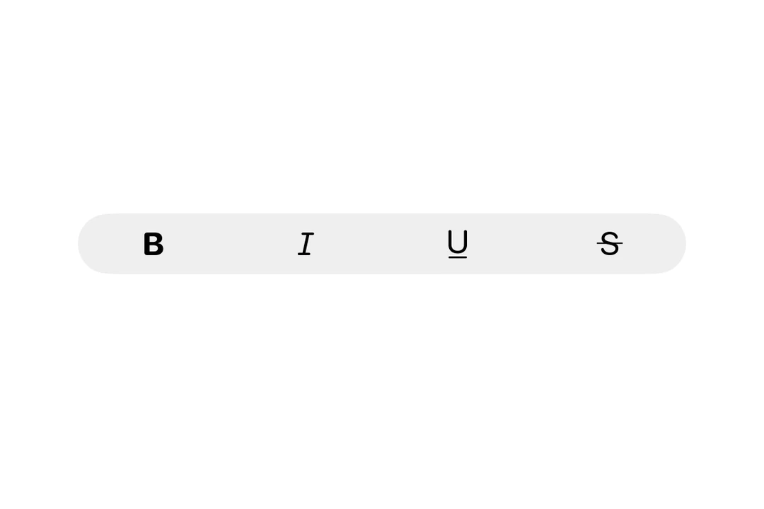
菜单中的控制组会显示为一行水平排列的图标按钮。
API
import { ControlGroup } from '@expo/ui/swift-ui';
Component
Type: React.Element<ControlGroupProps>
ReactNodeThe control group's content.
Can contain Button, Toggle, Picker, or other interactive controls.
ReactNodeThe label for the control group. Can be a string for simple text labels,
or a Label component for custom label content. When omitted, the control group
has no label.
SFSymbols7_0An SF Symbol name to display alongside the label.
Only used when label is a string.