Reference version

This documentation is available as Markdown for AI agents and LLMs. See the full Markdown index or append .md to any documentation URL.

Form

一个 SwiftUI Form 组件,用于以结构化布局收集用户输入。

iOS
tvOS
Included in Expo Go
Recommended version:
~58.0.1

Expo UI Form 与官方 SwiftUI Form API 相对应。它提供一个容器,用于对数据输入控件进行分组,例如设置或检查面板中的控件。
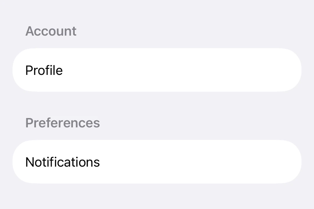
包含两个分组 Section 的 Form,其中有 Toggle 和页脚说明包含两个分组 Section 的 Form,其中有 Toggle 和页脚说明

安装

Terminal
- npx expo install @expo/ui
- yarn expo install @expo/ui
- pnpm expo install @expo/ui
- bun expo install @expo/ui

If you are installing this in an existing React Native app, make sure to install expo in your project.

用法

基本表单

BasicFormExample.tsx
import { Host, Form, TextField } from '@expo/ui/swift-ui'; export default function BasicFormExample() { return ( <Host style={{ flex: 1 }}> <Form> <TextField placeholder="Enter your name" /> </Form> </Host> ); }

带分区的表单

使用 Section 组件对表单中相关的控件进行分组。

FormWithSectionsExample.tsx
import { useState } from 'react'; import { Host, Form, Section, TextField, Toggle, Button, } from '@expo/ui/swift-ui'; export default function FormWithSectionsExample() { const [notifications, setNotifications] = useState(false); const [darkMode, setDarkMode] = useState(false); return ( <Host style={{ flex: 1 }}> <Form> <Section title="Profile"> <TextField placeholder="Name" /> <TextField placeholder="Email" /> </Section> <Section title="Preferences"> <Toggle label="Enable notifications" isOn={notifications} onIsOnChange={setNotifications} /> <Toggle label="Dark mode" isOn={darkMode} onIsOnChange={setDarkMode} /> </Section> <Section> <Button label="Save changes" onPress={() => console.log('Saved!')} /> </Section> </Form> </Host> ); }

带自定义背景的表单

使用 scrollContentBackground 修饰符来自定义或隐藏表单的背景。

FormBackgroundExample.tsx
import { Host, Form, Section, TextField } from '@expo/ui/swift-ui'; import { scrollContentBackground, background, } from '@expo/ui/swift-ui/modifiers'; export default function FormBackgroundExample() { return ( <Host style={{ flex: 1 }}> <Form modifiers={[ scrollContentBackground('hidden'), background('#F0F0F0'), ]}> <Section title="Custom Background"> <TextField placeholder="Enter text" /> </Section> </Form> </Host> ); }

不可滚动的表单

使用 scrollDisabled 修饰符可阻止表单滚动。

NonScrollableFormExample.tsx
import { useState } from 'react'; import { Host, Form, Section, TextField, Toggle, } from '@expo/ui/swift-ui'; import { scrollDisabled } from '@expo/ui/swift-ui/modifiers'; export default function NonScrollableFormExample() { const [isOn, setIsOn] = useState(false); return ( <Host style={{ flex: 1 }}> <Form modifiers={[scrollDisabled()]}> <Section title="Settings"> <Toggle label="Enable feature" isOn={isOn} onIsOnChange={setIsOn} /> </Section> </Form> </Host> ); }

下拉刷新表单

使用 refreshable 修饰符添加下拉刷新功能。

RefreshableFormExample.tsx
import { useState, useCallback } from 'react'; import { Host, Form, Section, Text } from '@expo/ui/swift-ui'; import { refreshable } from '@expo/ui/swift-ui/modifiers'; export default function RefreshableFormExample() { const [lastRefresh, setLastRefresh] = useState(new Date()); const handleRefresh = useCallback(async () => { // Simulate network request await new Promise(resolve => setTimeout(resolve, 1500)); setLastRefresh(new Date()); }, []); return ( <Host style={{ flex: 1 }}> <Form modifiers={[refreshable(handleRefresh)]}> <Section title="Pull to refresh"> <Text> Last refreshed: {lastRefresh.toLocaleTimeString()} </Text> </Section> </Form> </Host> ); }

API

import { Form } from '@expo/ui/swift-ui';

Component

Form

iOS
tvOS

Type: React.Element<FormProps>

FormProps

children

iOS
tvOS
Type: ReactNode

The content of the form.