This documentation is available as Markdown for AI agents and LLMs. See the full Markdown index or append .md to any documentation URL.
Gauge
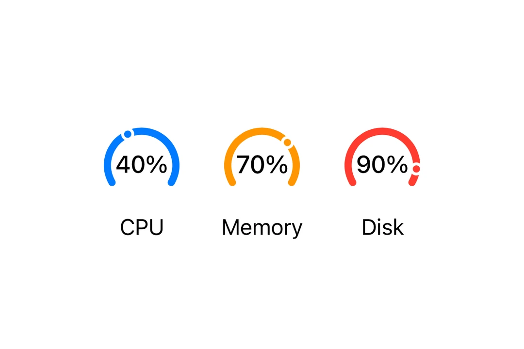
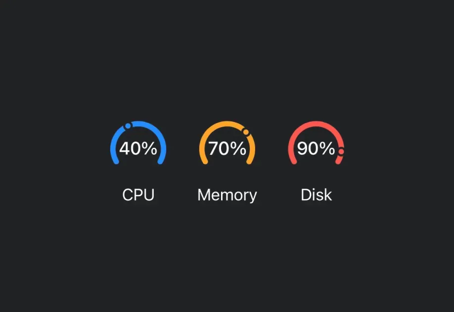
一个 SwiftUI Gauge 组件,用于通过视觉指示器显示进度。
Expo UI Gauge 与官方 SwiftUI Gauge API 相对应,并支持通过 gaugeStyle 修饰符设置样式。
安装
If you are installing this in an existing React Native app, make sure to install expo in your project.
用法
基本 Gauge
带标签
你可以将自定义组件作为 children 传入,为 Gauge 提供标签。
带数值标签
使用 currentValueLabel、minimumValueLabel 和 maximumValueLabel 属性显示数值信息。
Gauge 样式
使用 gaugeStyle 修饰符更改 Gauge 的外观。可用样式包括:automatic、circular、circularCapacity、linear 和 linearCapacity。
着色 Gauge
使用 tint 修饰符更改 Gauge 的颜色。
API
import { Gauge } from '@expo/ui/swift-ui';
Component
Type: React.Element<GaugeProps>
Renders a SwiftUI Gauge component.
ReactNodeA label showing the current value. Use Text or Label to display the value.
ReactNodeA label showing the maximum value. Use Text or Label to display the value.
ReactNodeA label showing the minimum value. Use Text or Label to display the value.