Reference version

This documentation is available as Markdown for AI agents and LLMs. See the full Markdown index or append .md to any documentation URL.

DisclosureGroup

用于显示可展开内容的 SwiftUI DisclosureGroup 组件。

iOS
Included in Expo Go
Recommended version:
~58.0.1

Expo UI DisclosureGroup 与官方 SwiftUI DisclosureGroup API 相对应,并显示一个可展开或收起内容的披露指示符。
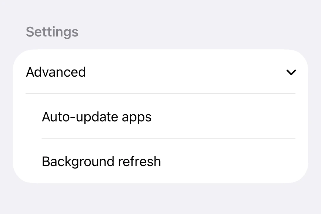
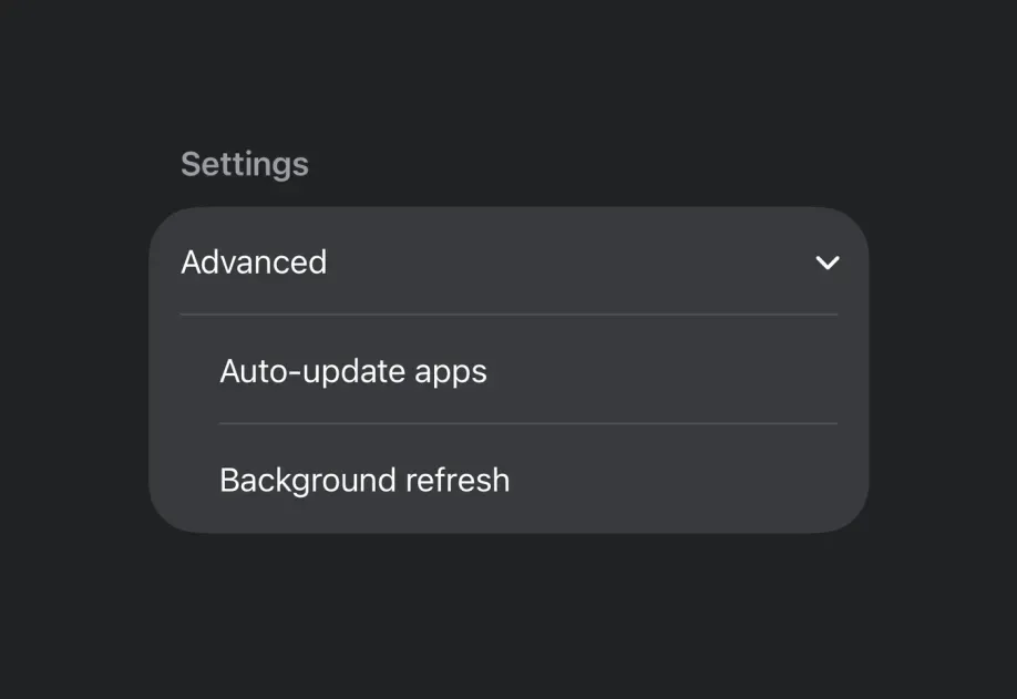
在 Form 中展开的 DisclosureGroup在 Form 中展开的 DisclosureGroup

安装

Terminal
- npx expo install @expo/ui
- yarn expo install @expo/ui
- pnpm expo install @expo/ui
- bun expo install @expo/ui

If you are installing this in an existing React Native app, make sure to install expo in your project.

用法

基本披露组

DisclosureGroup 最常用于 Form 内,以应用标准的 iOS 列表样式和箭头指示符。

BasicDisclosureGroupExample.tsx
import { useState } from 'react'; import { DisclosureGroup, Form, Host, Section, Text, } from '@expo/ui/swift-ui'; export default function BasicDisclosureGroupExample() { const [isExpanded, setIsExpanded] = useState(true); return ( <Host style={{ flex: 1 }}> <Form> <Section> <DisclosureGroup label="Advanced settings" isExpanded={isExpanded} onIsExpandedChange={setIsExpanded}> <Text>Auto-update apps</Text> <Text>App downloads</Text> <Text>Offload unused apps</Text> </DisclosureGroup> </Section> </Form> </Host> ); }

初始展开

将 isExpanded 初始设为 true,即可默认显示内容。

InitiallyExpandedExample.tsx
import { useState } from 'react'; import { Host, DisclosureGroup, Text } from '@expo/ui/swift-ui'; export default function InitiallyExpandedExample() { const [isExpanded, setIsExpanded] = useState(true); // A disclosure group fills the width it is given, so `matchContents` collapses it. return ( <Host style={{ flex: 1 }}> <DisclosureGroup label="Details" isExpanded={isExpanded} onIsExpandedChange={setIsExpanded}> <Text>This content is visible by default.</Text> </DisclosureGroup> </Host> ); }

自定义标签

如果标签需要自定义 SwiftUI 内容或修饰符,而不是使用 label 字符串属性,请使用 DisclosureGroup.Label。

CustomLabelDisclosureGroupExample.tsx
import { useState } from 'react'; import { DisclosureGroup, Form, Host, Section, Text, } from '@expo/ui/swift-ui'; import { font, foregroundStyle } from '@expo/ui/swift-ui/modifiers'; export default function CustomLabelDisclosureGroupExample() { const [isExpanded, setIsExpanded] = useState(false); return ( <Host style={{ flex: 1 }}> <Form> <Section> <DisclosureGroup isExpanded={isExpanded} onIsExpandedChange={setIsExpanded}> <DisclosureGroup.Label> <Text modifiers={[ font({ weight: 'semibold' }), foregroundStyle('#0a7ea4'), ]}> Network options </Text> </DisclosureGroup.Label> <Text>Wi-Fi</Text> <Text>Bluetooth</Text> <Text>Cellular data</Text> </DisclosureGroup> </Section> </Form> </Host> ); }

API

import { DisclosureGroup } from '@expo/ui/swift-ui';

Component

DisclosureGroup

iOS

Type: React.Element<DisclosureGroupProps>

DisclosureGroupProps

children

iOS
Type: ReactNode

isExpanded

iOS
Optional • Type: boolean

Controls whether the disclosure group is expanded.

label

iOS
Optional • Type: string

Text label for the disclosure group. Use DisclosureGroup.Label for custom label content.

onIsExpandedChange

iOS
Optional • Type: (isExpanded: boolean) => void

A callback that is called when the expansion state changes.