Reference version

This documentation is available as Markdown for AI agents and LLMs. See the full Markdown index or append .md to any documentation URL.

SwiftUI

使用 @expo/ui 构建原生 iOS 界面的 SwiftUI 组件。

iOS
tvOS
Included in Expo Go
Recommended version:
~58.0.1

@expo/ui/swift-ui 中的 SwiftUI 组件允许你使用 SwiftUI 从 React Native 构建完全原生的 iOS 界面。

安装

Terminal
- npx expo install @expo/ui
- yarn expo install @expo/ui
- pnpm expo install @expo/ui
- bun expo install @expo/ui

If you are installing this in an existing React Native app, make sure to install expo in your project.

用法

Expo UI 提供了多个 SwiftUI 组件。你可以通过从 @expo/ui/swift-ui 导入这些组件,在应用中使用它们。不过,要跨越从 React Native(UIKit)到 SwiftUI 的边界,你需要使用 Host 组件。 Host 是 SwiftUI 视图的容器。你可以把它看作 DOM 中的 <svg>,或 react-native-skia 中的 <Canvas>。在底层,它使用 UIHostingController 在 UIKit 中渲染 SwiftUI 视图。

import { Host, Button } from '@expo/ui/swift-ui'; export function SaveButton() { return ( <Host style={{ flex: 1 }}> <Button label="Save changes" /> </Host> ); }
使用 SwiftUI 扩展

创建可与 Expo UI 集成的自定义 SwiftUI 组件和修饰符。

Expo UI iOS Liquid Glass 教程

了解如何使用全新的 Expo UI,在 React Native 应用中构建真正的 SwiftUI 视图。

可用组件
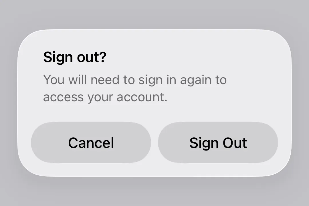
示例

修饰符

SwiftUI 修饰符可自定义 SwiftUI 组件的外观和行为。Expo UI 也为 SwiftUI 组件提供了修饰符。你可以从 @expo/ui/swift-ui/modifiers 导入修饰符,并将它们作为数组传递给 modifiers 属性。在以下示例中, expo-mesh-gradient 与 glassEffect 修饰符组合使用,创建了 Liquid Glass 文本。

GlassEffectExample.tsx
import { Host, Text } from '@expo/ui/swift-ui'; import { font, glassEffect, padding, } from '@expo/ui/swift-ui/modifiers'; import { MeshGradientView } from 'expo-mesh-gradient'; import { View } from 'react-native'; export default function GlassEffectExample() { return ( <View style={{ flex: 1 }}> <MeshGradientView style={{ flex: 1 }} columns={3} rows={3} colors={[ 'red', 'purple', 'indigo', 'orange', 'white', 'blue', 'yellow', 'green', 'cyan', ]} points={[ [0.0, 0.0], [0.5, 0.0], [1.0, 0.0], [0.0, 0.5], [0.5, 0.5], [1.0, 0.5], [0.0, 1.0], [0.5, 1.0], [1.0, 1.0], ]} /> <Host style={{ position: 'absolute', top: 0, right: 0, left: 0, bottom: 0, }}> <Text modifiers={[ font({ size: 32 }), padding({ all: 16, }), glassEffect({ glass: { variant: 'clear', }, }), ]}> Glass effect text </Text> </Host> </View> ); }

iOS 设置应用

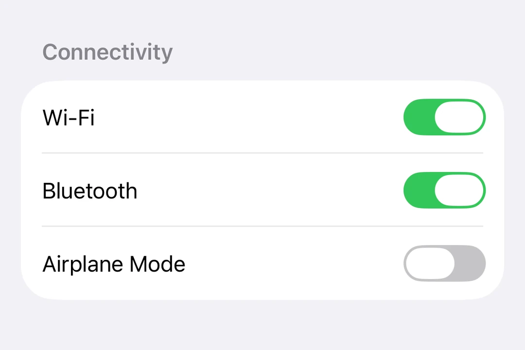
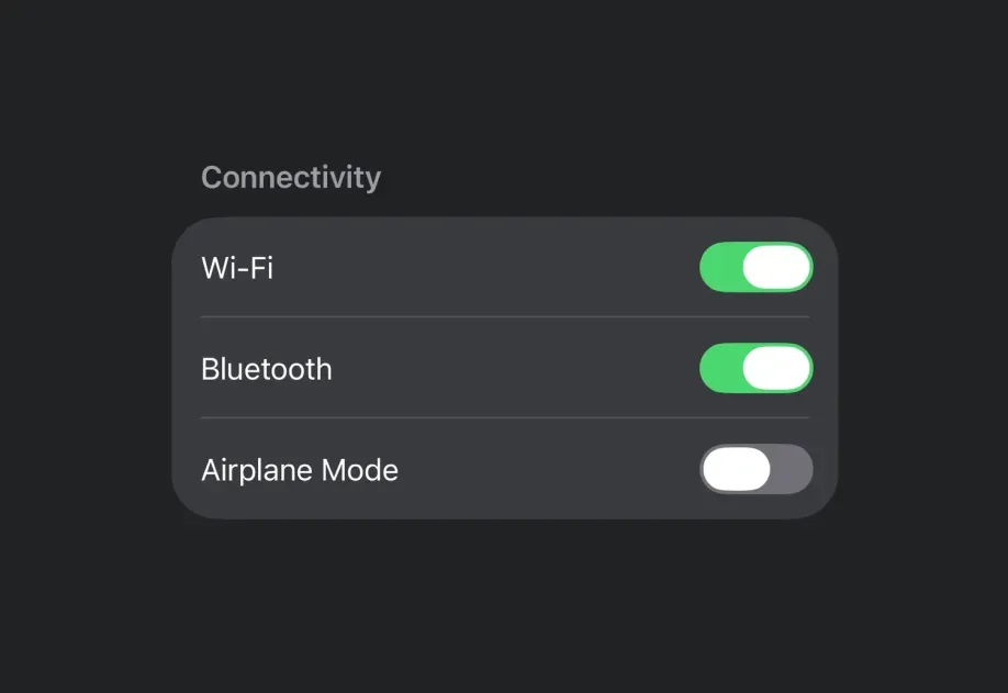
结合使用 Expo UI 组件和修饰符,你可以构建类似 iOS 设置应用的界面。

SettingsFormExample.tsx
import { Button, Form, Host, HStack, Image, Section, Spacer, Toggle, Text, } from '@expo/ui/swift-ui'; import { background, buttonStyle, foregroundStyle, clipShape, frame, } from '@expo/ui/swift-ui/modifiers'; import { Link } from 'expo-router'; import { useState } from 'react'; export default function SettingsFormExample() { const [isAirplaneMode, setIsAirplaneMode] = useState(true); return ( <Host style={{ flex: 1 }}> <Form> <Section> <HStack spacing={8}> <Image systemName="airplane" color="white" size={18} modifiers={[ frame({ width: 28, height: 28 }), background('#ffa500'), clipShape('roundedRectangle'), ]} /> <Text>Airplane Mode</Text> <Spacer /> <Toggle isOn={isAirplaneMode} onIsOnChange={setIsAirplaneMode} /> </HStack> <Link href="/wifi" asChild> {/* Use buttonStyle('plain') to prevent default blue button styling */} <Button modifiers={[buttonStyle('plain')]}> <HStack spacing={8}> <Image systemName="wifi" color="white" size={18} modifiers={[ frame({ width: 28, height: 28 }), background('#007aff'), clipShape('roundedRectangle'), ]} /> {/* Text inside a Link needs an explicit color. A hierarchical style adapts to light and dark mode. */} <Text modifiers={[ foregroundStyle({ type: 'color', color: 'primary', }), ]}> Wi-Fi </Text> <Spacer /> <Image systemName="chevron.right" size={14} color="secondary" /> </HStack> </Button> </Link> </Section> </Form> </Host> ); }

次要文本样式

使用 foregroundStyle 应用层级样式,使文本呈现更浅、更柔和的效果。

SecondaryTextExample.tsx
import { Button, Form, Host, HStack, Image, List, Section, Spacer, Text, } from '@expo/ui/swift-ui'; import { buttonStyle, font, foregroundStyle, padding, } from '@expo/ui/swift-ui/modifiers'; export default function SecondaryTextExample() { return ( <Host style={{ flex: 1 }}> <Form> <Section> <List> <Button onPress={() => console.log('Navigate')} modifiers={[buttonStyle('plain')]}> <HStack> <Text>Night Shift</Text> <Spacer /> <Text modifiers={[ foregroundStyle({ type: 'hierarchical', style: 'secondary', }), padding({ trailing: 8 }), ]}> 22:00 to 07:00 </Text> <Image systemName="chevron.right" size={14} color="#C7C7CC" /> </HStack> </Button> </List> <List> <Text modifiers={[ foregroundStyle({ type: 'hierarchical', style: 'secondary', }), font({ size: 14 }), ]}> 最多可节省 280.7 MB。这将永久删除“最近删除”相簿中保留的所有照片和视频。 </Text> </List> </Section> </Form> </Host> ); }

带图标的滑块

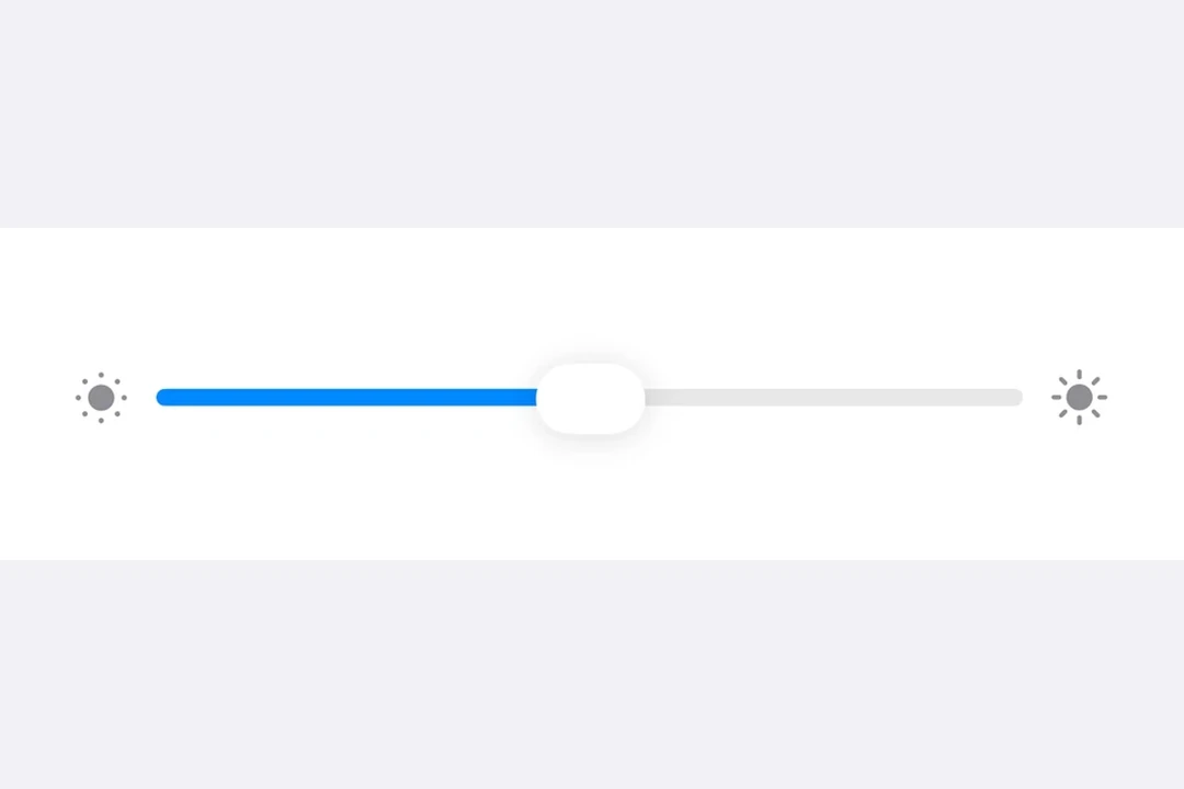
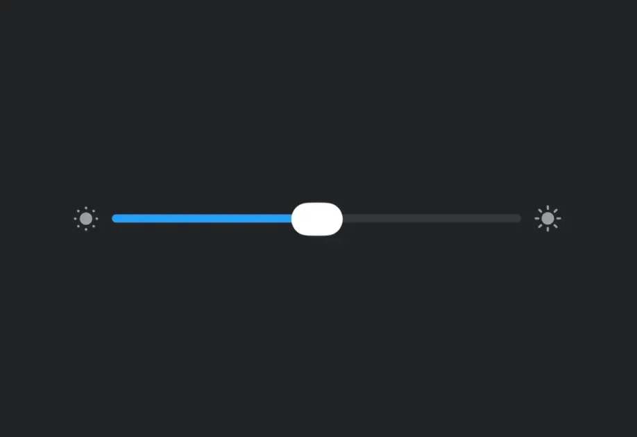
亮度或音量控制中常见的一种设计模式,是在 Slider 两侧放置图标。

SliderWithIconsExample.tsx
import { useState } from 'react'; import { Form, Host, HStack, Image, List, Section, Slider, Spacer, Text, Toggle, } from '@expo/ui/swift-ui'; import { padding } from '@expo/ui/swift-ui/modifiers'; export default function SliderWithIconsExample() { const [brightness, setBrightness] = useState(0.5); const [trueToneEnabled, setTrueToneEnabled] = useState(true); return ( <Host style={{ flex: 1 }}> <Form> <Section header={<Text>亮度</Text>} footer={ <Text> 根据环境光线条件自动调整 iPhone 显示效果,让色彩在不同环境下呈现一致。 </Text> }> <List> <HStack modifiers={[padding({ vertical: 6 })]}> <Image systemName="sun.min.fill" size={22} color="#8E8E93" /> <Spacer /> <Slider value={brightness} onValueChange={setBrightness} /> <Spacer /> <Image systemName="sun.max.fill" size={22} color="#8E8E93" /> </HStack> <Toggle label="True Tone" isOn={trueToneEnabled} onIsOnChange={setTrueToneEnabled} /> </List> </Section> </Form> </Host> ); }

多行列表项

对于包含标题和副标题的列表项,使用 VStack 并设置 alignment="leading"。

MultiLineListItemExample.tsx
import { Button, Form, Host, HStack, Image, List, Section, Spacer, Text, VStack, } from '@expo/ui/swift-ui'; import { buttonStyle, font, foregroundStyle, padding, } from '@expo/ui/swift-ui/modifiers'; export default function MultiLineListItemExample() { return ( <Host style={{ flex: 1 }}> <Form> <Section> <List> <HStack> <Image systemName="safari" size={22} modifiers={[padding({ trailing: 6 })]} /> <Spacer /> <Button onPress={() => console.log('Navigate')} modifiers={[ buttonStyle('plain'), padding({ vertical: 6 }), ]}> <VStack spacing={4} alignment="leading"> <Text>Chrome</Text> <Text modifiers={[ foregroundStyle({ type: 'hierarchical', style: 'secondary', }), font({ size: 14 }), ]}> 最近使用:今天 </Text> </VStack> <Spacer /> <Text modifiers={[ foregroundStyle({ type: 'hierarchical', style: 'secondary', }), font({ size: 16 }), ]}> 1.57 GB </Text> <Image systemName="chevron.right" size={14} color="#C7C7CC" /> </Button> </HStack> </List> </Section> </Form> </Host> ); }