This documentation is available as Markdown for AI agents and LLMs. See the full Markdown index or append .md to any documentation URL.
ConfirmationDialog
用于呈现确认提示的 SwiftUI ConfirmationDialog 组件。
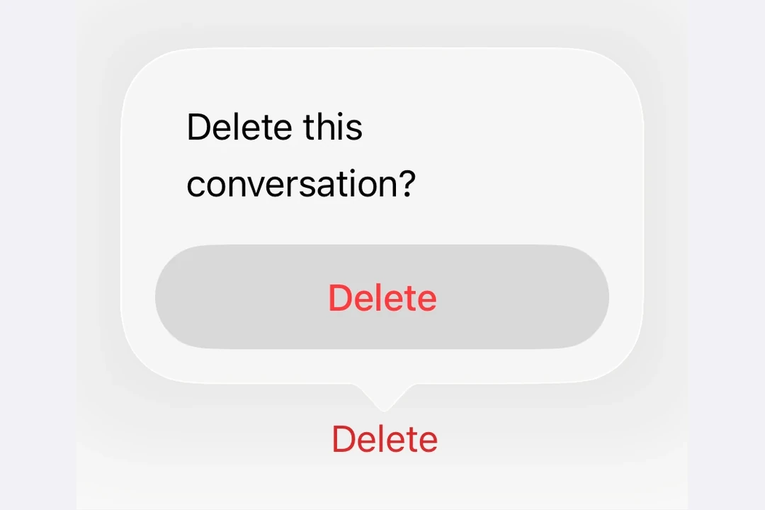
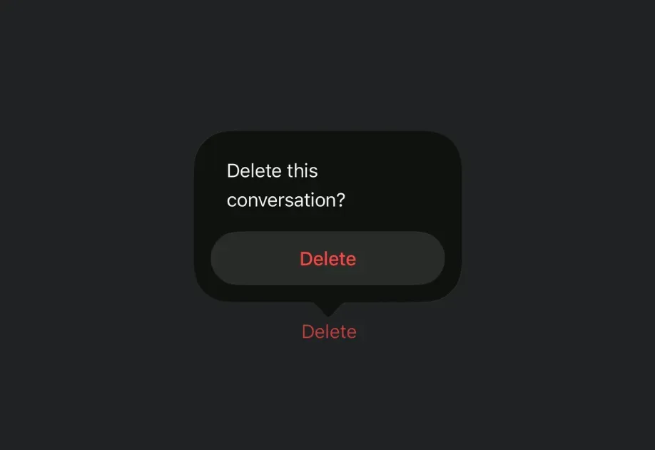
Expo UI ConfirmationDialog 与官方 SwiftUI confirmationDialog API 相对应,可呈现类似操作表的对话框,其中包含标题、操作选项和可选消息。
安装
If you are installing this in an existing React Native app, make sure to install expo in your project.
用法
基本确认对话框
使用 ConfirmationDialog.Trigger 定义可见元素,并使用 ConfirmationDialog.Actions 提供对话框按钮。
破坏性操作确认
在 ConfirmationDialog.Actions 内的 Button 上使用 role="destructive",将其设置为破坏性操作样式。
添加消息和多个操作选项
使用 ConfirmationDialog.Message 在标题下方显示描述性消息,并添加多个操作按钮以提供不同选项。
隐藏标题
设置 titleVisibility="hidden" 可隐藏对话框标题,同时仍显示操作选项和消息。出于无障碍考虑,仍应提供 title。
API
import { ConfirmationDialog } from '@expo/ui/swift-ui';
Component
Type: React.Element<ConfirmationDialogProps>
ConfirmationDialog presents a confirmation dialog with a title, optional message, and action buttons.
ReactNodeThe contents of the confirmation dialog.
Should include ConfirmationDialog.Trigger, ConfirmationDialog.Actions, and optionally ConfirmationDialog.Message.
(isPresented: boolean) => voidA callback that is called when the isPresented state changes.
string • Default: 'automatic'The visibility of the dialog title.
Acceptable values are: 'automatic' | 'visible' | 'hidden'