This documentation is available as Markdown for AI agents and LLMs. See the full Markdown index or append .md to any documentation URL.
Picker
用于从列表中选择选项的 SwiftUI Picker 组件。
信息 如需跨平台使用,请参阅通用的
Picker— 它会根据平台渲染相应的原生组件。
Expo UI Picker 与官方 SwiftUI Picker API 一致,并通过 pickerStyle 修饰符支持所有 Picker 样式。
安装
If you are installing this in an existing React Native app, make sure to install expo in your project.
分段 Picker
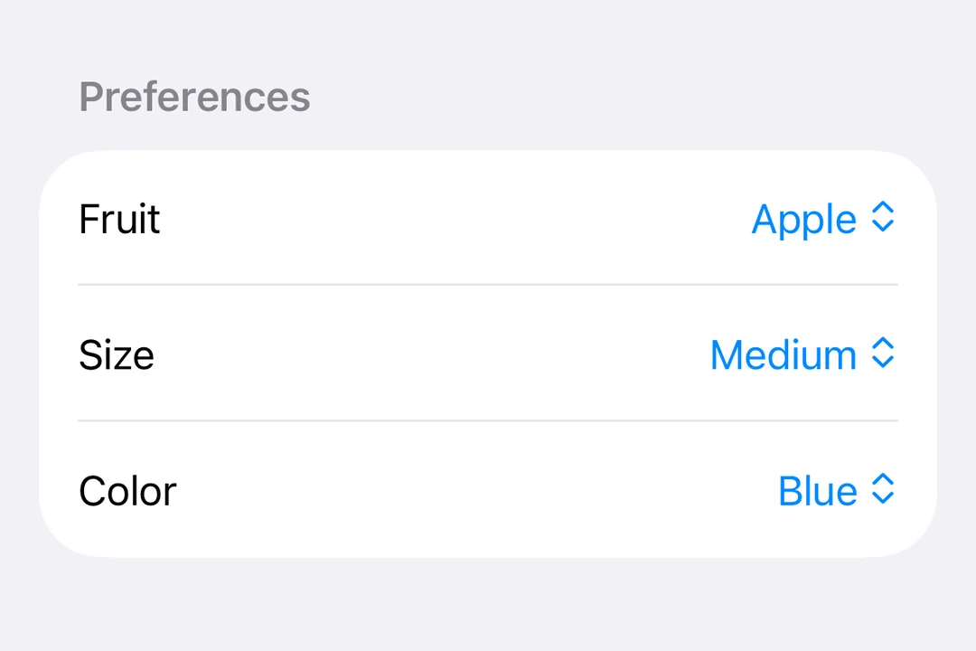
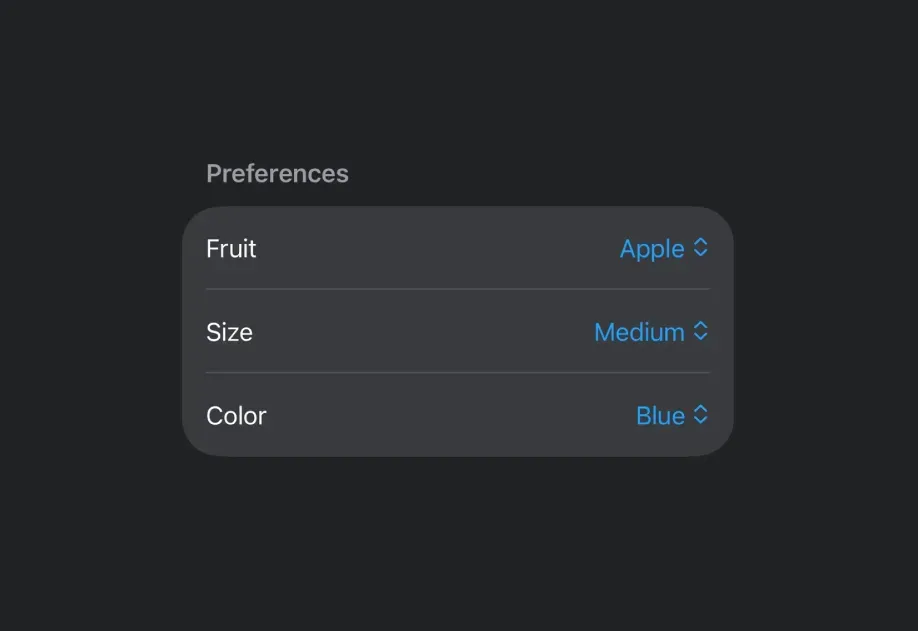
菜单 Picker
滚轮 Picker
警告 滚轮样式在 Apple TV 上不可用。
API
import { Picker } from '@expo/ui/swift-ui';
Component
Type: React.Element<PickerProps<T>>
Displays a native picker component
Example
<Picker modifiers={[pickerStyle('segmented')]}>
  <Text modifiers={[tag('option1')]}>Option 1</Text>
  <Text modifiers={[tag(0)]}>Option 3</Text>
</Picker>
React.ReactNodeThe content of the picker. You can use Text components with tag modifiers to display the options.
unionA label displayed on the picker.
Acceptable values are: string | React.ReactNode
(selection: T) => voidCallback function that is called when an option is selected.
Gets called with the selected tag value.
SFSymbolThe name of the system image (SF Symbol). For example: 'photo', 'heart.fill', 'star.circle'