Reference version

This documentation is available as Markdown for AI agents and LLMs. See the full Markdown index or append .md to any documentation URL.

选择器

具有菜单和滚轮外观的单选输入。

Android
iOS
Web
Included in Expo Go
Recommended version:
~58.0.1

Picker 是单选输入控件。你可以使用 <Picker.Item label value /> 子项来声明选项,以便父级 Picker 读取这些选项,并渲染符合平台特性的下拉菜单或转轮选择器。

通用 Picker 独立于 @expo/ui/community/picker,后者仍然是 @react-native-picker/picker 的兼容垫片。除非你明确需要 RN-Picker API,否则新代码应优先使用此通用 Picker
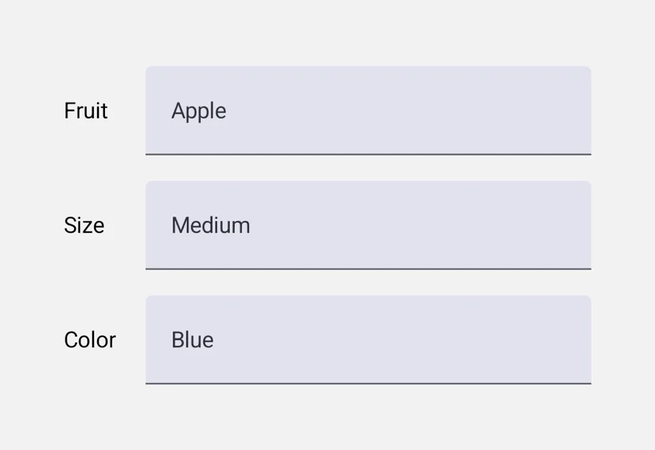
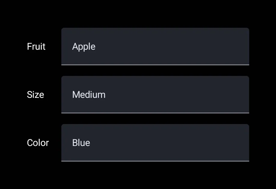
三个带标签的行,其下拉选择器分别设置为 Apple、Medium 和 Blue三个带标签的行,其下拉选择器分别设置为 Apple、Medium 和 Blue

安装

Terminal
- npx expo install @expo/ui
- yarn expo install @expo/ui
- pnpm expo install @expo/ui
- bun expo install @expo/ui

If you are installing this in an existing React Native app, make sure to install expo in your project.

用法

菜单外观(默认)

PickerMenuExample.tsx
import { useState } from 'react'; import { useColorScheme } from 'react-native'; import { Host, Row, Picker, Spacer, Text } from '@expo/ui'; const FLAVOURS = [ { label: 'Vanilla', value: 'vanilla' }, { label: 'Chocolate', value: 'chocolate' }, { label: 'Strawberry', value: 'strawberry' }, ]; export default function PickerMenuExample() { const [value, setValue] = useState('vanilla'); const colorScheme = useColorScheme(); return ( <Host matchContents={{ vertical: true }} style={{ width: '100%' }}> <Row alignment="center" spacing={12} style={{ padding: 16 }}> <Text textStyle={{ color: colorScheme === 'dark' ? '#FFFFFF' : '#000000' }}>Flavour:</Text> <Spacer flexible /> <Picker selectedValue={value} onValueChange={setValue}> {FLAVOURS.map(f => ( <Picker.Item key={f.value} label={f.label} value={f.value} /> ))} </Picker> </Row> </Host> ); }

转轮外观

appearance="wheel" 会在 iOS 上渲染内联可滚动转轮。在 Android 和 web 上,这会回退为平台的默认下拉菜单(Material 3 没有提供转轮样式的选择器)。

PickerWheelExample.tsx
import { useState } from 'react'; import { Host, Column, Picker } from '@expo/ui'; const FLAVOURS = [ { label: 'Vanilla', value: 'vanilla' }, { label: 'Chocolate', value: 'chocolate' }, { label: 'Strawberry', value: 'strawberry' }, ]; export default function PickerWheelExample() { const [value, setValue] = useState('chocolate'); return ( <Host matchContents={{ vertical: true }} style={{ width: '100%' }}> <Column spacing={8} style={{ padding: 16 }}> <Picker selectedValue={value} onValueChange={setValue} appearance="wheel"> {FLAVOURS.map(f => ( <Picker.Item key={f.value} label={f.label} value={f.value} /> ))} </Picker> </Column> </Host> ); }

API

import { Picker } from '@expo/ui';

Component

Picker

Android
iOS
Web

Type: React.Element<PickerProps<T>>

A single-selection input. Declare options via <Picker.Item label value /> children.

Props for the Picker component, a single-selection input.

PickerProps

appearance

Android
iOS
Web
Optional • Type: PickerAppearance • Default: 'menu'

Visual appearance of the picker. See PickerAppearance.

children

Android
iOS
Web
Optional • Type: ReactNode

<Picker.Item> children that declare the available options.

enabled

Android
iOS
Web
Optional • Type: boolean • Default: true

Whether the picker accepts input.

onValueChange

Android
iOS
Web
Type: (value: T) => void

Called when the user selects an option.

selectedValue

Android
iOS
Web
Type: T

The currently selected value. Must match the value of one of the <Picker.Item> children.

testID

Android
iOS
Web
Optional • Type: string

Identifier used to locate the component in end-to-end tests.

Interfaces

ExtractedPickerItem

Android
iOS
Web

Internal: extracted item data from <Picker.Item> children.

PropertyTypeDescription
labelstring
-
valueT
-

Types

PickerAppearance

Android
iOS
Web

Literal type: string

Visual appearance of the picker.

  • 'menu' — Compact button that opens a popup/dropdown on tap. Cross-platform default.
  • 'wheel' — Scrollable rotor UI that's always visible inline. iOS only; on Android and web this falls back to the platform's default dropdown.

Acceptable values are: 'wheel' | 'menu'

PickerItemValue

Android
iOS
Web

Literal type: union

The type of values a Picker.Item can carry.

Acceptable values are: string | number