Reference version

This documentation is available as Markdown for AI agents and LLMs. See the full Markdown index or append .md to any documentation URL.

RNHostView

用于在 @expo/ui 视图中承载 React Native 视图的跨平台组件。

Android
iOS
Web
Included in Expo Go
Recommended version:
~58.0.1

在通用的 @expo/ui 布局中承载 React Native 视图子树。在 Android 和 iOS 上,它会重新导出平台原生的 Jetpack Compose 的 RNHostView/SwiftUI 的 RNHostView,因此 React Native 子元素可以桥接到周围的 Compose/SwiftUI 树中。在 Web 上,没有可供桥接的原生宿主树,因此它会回退为包裹子元素的 React Native View。

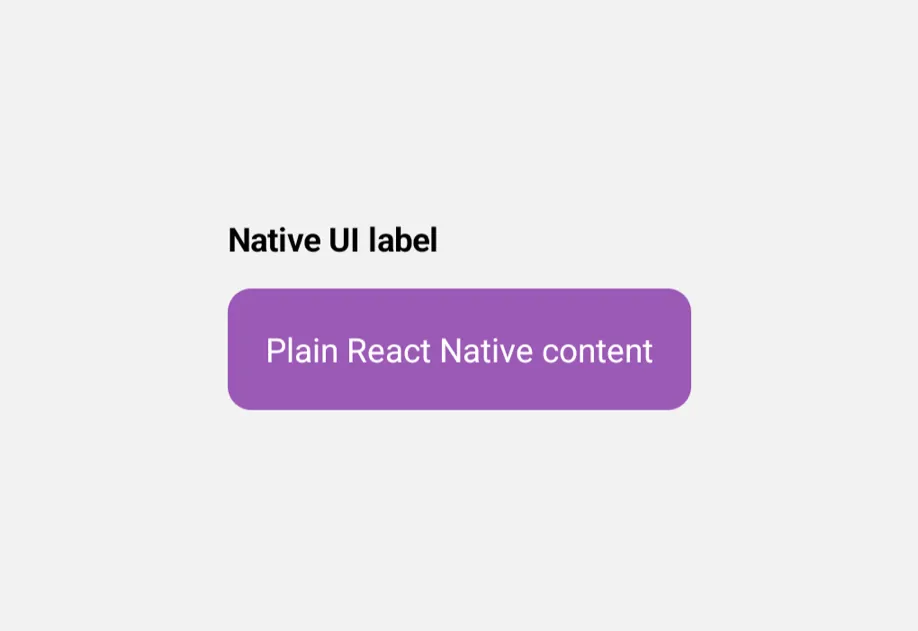
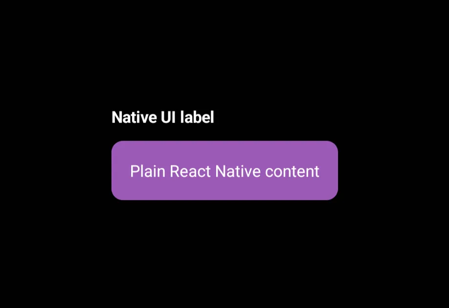
紫色 React Native 芯片上方的粗体标签紫色 React Native 芯片上方的粗体标签

安装

Terminal
- npx expo install @expo/ui
- yarn expo install @expo/ui
- pnpm expo install @expo/ui
- bun expo install @expo/ui

If you are installing this in an existing React Native app, make sure to install expo in your project.

用法

基本用法

在通用的 @expo/ui 布局中的任意位置放置 React Native 视图子树。

RNHostViewExample.tsx
import { Host, Column, RNHostView, Text } from '@expo/ui'; import { Text as RNText, View, useColorScheme } from 'react-native'; export default function RNHostViewExample() { const colorScheme = useColorScheme(); return ( <Host matchContents> <Column spacing={12} style={{ padding: 16 }}> <Text textStyle={{ color: colorScheme === 'dark' ? '#FFFFFF' : '#000000', fontWeight: 'bold' }}> Native UI label </Text> <RNHostView matchContents> <View style={{ alignSelf: 'flex-start', padding: 16, backgroundColor: '#9B59B6', borderRadius: 10, }}> <RNText style={{ color: 'white' }}>Plain React Native content</RNText> </View> </RNHostView> </Column> </Host> ); }

填充父级与匹配子元素

默认情况下,RNHostView 会填充其原生父级。将 matchContents 设置为让它缩小以适应其 React Native 子元素。

RNHostViewSizingExample.tsx
import { Host, Column, Row, Text, RNHostView } from '@expo/ui'; import { View, useColorScheme } from 'react-native'; export default function RNHostViewSizingExample() { const colorScheme = useColorScheme(); const ink = { color: colorScheme === 'dark' ? '#FFFFFF' : '#000000' }; return ( <Host matchContents> <Column spacing={24} style={{ padding: 16 }}> <Column spacing={8}> <Text textStyle={{ ...ink, fontSize: 18, fontWeight: 'bold' }}>Fill parent size</Text> <Text textStyle={{ fontSize: 12, color: '#666666' }}> The RNHostView fills the native parent's 100×100 frame. </Text> <Row style={{ width: 100, height: 100 }}> <RNHostView> <View style={{ flex: 1, backgroundColor: '#9B59B6', borderRadius: 10, margin: 4 }} /> </RNHostView> </Row> </Column> <Column spacing={8}> <Text textStyle={{ ...ink, fontSize: 18, fontWeight: 'bold' }}>Match child size</Text> <Text textStyle={{ fontSize: 12, color: '#666666' }}> The RNHostView shrinks to wrap its 50×50 child. </Text> <Row style={{ padding: 8 }}> <RNHostView matchContents> <View style={{ width: 50, height: 50, backgroundColor: '#9B59B6', borderRadius: 10 }} /> </RNHostView> </Row> </Column> </Column> </Host> ); }

API

import { RNHostView } from '@expo/ui';

Component

RNHostView

Android
iOS
Web

Type: React.Element<RNHostViewProps>

Hosts React Native views inside Jetpack Compose or SwiftUI views.

Props for the RNHostView component.

RNHostViewProps

children

Android
iOS
Web
Type: ReactElement

The React Native view to host.

disabled

Android
iOS
Web
Optional • Type: boolean

Whether the component is disabled. Disabled components do not respond to user interaction.

hidden

Android
iOS
Web
Optional • Type: boolean

Whether the component is hidden.

matchContents

Android
iOS
Optional • Type: boolean • Default: false

When true, the host updates its size in the native view tree to match the children's size. When false, the host uses the size of the parent native view.

Can only be set once on mount; changing it remounts the component.

modifiers

Android
iOS
Optional • Type: ModifierConfig[]

Platform-specific modifier escape hatch. Pass an array of modifier configs from @expo/ui/swift-ui/modifiers or @expo/ui/jetpack-compose/modifiers. A modifier supplied here replaces any modifier of the same type that the component derives from style or other props.

onAppear

Android
iOS
Web
Optional • Type: () => void

Called when the component appears on screen.

onDisappear

Android
iOS
Web
Optional • Type: () => void

Called when the component is removed from screen.

onLayout

Android
iOS
Web
Optional • Type: (event: LayoutChangeEvent) => void

onPress

Android
iOS
Web
Optional • Type: () => void

Called when the component is pressed.

style

Android
iOS
Web
Optional • Type: Pick<ViewStyle, 'padding' | 'paddingHorizontal' | 'paddingVertical' | 'paddingTop' | 'paddingBottom' | 'paddingLeft' | 'paddingRight' | 'backgroundColor' | 'borderRadius' | 'borderWidth' | 'borderColor' | 'opacity' | 'width' | 'height'>

Platform-agnostic style properties. These are translated to SwiftUI modifiers on iOS and Jetpack Compose modifiers on Android.

testID

Android
iOS
Web
Optional • Type: string

Identifier used to locate the component in end-to-end tests.