Reference version

This documentation is available as Markdown for AI agents and LLMs. See the full Markdown index or append .md to any documentation URL.

Text

用于显示样式化文本内容的组件

Android
iOS
Web
Included in Expo Go
Recommended version:
~58.0.1

用于显示文本的组件。默认根据平台配色方案(浅色/深色)进行适配,并通过 textStyle 提供一组专注于排版的属性。
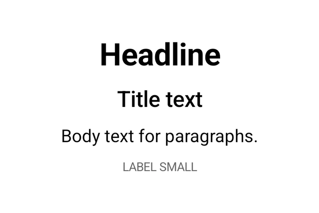
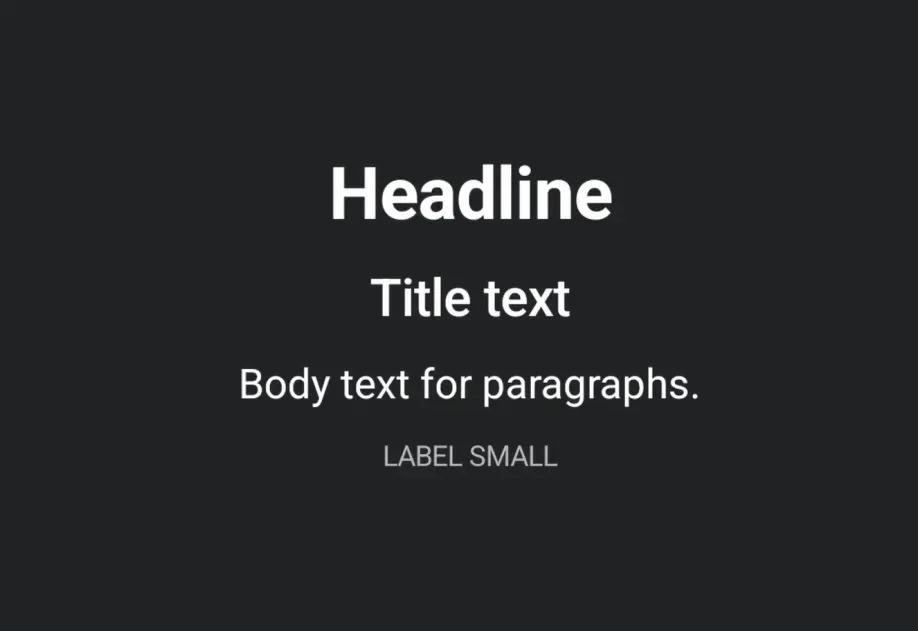
Material 3 排版层级:标题、题目、正文和标签Material 3 排版层级:标题、题目、正文和标签

安装

Terminal
- npx expo install @expo/ui
- yarn expo install @expo/ui
- pnpm expo install @expo/ui
- bun expo install @expo/ui

If you are installing this in an existing React Native app, make sure to install expo in your project.

使用

基本文本

TextExample.tsx
import { useColorScheme } from 'react-native'; import { Host, Text } from '@expo/ui'; export default function TextExample() { const colorScheme = useColorScheme(); return ( <Host matchContents> <Text textStyle={{ color: colorScheme === 'dark' ? '#FFFFFF' : '#000000' }}> Hello, world! </Text> </Host> ); }

设置样式的文本

使用 textStyle 设置排版相关的属性(字体大小、粗细、对齐方式)。

StyledTextExample.tsx
import { useColorScheme } from 'react-native'; import { Host, Text } from '@expo/ui'; export default function StyledTextExample() { const colorScheme = useColorScheme(); return ( <Host matchContents> <Text textStyle={{ color: colorScheme === 'dark' ? '#FFFFFF' : '#000000', fontSize: 24, fontWeight: '700', textAlign: 'center', }}> Headline </Text> </Host> ); }

截断长文本

使用 numberOfLines 将长文本限制为指定行数,并在末尾显示省略号。

TruncatedTextExample.tsx
import { useColorScheme } from 'react-native'; import { Host, Text } from '@expo/ui'; export default function TruncatedTextExample() { const colorScheme = useColorScheme(); return ( <Host matchContents={{ vertical: true }} style={{ width: '100%' }}> <Text numberOfLines={1} textStyle={{ color: colorScheme === 'dark' ? '#FFFFFF' : '#000000' }}> A very long line of text that will be truncated when it does not fit on a single line. </Text> </Host> ); }

API

import { Text } from '@expo/ui';

Component

Text

Android
iOS
Web

Type: React.Element<TextProps>

A component for displaying styled text content.

Props for the Text component.

TextProps

children

Android
iOS
Web
Optional • Type: string

The text content to display.

disabled

Android
iOS
Web
Optional • Type: boolean

Whether the component is disabled. Disabled components do not respond to user interaction.

hidden

Android
iOS
Web
Optional • Type: boolean

Whether the component is hidden.

modifiers

Android
iOS
Optional • Type: ModifierConfig[]

Platform-specific modifier escape hatch. Pass an array of modifier configs from @expo/ui/swift-ui/modifiers or @expo/ui/jetpack-compose/modifiers. A modifier supplied here replaces any modifier of the same type that the component derives from style or other props.

numberOfLines

Android
iOS
Web
Optional • Type: number

Maximum number of lines to display. Text is truncated with an ellipsis when exceeded.

onAppear

Android
iOS
Web
Optional • Type: () => void

Called when the component appears on screen.

onDisappear

Android
iOS
Web
Optional • Type: () => void

Called when the component is removed from screen.

onPress

Android
iOS
Web
Optional • Type: () => void

Called when the component is pressed.

style

Android
iOS
Web
Optional • Type: Pick<ViewStyle, 'padding' | 'paddingHorizontal' | 'paddingVertical' | 'paddingTop' | 'paddingBottom' | 'paddingLeft' | 'paddingRight' | 'backgroundColor' | 'borderRadius' | 'borderWidth' | 'borderColor' | 'opacity' | 'width' | 'height'>

Platform-agnostic style properties. These are translated to SwiftUI modifiers on iOS and Jetpack Compose modifiers on Android.

testID

Android
iOS
Web
Optional • Type: string

Identifier used to locate the component in end-to-end tests.

textStyle

Android
iOS
Web
Optional • Type: { color: string, fontFamily: string, fontSize: number, fontWeight: 'normal' | 'bold' | '100' | '200' | '300' | '400' | '500' | '600' | '700' | '800' | '900', letterSpacing: number, lineHeight: number, textAlign: 'center' | 'left' | 'right' }

Text-specific styling (font, color, alignment).