This documentation is available as Markdown for AI agents and LLMs. See the full Markdown index or append .md to any documentation URL.
BottomSheet
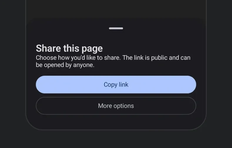
从屏幕底部向上滑出的模态表单
从屏幕底部向上滑出的模态表单。表单的可见性由 isPresented 控制——从 React state 切换该属性,并在 onDismiss 中将其关闭(用户向下滑动或点击遮罩层时调用)。

安装
If you are installing this in an existing React Native app, make sure to install expo in your project.
用法
基本底部表单
隐藏拖动指示器
对于没有拖动手柄的表单,传入 showDragIndicator={false}。
内容内边距
表单默认会为其内容添加内边距。传入 contentPadding 可更改该内边距——0 可让行、图像或分隔线延伸到表单边缘。
吸附点
传入 snapPoints,允许用户在多个停靠高度之间拖动表单。你可以使用语义值 'half' 和 'full' 来实现跨平台一致性。{ fraction } 和 { height } 形式在 iOS 和 web 上会被精确采用。
当表单内容可能高于最小吸附点时,请将其包裹在 ScrollView 中,以便正确滚动溢出内容。
在 Android 上,
{ fraction }和{ height }会吸附到'half'/'full'中距离最近的一个——底层ModalBottomSheet仅支持两种停靠状态。只有当内容高度足够大、超过 Material 的部分显示阈值时,部分状态才可见;如果需要在短内容上显示半屏状态,请为内容指定明确高度,或填充可用空间。
可滚动的 React Native 内容
底部表单支持将 React Native 列表(例如 FlatList,或 FlashList、Legend List 等高性能列表)作为子元素,但需要将其包裹在 RNHostView 中。 snapPoints 设置表单大小,列表会在该高度范围内滚动。启用 nestedScrollEnabled 后,列表会先滚动自身内容;到达顶部边缘后,剩余的拖动操作会移动表单。
API
import { BottomSheet } from '@expo/ui';
Component
Type: React.Element<BottomSheetProps>
A modal sheet that slides up from the bottom of the screen.
Props for the BottomSheet component, a modal sheet that slides up from the bottom of the screen.
ColorValueThe sheet's own background color, painting its full chrome (including the drag-indicator zone and, on iOS, the home-indicator safe-area inset). When omitted, each platform keeps its own default.
This only paints the background. children are React Native views on
every platform, so they don't pick up a contrasting text color
automatically -- set one explicitly if you use a dark containerColor.
ColorValueThe preferred color for native Compose content that doesn't set its own
color. Doesn't reach a BottomSheet's (React Native) children -- see
containerColor's doc.
BottomSheetContentPaddingPadding between the sheet and children, in dp on Android, points on iOS, and
CSS pixels on web. Pass 0 for content that reaches the sheet's edges.
When omitted, each platform keeps the inset it applies by default.
Example
``contentPadding={0} — full-bleed content
Example
``contentPadding={{ top: 8, bottom: 24 }} — no horizontal inset
ModifierConfig[]Platform-specific modifier escape hatch. Pass an array of modifier configs
from @expo/ui/swift-ui/modifiers or @expo/ui/jetpack-compose/modifiers.
() => voidCalled when the bottom sheet is dismissed by the user (e.g. swiping down or tapping the overlay).
ColorValueThe color of the scrim overlay rendered behind the bottom sheet.
Pass 'transparent' to make the backdrop invisible while still blocking touches.
boolean • Default: trueWhether pressing the Android hardware back button (or back gesture) dismisses the bottom sheet.
When false, the back press does not dismiss the sheet (note: the press still does not reach
React Native's BackHandler).
boolean • Default: trueWhether tapping the backdrop (scrim) dismisses the bottom sheet.
When false, the sheet stays open until the user explicitly closes it (e.g. via a button).
boolean • Default: trueWhether to show a drag indicator at the top of the sheet.
SnapPoint[]Heights the sheet can rest at.
When omitted, the sheet auto-sizes to its content.
See SnapPoint for the supported values.
Example
``['half', 'full'] — draggable between half and full
Example
``['full'] — always full height
Types
Padding between a BottomSheet and its content — a single value applied to every
edge, or per-edge values where an edge that is left out is 0.
Type: number or object shaped as below:
A snap point describing one of the heights a BottomSheet can rest at.
'half'— Approximately half-screen.'full'— Fully expanded.{ fraction }— A fraction of the screen height (0–1). iOS / web only.{ height }— A fixed pixel height. iOS / web only.
On Android, { fraction } and { height } snap to the nearest of 'half' / 'full'.
See the component docs for platform behavior notes.
Type: 'half' or 'full' or object shaped as below:
Or object shaped as below: