This documentation is available as Markdown for AI agents and LLMs. See the full Markdown index or append .md to any documentation URL.
Host
一个跨平台的 Host 组件,用于封装通用的 @expo/ui 内容。
一个用于容纳通用 @expo/ui 内容的容器。在 Android 和 iOS 上,它会重新导出平台原生的 Host for Jetpack Compose/Host for SwiftUI,因此 Jetpack Compose/SwiftUI 子组件的渲染效果与平台专用包中的完全相同。在 Web 上,它会回退为 React Native View。将 Host 用作任何通用子树的根节点,即可让同一组件树在所有三个平台上运行。
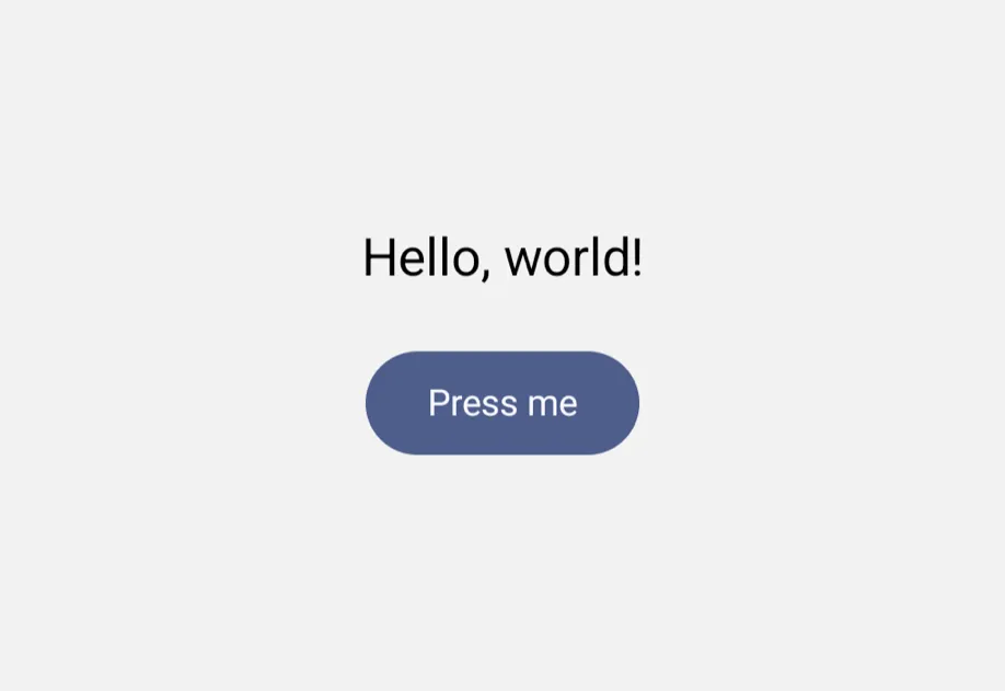
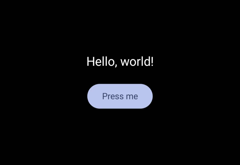
安装
If you are installing this in an existing React Native app, make sure to install expo in your project.
用法
基本用法
在 React Native 视图中放置组件
Host 会在 Android 上使用 Jetpack Compose、在 iOS 上使用 SwiftUI 渲染其通用子组件。Host 内部的 React Native 视图(例如 View 或 ScrollView)会切换回 React Native 渲染。若要在该视图中使用通用组件,请将组件包裹在新的 Host 中。即使视图外层的树中已有一个 Host,也要这样做。
若要在通用布局中放置 React Native 视图,请使用 RNHostView。
匹配内容尺寸
使用 matchContents 让 Host 调整自身大小以适应其内容。在 Android 和 iOS 上,该属性会转发给平台原生的 Host(具体的平台语义请参阅 Jetpack Compose/SwiftUI)。在 Web 上,它会对底层 View 应用 alignSelf: 'flex-start',使 host 收缩以适应其子组件,而不是被父组件拉伸。
注意: 在 Web 上,按轴设置的形式(
{ horizontal: true }/{ vertical: true })与布尔形式的效果相同,因为alignSelf只控制在父组件交叉轴上的拉伸。依赖各轴独立调整尺寸的组件,无论选择哪个轴,都应预期 Web 上会采用相同的收缩适配行为。
布局方向
使用 layoutDirection 将子树渲染为从左到右或从右到左。在 Android 和 iOS 上,该属性会转发给平台原生的 Host(具体的平台语义请参阅 Jetpack Compose/SwiftUI)。在 Web 上,它会在底层 View 上设置 dir 属性,使后代继承所选方向。
响应内容布局
使用 onLayoutContent 获取 host 内容的当前尺寸。在 Android 和 iOS 上,该属性会转发给平台原生的 Host(具体的平台语义请参阅 Jetpack Compose/SwiftUI)。在 Web 上,该尺寸由底层 View 的 onLayout 回调计算得出。
填充视口
对于需要根据可用视口空间调整尺寸的内容,请使用 useViewportSizeMeasurement。在 Android 和 iOS 上,该属性会转发给平台原生的 Host(具体的平台语义请参阅 Jetpack Compose/SwiftUI)。在 Web 上,host 底层的 View 会被设置为当前窗口的宽度和高度;你传入的任何显式 style 仍具有优先级。
忽略安全区域
默认情况下,Host 会遵循设备的安全区域内边距(刘海、Home 指示条等)。使用 ignoreSafeArea="all" 可让内容延伸至屏幕边缘,或使用 ignoreSafeArea="keyboard" 保留安全区域内边距但忽略键盘内边距。在 Android 和 iOS 上,该属性会转发给平台原生的 Host(具体的平台语义请参阅 Jetpack Compose/SwiftUI)。在 Web 上,它通过将 CSS env(safe-area-inset-*) 值应用为底层 View 的内边距来实现;对于启用了 VirtualKeyboard API 的页面,默认设置还会将 env(keyboard-inset-*) 纳入计算。
强制指定配色方案
使用 colorScheme 覆盖子树的外观。传入 'light' 或 'dark' 可强制指定配色方案,省略则遵循设备设置。在 Android 和 iOS 上,该属性会转发给平台原生的 Host(具体的平台语义请参阅 Jetpack Compose/SwiftUI)。在 Web 上,它会在底层 View 上设置 data-theme,使设计令牌 CSS 变量无论 prefers-color-scheme 的值如何,都会解析为强制指定的配色方案。
设置颜色主题种子
使用 seedColor 从单一基色为子树派生主题。每个平台都会以原生方式处理它。在 Android 上,它会生成完整的 Material 3 调色板(SchemeTonalSpot,与 Material You 使用的算法相同),用于为 Compose 子组件设置主题,并通过 useMaterialColors 向后代提供。在 iOS 上,它会作为 SwiftUI tint 应用,并通过环境向下传递,为按钮、开关和滑块等交互控件设置主题。在 Web 上,它会生成一组主色阶,并以 CSS 变量的形式提供给底层 View。省略时,各平台会回退到其默认主题。
API
import { Host } from '@expo/ui';
Component
Type: React.Element<UniversalHostProps>
A bridging container that hosts SwiftUI views on iOS and Jetpack Compose views on Android.
On platforms without a native UI-toolkit binding (web, RN fallback), renders a plain View.
Props
ReactNodeColorSchemeNameThe color scheme to apply to the subtree.
'light' / 'dark' force a specific appearance; omitted follows the device setting.
stringControls which safe area regions the hosting view should ignore.
'all'- ignores all safe area insets.'keyboard'- ignores only the keyboard safe area.
Acceptable values are: 'all' | 'keyboard'
stringLayout direction for the platform UI content.
Defaults to the current locale direction from I18nManager.
Acceptable values are: 'leftToRight' | 'rightToLeft'
union • Default: falseWhen true, the host updates its size in the React Native view tree to match the content's layout from the underlying platform UI toolkit.
Can only be set once on mount.
Acceptable values are: boolean | {
horizontal: boolean,
vertical: boolean
}
(event: {
  nativeEvent: {
  height: number,
  width: number
}
}) => void
Callback function that is triggered when the content completes its layout. Provides the current dimensions of the content, which may change as the content updates.
ColorValueSeed color used to derive the theme applied to the host's subtree. Each platform interprets it natively:
- On Android, it generates a full Material 3 palette (
SchemeTonalSpot, the same algorithm as Material You) that themes Compose children and is exposed to descendants viauseMaterialColors(). - On iOS, it is applied as the SwiftUI tint, propagating through the environment to theme interactive controls such as buttons, switches, and sliders.
- On web, it generates a primary color scale exposed as CSS variables to the subtree.
When omitted, each platform falls back to its default theme.
boolean • Default: falseWhen true and no explicit size is provided, the host will use the viewport size as the proposed size for layout.
This is particularly useful for views that need to fill their available space, such as List.