This documentation is available as Markdown for AI agents and LLMs. See the full Markdown index or append .md to any documentation URL.
Row
通用 @expo/ui 组件的水平布局容器
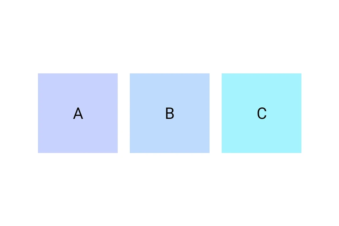
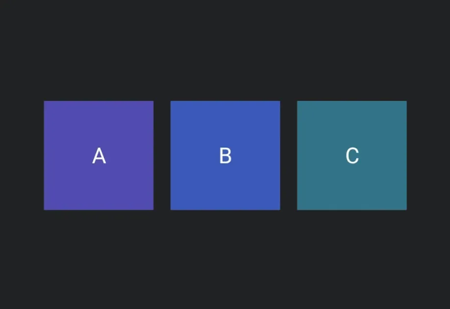
一个水平布局容器,将其子元素从起始端排列到末端。在 Android 上委托给 Jetpack Compose 的 Row,在 iOS 上委托给 SwiftUI 的 HStack,在 Web 上使用 flex View
安装
If you are installing this in an existing React Native app, make sure to install expo in your project.
使用
基本行
对齐
使用 alignment 沿交叉轴(垂直轴)定位子元素
使用 Spacer 分隔内容
将 Row 与可伸缩的 Spacer 结合使用,可将其子元素推向相反的两端
API
import { Row } from '@expo/ui';
Component
A horizontal layout container that arranges its children from start to end.
Props for the Row component, a horizontal layout container.
string • Default: 'start'Cross-axis (vertical) alignment of children.
Acceptable values are: 'start' | 'center' | 'end'
booleanWhether the component is disabled. Disabled components do not respond to user interaction.
ModifierConfig[]Platform-specific modifier escape hatch. Pass an array of modifier configs
from @expo/ui/swift-ui/modifiers or @expo/ui/jetpack-compose/modifiers.
A modifier supplied here replaces any modifier of the same type that the
component derives from style or other props.
() => voidCalled when the component is removed from screen.
numberHorizontal spacing between children, in density-independent pixels.
Pick<ViewStyle, 'padding' | 'paddingHorizontal' | 'paddingVertical' | 'paddingTop' | 'paddingBottom' | 'paddingLeft' | 'paddingRight' | 'backgroundColor' | 'borderRadius' | 'borderWidth' | 'borderColor' | 'opacity' | 'width' | 'height'>Platform-agnostic style properties. These are translated to SwiftUI modifiers on iOS and Jetpack Compose modifiers on Android.