This documentation is available as Markdown for AI agents and LLMs. See the full Markdown index or append .md to any documentation URL.
选择器
与 @react-native-picker/picker 兼容的选择器。
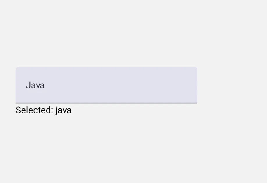
一个 API 与 @react-native-picker/picker 兼容的 Picker 组件。在 iOS 上使用 SwiftUI 滚轮式 Picker,在 Android 上使用 Material 3 ExposedDropdownMenuBox,在 web 上使用原生 <select> 元素。
在底层,此组件封装了平台专属的 @expo/ui 原语:
- Android:Jetpack Compose ExposedDropdownMenuBox
- iOS:搭配
pickerStyle('wheel')的 SwiftUI Picker
如果需要更精细的控制,请直接使用这些原语。

安装
If you are installing this in an existing React Native app, make sure to install expo in your project.
从 @react-native-picker/picker 迁移
- 将导入语句从
import { Picker } from '@react-native-picker/picker'更新为import { Picker } from '@expo/ui/community/picker'。 - 不支持
mode、prompt、dropdownIconColor、dropdownIconRippleColor、numberOfLines、selectionColor、itemStyle和accessibilityLabel属性。 - 在
Picker.Item上,style属性仅作用于color、backgroundColor、fontFamily和fontSize。顶层的color和fontFamily属性仍受支持,可作为对应style值的别名。 Picker.Item上的enabled仅适用于 Android。ref的focus()和blur()方法仅在 Android 上生效(打开/关闭下拉菜单)。在 iOS 上,滚轮选择器始终可见。
基本用法
单项样式与状态
为 Picker.Item 传入 style,即可控制每个选项的 color、backgroundColor、fontFamily 和 fontSize;传入 enabled={false} 可在 Android 上禁用指定选项。
在 iOS 上,fontFamily 接受 iOS 字体名称(例如 'Menlo');在 Android 上,则接受 Compose 通用字体系列('monospace'、'serif'、'sansSerif'、'cursive')或通过 expo-font 加载的字体。
命令式聚焦与失焦(Android)
使用 ref 在 Android 上以编程方式打开和关闭下拉菜单。在 iOS 上,这些方法无效,因为滚轮选择器始终可见。
API
import { Picker } from '@expo/ui/community/picker';
Components
Type: React.Element<PickerProps<T>>
A drop-in replacement for @react-native-picker/picker on web.
Renders a native <select> element.
ReactNodePicker.Item children that define the available options.
(itemValue: T, itemIndex: number) => voidCallback when an item is selected. Called with (itemValue, itemIndex).
TThe currently selected value. Must match the value of one of the Picker.Item children.
Type: React.Element<ComponentType<PickerItemProps>>
stringText color for the item. Equivalent to setting color in the style prop.
stringCustom font family for the item. Equivalent to setting fontFamily in the style prop.
StyleProp<TextStyle>Style applied to the item label. Only the following values take effect:
color, backgroundColor, fontFamily, and fontSize. When also set
via the top-level color or fontFamily props, values from style win.