Reference version

This documentation is available as Markdown for AI agents and LLMs. See the full Markdown index or append .md to any documentation URL.

菜单

与 @react-native-menu/menu 兼容的菜单。

Android
iOS
Included in Expo Go
Recommended version:
~58.0.1

一个 API 与 @react-native-menu/menu 兼容的 MenuView 组件。支持单击(默认)和长按(shouldOpenOnLongPress)触发。

在底层,此组件封装了平台专属的 @expo/ui 基元:

如果需要更低层级的控制,请直接使用这些基元。

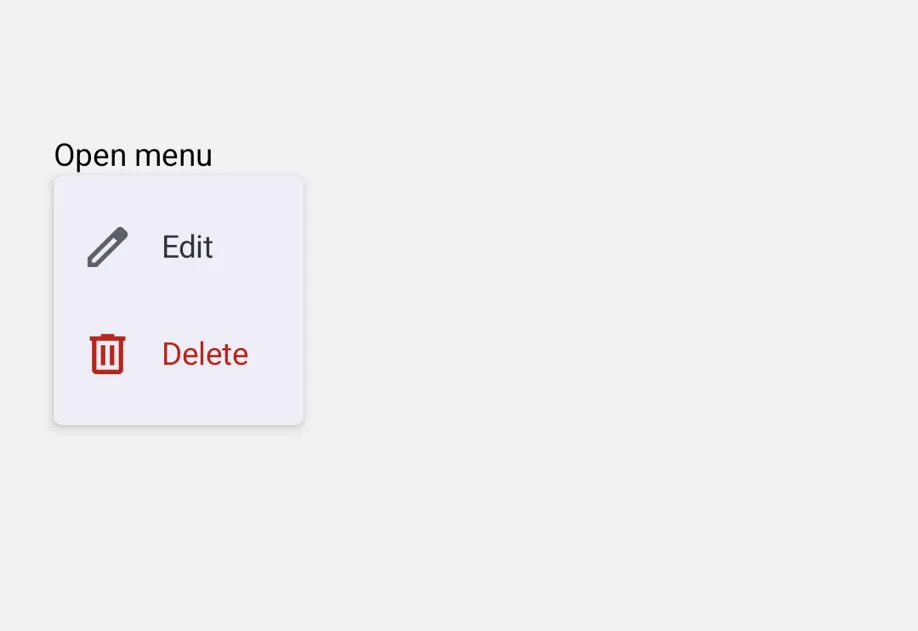
包含“编辑”和“删除”行的打开菜单包含“编辑”和“删除”行的打开菜单

安装

Terminal
- npx expo install @expo/ui
- yarn expo install @expo/ui
- pnpm expo install @expo/ui
- bun expo install @expo/ui

If you are installing this in an existing React Native app, make sure to install expo in your project.

从 @react-native-menu/menu 迁移

  • 将导入语句从 import { MenuView } from '@react-native-menu/menu' 更新为 import { MenuView } from '@expo/ui/community/menu'。
  • Android 上的 action.image 与上游实现不同。@react-native-menu/menu 需要一个可绘制资源名称字符串(例如 'ic_menu_add'),并根据 android/app/src/main/res/drawable/ 解析该资源。此兼容实现不会解析可绘制资源名称——请改为传入 ImageSourcePropType(例如 require('@expo/material-symbols/edit.xml'))。iOS 上接受字符串值作为 SF Symbol 名称。使用 Icon.select 在每个调用位置定义两端的值,以便未使用的平台代码能按平台进行摇树优化。
  • title 仅在 iOS 上渲染为分节标题;Android 的 Material DropdownMenu 没有标题插槽。
  • 在 Android 上,MenuView 会将触发器包裹在自己的 Pressable 中以打开菜单,因此,附加到作为 children 传入的 Pressable 上的 onPress/onLongPress 处理程序不会触发——外层包装器会捕获手势。请改为将处理程序放入 onPressAction 的分支中;或者,如果需要在触发器上保留独立的单击和长按操作,请使用较低层级的 DropdownMenu 基元。
  • 命令式 ref.show() API 仅适用于 Android。SwiftUI Menu/ContextMenu 没有以编程方式打开菜单的 API,因此在 iOS 上调用此方法不会执行任何操作(并会显示一次性开发警告)。
  • 不支持 @react-native-menu/menu 中的以下属性:themeVariant、hitSlop、isAnchoredToRight、subtitle、keepsMenuPresented、preferredElementSize 和 state: 'mixed'。

基本用法

将任意视图作为触发器传入。MenuView 会附加自己的单击或长按处理逻辑。

MenuExample.tsx
import { Icon } from '@expo/ui'; import { MenuView } from '@expo/ui/community/menu'; import { Text, useColorScheme, View } from 'react-native'; const editIcon = Icon.select({ ios: 'pencil', android: import('@expo/material-symbols/edit.xml'), }); const deleteIcon = Icon.select({ ios: 'trash', android: import('@expo/material-symbols/delete.xml'), }); export default function MenuExample() { const colorScheme = useColorScheme(); return ( <MenuView actions={[ { id: 'edit', title: 'Edit', image: editIcon }, { id: 'delete', title: 'Delete', image: deleteIcon, attributes: { destructive: true } }, ]} onPressAction={e => console.log(e.nativeEvent.event)}> <View> <Text style={{ color: colorScheme === 'dark' ? '#FFFFFF' : '#000000' }}>Open menu</Text> </View> </MenuView> ); }

长按(上下文菜单)

设置 shouldOpenOnLongPress,将其渲染为上下文菜单。在 Android 上,同一个受控 DropdownMenu 会在触发器被长按时打开,而不是单击时打开。在 iOS 上,这会使用 SwiftUI 的 ContextMenu,并将触发器显示为模糊预览。

LongPressMenuExample.tsx
import { Icon } from '@expo/ui'; import { MenuView } from '@expo/ui/community/menu'; import { Text, useColorScheme, View } from 'react-native'; const copyIcon = Icon.select({ ios: 'doc.on.doc', android: import('@expo/material-symbols/content_copy.xml'), }); const shareIcon = Icon.select({ ios: 'square.and.arrow.up', android: import('@expo/material-symbols/share.xml'), }); export default function LongPressMenuExample() { const colorScheme = useColorScheme(); return ( <MenuView shouldOpenOnLongPress actions={[ { id: 'copy', title: 'Copy', image: copyIcon }, { id: 'share', title: 'Share', image: shareIcon }, ]} onPressAction={e => console.log(e.nativeEvent.event)}> <View style={{ padding: 8 }}> <Text style={{ color: colorScheme === 'dark' ? '#FFFFFF' : '#000000' }}>Long-press me</Text> </View> </MenuView> ); }

子菜单和内嵌分节

默认情况下,subactions 会将嵌套操作渲染为子菜单。在父项上设置 displayInline: true,则会将子项渲染为内嵌分节,适合用于分组。在 Android 上,只会显示分隔线(Material 的 DropdownMenu 没有分节基元)。在 iOS 上,父项的 title 会成为分节标题。

SubmenuExample.tsx
import { MenuView } from '@expo/ui/community/menu'; import { Text, useColorScheme, View } from 'react-native'; export default function SubmenuExample() { const colorScheme = useColorScheme(); return ( <MenuView actions={[ { id: 'rename', title: 'Rename' }, { id: 'sort', title: 'Sort by', subactions: [ { id: 'sort-name', title: 'Name' }, { id: 'sort-date', title: 'Date' }, { id: 'sort-size', title: 'Size' }, ], }, { id: 'share-section', title: 'Share', displayInline: true, subactions: [ { id: 'share-airdrop', title: 'AirDrop' }, { id: 'share-message', title: 'Message' }, ], }, ]} onPressAction={e => console.log(e.nativeEvent.event)}> <View> <Text style={{ color: colorScheme === 'dark' ? '#FFFFFF' : '#000000' }}>Open menu</Text> </View> </MenuView> ); }

带勾选标记的切换项

将 state 设置为 'on' 或 'off',可将操作渲染为可切换项;开启时会显示前置勾选标记。选择该操作会触发 onPressAction,调用方负责更新状态。

ToggleMenuExample.tsx
import { MenuView } from '@expo/ui/community/menu'; import { useState } from 'react'; import { Text, useColorScheme, View } from 'react-native'; export default function ToggleMenuExample() { const colorScheme = useColorScheme(); const [pinned, setPinned] = useState(false); return ( <MenuView actions={[{ id: 'pin', title: 'Pin to top', state: pinned ? 'on' : 'off' }]} onPressAction={e => { if (e.nativeEvent.event === 'pin') setPinned(p => !p); }}> <View> <Text style={{ color: colorScheme === 'dark' ? '#FFFFFF' : '#000000' }}> {pinned ? 'Pinned' : 'Not pinned'} </Text> </View> </MenuView> ); }

API

import { MenuView } from '@expo/ui/community/menu';

Component

Android
iOS

Type: React.Element<MenuComponentProps & { ref: Ref<MenuComponentRef> }>

A drop-in replacement for @react-native-menu/menu's MenuView. Wrap any trigger view; long-pressing or tapping (per shouldOpenOnLongPress) shows a popup menu built from the actions tree.

  • On Android, renders via Compose's DropdownMenu anchored to a Pressable.
  • On iOS, renders via SwiftUI's Menu (tap) or ContextMenu (long-press).
  • On web, the trigger renders the trigger but actions do not fire; a one-time console.warn is emitted.

Props

actions

Android
iOS

The actions to display in the menu.

children

Android
iOS
Optional • Type: ReactNode

Trigger view. Long-pressing or tapping (per shouldOpenOnLongPress) opens the menu.

colorScheme

Android
Optional • Type: ColorSchemeName

The color scheme of the menu on Android. Omit to follow the device setting.

onCloseMenu

Android
Optional • Type: () => void

Callback invoked when the menu closes (either via dismissal or after an action fires).

On Android, fires from the controlled DropdownMenu's dismiss path. On iOS, SwiftUI Menu/ContextMenu do not expose a close hook in a way we can forward, so this is not fired there.

onOpenMenu

Android
Optional • Type: () => void

Callback invoked when the menu opens.

On Android, fires when the trigger's tap/long-press flips expanded to true. On iOS, SwiftUI Menu/ContextMenu do not expose an open hook, so this is not fired there.

onPressAction

Android
iOS
Optional • Type: (event: NativeActionEvent) => void

Callback invoked when a menu action is selected.

shouldOpenOnLongPress

Android
iOS
Optional • Type: boolean • Default: false

When true, the menu opens on long-press of the trigger instead of a single tap.

style

Android
iOS
Optional • Type: StyleProp<ViewStyle>

Style applied to the trigger wrapper.

testID

Android
iOS
Optional • Type: string

Test identifier passed through to the trigger view.

title

iOS
Optional • Type: string

Menu title shown at the top of the menu.

Types

Android
iOS

A single action inside a MenuView. Compatible with @react-native-menu/menu.

PropertyTypeDescription
attributes(optional)MenuAttributes

Visual/behavioral flags.

displayInline(optional)boolean

When true and subactions is present, renders the children as an inline section inside the parent menu (with this action's title as the section header on iOS).

id(optional)string

Identifier passed back via onPressAction.nativeEvent.event when this action is selected. Defaults to title if omitted.

image(optional)SFSymbol | ImageSourcePropType

Icon to render beside the action label.

  • When an SFSymbol name (e.g. 'trash'), rendered on iOS only. Not rendered on Android — pass an ImageSourcePropType instead to show an icon there.
  • When an ImageSourcePropType (e.g. require('./trash.xml') or { uri: '...' }), rendered on Android via Compose Icon. Ignored on iOS; SwiftUI menus only accept SF Symbol names for built-in Menu/Button labels.
imageColor(optional)ColorValue

Tint color applied to the action's icon.

Visually applied on Android via the leading Icon's tint. On iOS, the value is accepted but may not render: SwiftUI's Menu/ContextMenu draw their items via the system menu UI, which ignores per-item color modifiers.

state(optional)MenuState

Selection state. When 'on', the action renders a checkmark.

subactions(optional)MenuAction[]

Nested actions. Without displayInline, renders as a submenu; with displayInline: true, renders as an inline section.

titlestring

Action label shown in the menu.

titleColor(optional)ColorValue
Only for: 
Android

Text color of the action label.

Android
iOS

Visual and behavioral attributes of a menu action. Compatible with @react-native-menu/menu.

PropertyTypeDescription
destructive(optional)boolean

Renders the action with a destructive style (red text/icon).

disabled(optional)boolean

Disables the action so it can't be activated.

hidden(optional)boolean

Hides the action from the menu.

Android
iOS

Imperative handle exposed by MenuView via ref. Compatible with @react-native-menu/menu's ref.show() API.

PropertyTypeDescription
show() => void
Only for: 
Android

Programmatically open the menu.

On Android, opens the anchored DropdownMenu (equivalent to the user tapping the trigger). On iOS this is a no-op — SwiftUI Menu/ContextMenu have no programmatic open API; a one-time console.warn is emitted in development.

Android
iOS

Literal type: string

Selection state for a menu action. 'on' renders a checkmark; 'off' doesn't.

Acceptable values are: 'on' | 'off'

NativeActionEvent

Android
iOS

Event payload delivered to onPressAction when an action is selected. Compatible with @react-native-menu/menu.

PropertyTypeDescription
nativeEvent{ event: string }
-