This documentation is available as Markdown for AI agents and LLMs. See the full Markdown index or append .md to any documentation URL.
SegmentedControl
与 @react-native-segmented-control/segmented-control 兼容的分段控件。
一个 SegmentedControl 组件,其 API 与 @react-native-segmented-control/segmented-control 兼容。它在 Android 上使用 Jetpack Compose SingleChoiceSegmentedButtonRow,在 iOS 上使用带分段样式的 SwiftUI Picker。
在底层,此组件封装了平台专属的 @expo/ui 基元:
- Android:Jetpack Compose SegmentedButton
- iOS:带
pickerStyle('segmented')的 SwiftUI Picker
如果你需要更低级别的控制(自定义修饰符、样式或布局),请直接使用这些基元。
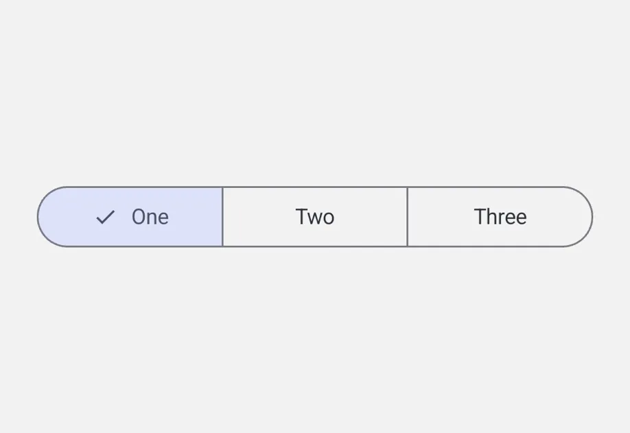
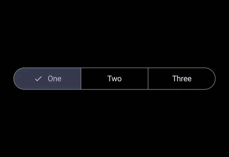
安装
If you are installing this in an existing React Native app, make sure to install expo in your project.
从 @react-native-segmented-control/segmented-control 迁移
- 将导入语句从
import SegmentedControl from '@react-native-segmented-control/segmented-control'更新为import SegmentedControl from '@expo/ui/community/segmented-control'。 values数组不支持图像值,仅支持字符串。- 不支持
momentary、backgroundColor、fontStyle和activeFontStyle属性。 tintColor仅在 Android 上有效(设置活动分段容器的颜色)。在 iOS 上,该属性无效。
基本用法
API
import SegmentedControl from '@expo/ui/community/segmented-control';
Component
Type: React.Element<SegmentedControlProps>
stringOverrides the control's appearance irrespective of the system theme.
Acceptable values are: 'light' | 'dark'
boolean • Default: trueIf false, the user cannot interact with the control.
(event: NativeSegmentedControlChangeEvent) => voidCalled when the user taps a segment.
The event carries nativeEvent.selectedSegmentIndex and nativeEvent.value.
(value: string) => voidCalled when the user taps a segment. Receives the segment's string value.
StyleProp<ViewStyle>Types
Shape of the native event passed to onChange.
Matches @react-native-segmented-control/segmented-control.
Deprecated: use NativeSegmentedControlChangeEvent
Type: NativeSegmentedControlChangeEvent
Shape of the native event passed to onChange.
Matches @react-native-segmented-control/segmented-control.